
The Emotional Characteristics of White for
Applications of Product Color Design
Nooree Na and Hyeon-Jeong Suk *
Department of Industrial Design, KAIST, Daejeon, Korea
This study aims to investigate the emotional characteristics of various shades of white. The study involved three experiments: Prior to the main experiments, the emotional characteristics of 13 basic colors were evaluated from which four factors, flamboyant, elegant, clear, and soft were extracted to facilitate the evaluation of white in the subsequent experiments. In Experiment I, white was identified to be dominantly more elegant in comparison to the other colors; in Experiment II, the emotional characteristics of 25 shades of white were assessed to derive an equation for predicting the emotional quality based on the color attributes of different shades of white; lastly in Experiment III, 1:1 scale mock-ups of mobile phones, coated with various shades of white as well as different levels of gloss and texture, were employed for further emotional assessment of white products in real-life situations. Consistent tendencies were observed in Experiment II and Experiment III, confirming the validity of the results. In addition, although color was the most dominant element that decided product emotion, gloss and texture were also found to influence the emotional characteristics of products. In conclusion, this study provides empirical evidence on the emotional responses of different shades of white, and supports designers to find an appropriate color for designing white based products.
Keywords – Color Emotion, Color Evaluation, Color-Material-Finishing (CMF), Product Color, White
Relevance to Design Practice – The results can be usefully employed during the final phases of product design when designers experience difficulty in deciding color, gloss, and texture. Designers can select an appropriate color of white based on the type of emotion they wish to elicit, and objectively check the validity of the selected color.
Citation: Na, N., & Suk, H. J. (2014). The emotional characteristics of white for applications of product color design. International Journal of Design, 8(2), 61-70.
Received April 1, 2013; Accepted January 6, 2014; Published August 31, 2014.
Copyright: © 2014 Na & Suk. Copyright for this article is retained by the authors, with first publication rights granted to the International Journal of Design. All journal content, except where otherwise noted, is licensed under a Creative Commons Attribution-NonCommercial-NoDerivs 2.5 License. By virtue of their appearance in this open-access journal, articles are free to use, with proper attribution, in educational and other non-commercial settings.
*Corresponding Author: h.j.suk@kaist.ac.kr
Nooree Na is a PhD candidate in the department of Industrial Design at KAIST, Korea, the same program in which she received her Master’s and Bachelor’s degree. Her current research interests include emotional design for color applications and user-centered design.
Dr. Hyeon-Jeong Suk received her BS and MS in industrial design from KAIST (ID KAIST), South Korea and PhD in psychology from the University of Mannheim, Germany. Currently she is an associate professor of ID KAIST leading a laboratory for color and emotion studies (ced.kaist.ac.kr), and is also an editor-in-chief of the Journal of Korean Society for Emotion & Sensitivity. Her research interests include color psychology and emotional design.
Introduction
Humans experience diverse colors throughout their daily lives, and it is well known that color significantly affects human emotions and feelings. According to Wexner (1954), every color has its own characteristics and each color induces different feelings. As an example, red is associated with exciting and stimulating emotions, whereas blue is associated with secure and comfortable feelings, and yellow with cheerful and joyous ones. Moreover, color is of great importance for deciding product emotion, and it is regarded as a vital element for showing the relationship between a product and its function, shape, material, etc. (Jang & Kim, 2007). Color is what ultimately attracts consumers and convinces them to purchase a product. Therefore, selecting appropriate colors and, consequently, conveying the desired product emotion is an essential process in product design.
In comparison to other colors, white exudes a positive impression, reminding users of clean, pure, refreshing, beautiful, gentle, and natural sentiments (Saito, 1996). White also has a particularly distinct role in the perceptional aspect. First, white is the standard for measuring the colorimetric system, in which every color value is measured based on a standard white surface. As such, measured values of all colors change if the standard white is incorrect (Kim, 1999). Second, as a color gets closer to white, its color tolerance also becomes lower (Kuehni, 1976). This indicates that the different shades of white are easily recognizable even when the alterations in shades are minimal. Third, white is the most universally used color in all industries. It has been globally ranked as the favorite color for the exterior of automobiles (Satake et al., 2011), and most home appliances have traditionally been painted with white bases.
A deep understanding of the many roles of white together with its various attributes can potentially open new, interesting lines of topic for designers to incorporate in their works (Park & Ra, 2010). Thus, it is not only important for product designers to understand the emotional characteristics of colors referred to as “white,” despite slight differences in shades (like saturated white with yellow shade or bluish white with low brightness), but it is also crucial for them to conduct thoughtful research about emotional influences of color on products. However, there are few papers and books that deal with white due to the fact that white is generally not considered a color. Previous studies (Hemphill, 1996; Ou, Luo, Woodcock, & Wright, 2004) that have explored color emotions are not only limited to investigating colors with great differences such as red, blue, yellow, and green, but also lack quantitative analysis. Hence, this study attempts to empirically investigate the emotional characteristics of various shades of white. Furthermore, it intends to provide a design guideline for selecting appropriate colors that truly convey the designers’ desired emotions for white based products.
Related Works
Many studies attempt to determine consumers’ emotions towards products and apply them to sales strategies. According to Moon’s (2001) study, the role of design occupies more than 60 percent of purchase intention, and among the diverse design elements of product design, color weighs in greatly. Additionally, Chun, Kim and Chung (2008) revealed that as a consumer’s intention of purchase increases, the importance of the product color increases along with it.
Early studies on color emotion were focused on whether a wide variety of colors evoke different emotional characteristics. Hemphil (1996) found that color significantly affects human emotions and feelings, and Wexner (1954) identified that each color has distinctive emotional characteristics. Ou and his colleagues (2004) classified color emotions for single colors and developed color-science-based color emotion models. Suk and Irtel (2010) also evaluated color emotion using emotional icons. Meanwhile, there have also been some researches regarding color emotion intended for product design applications. Hong, Lee and Kim (2012) conducted a workshop to extract the appropriate colors which strongly express certain design styles, and Kwak (2010) revealed that color emotion can be influenced by shape. Also, Lucassen, Gevers, and Ginsenij (2011) investigated the effects of texture on color emotion, in which they concluded that when textured samples are included in color emotion studies, the psychological responses may be more strongly affected by texture rather than by color.
These preceding studies provide valuable information about color emotion and emotional evaluation methods, but none of them provide such exploratory treatment for white or put a specific spotlight towards a single color. Some research have revealed that white has a relatively small color tolerance compared to other colors, where color tolerance refers to a tolerance limit of color difference between anchor color and a test color. According to the CMC ellipsoid derived from the CMC (Color Measurement Committee) color difference formula, color tolerance decreases as the a value and b value of a color converge towards zero (Berns, 2000). A research study quantifying the color tolerance of various colors formed the same conclusion (Melgosa, Hita, Poza, Alman, & Berns, 1997). In other words, people detect color differences more easily as a color becomes whiter. Therefore, it is reasonable to think that different shades of white have a better chance of inducing their respective emotional characteristics to the viewers. Nevertheless, related studies are still insufficient. For example, Qiao, Berns, Reniff, and Montag (1998) sampled hues to investigate the hue discrimination suprathresholds to quantify the global lack of visual uniformity. However, due to the use of only 12 colors with large color differences, the study did not identify any effect regarding small color differences. Nickerson and Stultz (1944) dealt with the color tolerance of white in their study. However, white was used somewhat as a control group. As a result, the test accuracy of white in this study was relatively low compared to other colors. In such regard, there is a definite lack of in-depth studies regarding various shades of white, especially when weighed against their potential importance. Thus, this study aims to find emotional characteristics focused on various shades of white and their application to product design.
Objectives
This study is intended to identify the emotional characteristics of various shades of white and to provide empirical evidences that are applicable for product design practice. Accordingly, three objectives were formulated as follows:
- To explore emotional factors through the quantitative profiling of emotional characteristics of product colors
- To identify the emotional characteristics of various shades of white depending on different nuances
- To develop the guidelines for suggesting an appropriate shade of white during design processes based on the desirable emotional characteristics of a product
Experiment Plan
In studying the emotional characteristics of various shades of white, three sequential experiments were conducted. First, four emotional factors to assess product color emotions were elicited by evaluating 13 basic colors. Second, the emotional qualities of various shades of white were estimated based on the selected factors. Finally, in order to assess the emotions of various shades of white when applied to actual products, the emotional characteristics of 1:1 scaled mobile phone mock-ups coated with different shades of white and diverse levels of gloss and texture were evaluated.
Preliminary Study to Define Range of White
Before conducting the experiments, the perceptional range of shades of white found in daily life was defined. Eight colors (yellow, yellow red, red, red blue, blue, blue green, green and green yellow) with 5 percent blackness from the Natural Color System were selected as color stimuli, and the differences in brightness between each selected color and white was divided into 12 levels. Then, 50 participants were asked to select a maximum level of tolerance for which the stimuli could be accepted as white. Based on the results, the average tolerance level of a L value (brightness) in the CIE 1976 Lab color system was 92.53. However, because the JND (just noticeable difference) of the L value in daily life is 2.30 (Mahy, Eycken, & Oosterlinck, 1994), white was defined as any color, varying in hue and saturation, with a L value greater than 90.23.
Experiment I: Exploring Emotional Factors
Objective
The purpose of Experiment I was to explore major emotional factors for the evaluation of product colors. By coupling basic colors with emotional factors, the emotional characteristics of white relative to other colors were also examined.
Method
Participants
30 participants took part in the experiment. The participants comprised of 16 male and 14 female students, and the average age of the participants was 23.60 years with a standard deviation of 2.63 years.
Stimuli
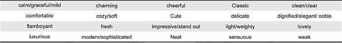
150 adjectives that represent emotions stimulated by products or colors were selected through literature reviews (Kobayashi & Matsunaga, 1991; Jeong & Lee, 2005). The number of adjectives was narrowed down to 60 by eliminating words that seemed inappropriate for expressing product colors and removing words with the same meaning. In the final stage of filtering, a questionnaire was conducted evaluating how well the adjectives convey the emotions induced by a product color. Based on the responses, a final list of 20 emotional adjectives was extracted (see Table 1).
Table 1. Twenty emotional adjective groups for evaluating product color.
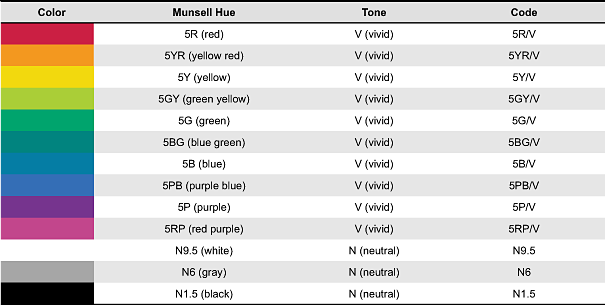
As basic color stimuli, 13 colors were chosen from the Hue & Tone 120 System and shaped into 3 cm by 3 cm square patches. As shown in Table 2, the collection of colors composed of 10 hues (red, yellow red, yellow, green yellow, green, blue green, blue, purple blue, purple, red purple) with vivid tone and 3 neutral colors—white, gray, and black.
Table 2. Thirteen color stimuli extracted from Hue & Tone 120 System.
Procedure
The experiments were conducted indoors where sunlight was completely blocked out by heavy curtains. The artificial light used in the experiment was similar to D65, which is a commonly used standard illuminant defined by the CIE. The measure of the color temperature was 6564 K, with an illumination value of 835 lx. The participants assessed 13 basic colors with 20 emotional adjective groups using the 7-point Likert scale (7 point: very appropriate, 1 point: not appropriate). For instance, they gave a score of 7 points if they strongly agreed with the coupling between the given color and the emotional adjective.
Result and Analysis
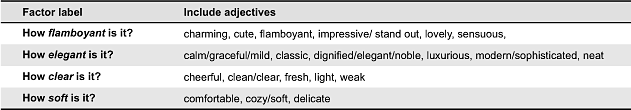
The reliability test showed that there were significant differences between the colors (Cronbach’s alpha value > 0.80, KMO > 0.80, Bartlett’s significant value < 0.05). As a next step, a factor analysis was performed to select the emotional factors for evaluating product color. Four emotional factors were identified. Table 3 shows the selected factors, which account for 66.39% of the data. Adjectives like “flamboyant,” “stand out/ impressive,” “lovely,” “charming,” “sensuous,” and “cute” were grouped in factor 1 and categorized as flamboyant. The remaining three emotional factors include elegant, clear, and soft.
Table 3. Four emotional factors from factor analysis.
The emotional characteristics of white related to other colors were obtained by calculating their mean score. Warm colors such as 5R/V (5.13) and 5Y/V (5.46) received high flamboyant scores, whereas cold colors and neutral colors did not. Accordingly, neutral colors such as N1.5 (3.69), N6 (1.79), and N9.5 (2.53) were not regarded as flamboyant, but rather more elegant relative to vivid colors (average elegant score of neutral colors: 5.10; vivid colors: 3.24). Among the neutrals, white dominantly appeared to be perceived as most elegant (5.90). In the clear factor, 5B/V (5.85) received the highest score followed by white (5.35). Lastly, white received slightly higher scores than average in soft factor (score of white: 4.00; score of average: 3.34).
Experiment II: Examining Emotional Characteristics of Various Whites
Objective
In this experiment, different emotional responses were explored based on various shades of white. Moreover, the emotional effects of hue, saturation, and brightness were quantified.
Method
Participants
A group of 30 participants were recruited. The group comprised of 13 male and 17 female students, and their average age was 23.33 years with a standard deviation of 3.24 years. All participants were paid volunteers and students without color vision problems.
Stimuli
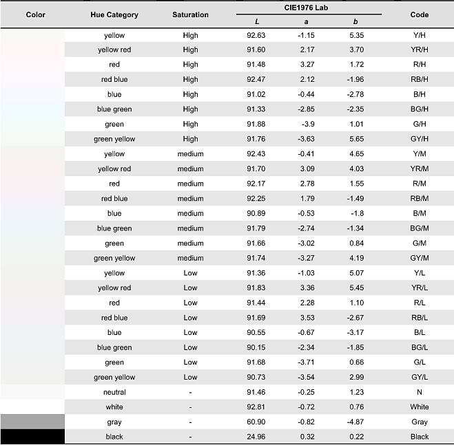
As shown in Table 4, 25 white color patches in various shades were selected from the Natural Color System (NCS). The patches were made up of one neutral color and eight hues (yellow, yellow red, red, red blue, blue, blue green, green, and green yellow) with three levels of saturation. In addition, three anchor colors—white, gray, and black—were embedded among the color stimuli to compare the evaluation results with Experiment I. In order to analyze the results quantitatively, the CIE 1976 Lab value of all the color stimuli were measured using a spectrophotometer (Minolta CM-2600d).
Table 4. Twenty five white color and three anchor color stimuli selected from NCS.
Procedure
Participants were asked to evaluate the white color stimuli with four emotional factors—flamboyant, elegant, clear, and soft—extracted from Experiment I using a 7-point Likert scale. For example, participants gave a score of 7 points in the flamboyant factor if they felt the R/H color was highly flamboyant. The experiment was conducted on a desk covered with gray fabric to avoid the influence caused by the color of the desk, and the light environment was the same as the previous experiment.
Result and Analysis
A reliability test was conducted on each emotional factor. The results indicated that all evaluations were reliable (Cronbach’s alpha value: flamboyant: 0.84; elegant: 0.83; clear: 0.73; soft: 0.65). Next, using their mean scores, all the various shades of white were positioned on a 2-dimensional graph represented by two emotional factors resulting in a total of six graphs being displayed as shown in Figure 1. As is the case for the basic colors, the various shades of white displayed respective emotional characteristics according to the different shades of color. White with warm shades such as red, yellow red, and red blue were regarded as more flamboyant than whites in cold and neutral shades. White with a red blue shade was also perceived as the most elegant relative to other whites. In the clear factor, saturation was considered more significant rather than other factors. Saturated white with blue shades dominantly appeared to be perceived as most clear, followed by green blue and green shades with high saturation. Lastly, compared to others, the results of the soft factor were not scattered but white with yellow shade was regarded as relatively soft.
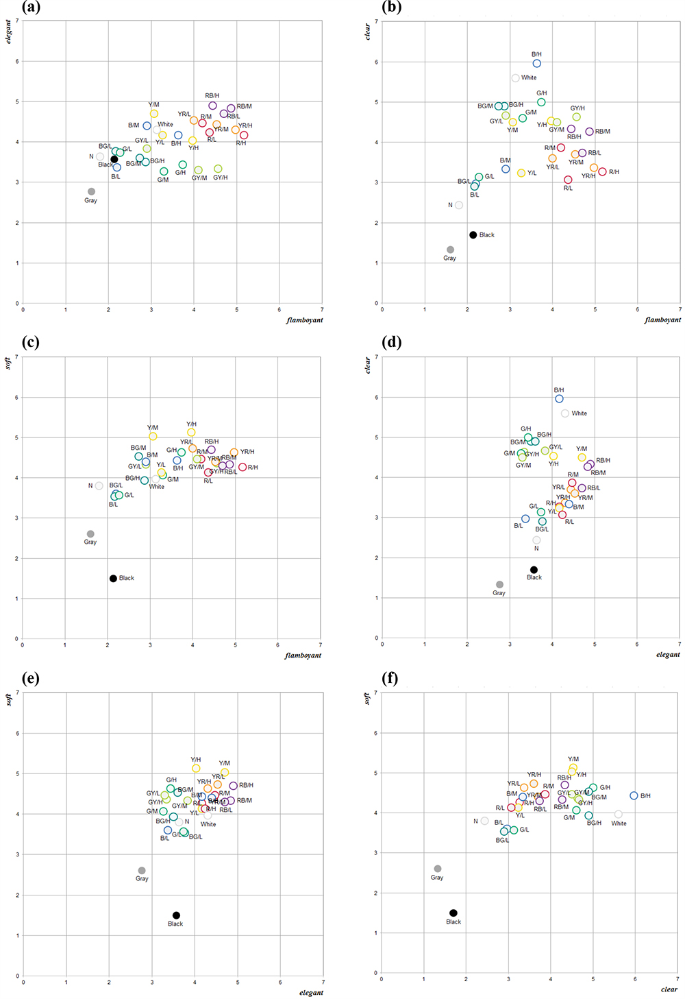
Figure 1. Emotional characteristics of white and anchor color stimuli:
(a) flamboyant-elegant, (b) flamboyant-clear,
(c) flamboyant-soft, (d) elegant-clear, (e) elegant-soft and (f) soft-clear.
(click to enlarge the image)
In order to analyze this distribution tendency quantitatively, stepwise multiple regression analyses was performed using the value of hue (a, b), brightness (L), and saturation (C = (a² + b²)1/2) as independent variables, and the results of the emotional evaluation as dependent variables, a and b values, signifying hue, had independent effects on the outcome (+a: red; -a: green; +b: yellow; -b: blue). Because saturation C is a result of an interaction between a and b values, its effect was not independent. However, the C values were included in the equation as an independent variable to increase the equation’s explanation capacity. By conducting multiple regression analysis, a color emotion equation was derived, which can be used to predict the emotional qualities of white based products based on the color attributes of white (see Table 5).
Table 5. Color emotion equation using color values.
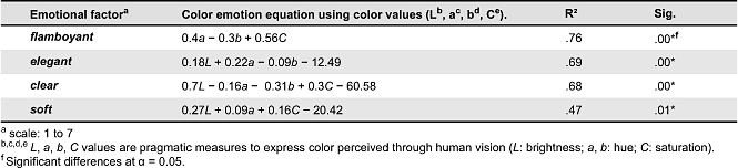
How much a color feels flamboyant is affected by hue and saturation. This means that colors with higher a and C values and lower b values, specifically more saturated and purplish whites, are more flamboyant than other colors. The elegant factor depends on hue and brightness of a color. Different shades of white with high brightness, a high a value, and a low b value, enhances the elegant feeling. Finally, the perception of clear and soft emotions in a color is influenced together by hue, saturation, and brightness. For example, white in a highly saturated cold shade (low a and b value) with high brightness expresses strong sentiment of clearness, whereas white in a highly saturated red shade (high a value) with high brightness feels softer relative to other whites. As such, the distinctive emotional characteristics of a particular white can be predicted by putting its color values in the suggested color emotion equations.
Experiment III: Identifying the Effect of CMF on White
Objective
The aim of this experimental phase was to examine the effects of color, material, and finishing (CMF) on the emotional characteristics of white products. The relative influences of hue, saturation, gloss, and texture were identified, and the relations between each CMF element and the four emotional factors were also found.
Method
Participants
A group of 30 people participated in the experiment. The group comprised of 15 male and 15 female students, and the average age of the subjects was 22.27 years with a standard deviation of 2.25 years. All subjects were paid volunteers and students without color vision problems.
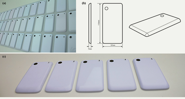
Figure 2. (a) 45 CMF stimuli, (b) dimensional drawings of the stimulus
and (c) stimuli in 5 glosses and textures:
(starting from the left) low gloss with smooth texture, medium gloss with smooth texture, high gloss with smooth texture, low gloss with medium texture, low gloss with rough texture.
Stimuli
In deciding the CMF elements prior to conducting the experiment, three assumptions were made. First, both hue and saturation represent color; second, texture is related to material; and third, gloss equates to finishing. As for stimuli, 9 shades of white with different nuances were selected among the white stimuli used in Experiment II—Y/H, R/H, B/H, G/H, Y/L, R/L, B/L, G/L, N—corresponding to four hues with two levels of saturation and one neutral color. Afterwards, each color was divided into three levels of gloss and texture (gloss: high, medium, low; texture: smooth, medium, rough). 5 stimuli in various glosses and textures, but not expressing both gloss and texture simultaneously, were prepared (low gloss with smooth texture-control stimulus; medium gloss with smooth texture; high loss with smooth texture; low gloss with medium texture; low gloss with rough texture). In such a manner, a total of 45 stimuli (9 white * 5 glosses and textures) were prepared for the experiment. The values of relative gloss measured by a spectrophotometer were G40, G80, and G110 (scale: 0~175), where higher numerical values signify higher gloss. The values of texture, measured by surface roughness, were 0.50μm, 2.00μm, and 3.50μm. In this case, higher values meant rougher texture. To create the feeling of real products for experimentation, all of the stimuli were produced as 1:1 scale mock-ups of the same mobile phone model (57mm× 115mm) using ABS plastic.
Procedure
The participants assessed the CMF stimuli using four emotional factors—flamboyant, elegant, clear, and soft—on a 7-point Likert scale. The stimuli were arranged in random orders and given to the participants all at once. During the experiment, the participants were allowed to feel the texture of the stimuli with their fingers at a constant distance because the textures were not distinguishable unless the participant touched the stimuli. Similar to Experiment II, the experiment was conducted on a gray fabric to avoid the effect caused by the background color, and the light environment was same as in the previous experiments.
Result and Analysis
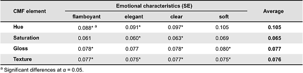
To analyze the effects of CMF elements on the emotional characteristics, 4-way ANOVA (ANalysis Of VAriance) was conducted using hue, saturation, gloss, and texture as independent variables, with the evaluation score of the respective emotional characteristics as the dependent variable. The test results indicated that there was a significant relationship between each CMF element and the different emotional characteristics. Hue had a significant effect in most of the emotional characteristics, including flamboyant, elegant, and clear (flamboyant/clear p < 0.05; elegant p = 0.02), whereas saturation was significant for only elegant and clear (both p < 0.05). Gloss was significant for flamboyant, clear, and soft (all p < 0.05), and texture had a high significance level for all of the emotional characteristics (all p < 0.05). In addition, the average standard error of each emotional characteristic depending on respective CMF element was calculated as shown in Table 6. The results illustrate that the average standard error for hue was highest, followed by gloss, texture, and saturation, respectively. The size of the standard error indicates how much each CMF element influences emotional characteristics, where the influence becomes greater with a higher standard error. In this study, it was observed that hue played the most powerful role in determining the emotional characteristics of white products, whereas saturation played the smallest role. The influences of gloss and texture were relatively similar, and were both greater than saturation but smaller than hue.
Table 6. Average standard error of each emotional characteristic.
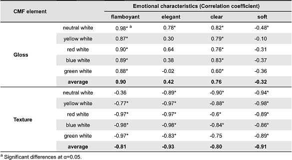
From the analysis, it was discovered that hue was the most influential element in deciding emotional characteristics of white products, whereas saturation, in comparison, had little effect. Thus, saturation was combined with hue prior to running a correlation analysis to find the relation between color and gloss or texture. The results of the correlation analysis (see Table 7) showed that there was a positive correlation between gloss and flamboyant, elegant, and clear respectively, and a negative correlation between gloss and soft. This means that surfaces with high gloss enhanced flamboyant, elegant, and clear emotions, and surfaces with low gloss stimulated soft sentiments. In case of texture, there was a strong negative correlation with all of the emotional characteristics. In other words, smooth texture effectively maximized all four emotional factors. In addition, the correlation coefficient of flamboyant and clear were fairly high both in gloss and texture, whereas the values were relatively low for elegant and soft, particularly in gloss. The results indicated that color is the most significant element for portraying flamboyant and clear emotions, significant enough that these emotional characteristics of white products will remain the same even with changes in levels of gloss or texture. In comparison, there was little or no significant correlation between elegant and gloss, and soft and gloss, indicating that elegant and soft emotions were influenced by gloss more than color.
Table 7. Correlation coefficient of each emotional characteristic based on gloss and texture.
Implications for Design Practice
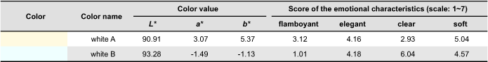
Based on the color emotion equation, which is shown in Table 5, designers are able to identify the emotional characteristics of their selected colors. For example, there are two different shades of white—white A and white B. White A has yellow nuance and white B is tinged with blue, as shown in Table 8. The emotional response of each color can be predicted by substituting the respective color values (L, a, b, C) into the color emotion equation. In this case, the score for the elegant (A: 4.16; B: 4.18) and soft (A: 5.04; B: 4.57) factors are similar. Although neither color fittingly expresses flamboyancy due to their low levels in hue, the output of the equation suggests that for the flamboyant factor white A (3.12) is preferable over white B (1.01). Finally, for the clear factor, white B (6.04) has a noticeably higher score. This means that if a designer wants to render an impression of clarity and softness to his or her product, white B is the more appropriate choice.
Table 8. Scores of four emotional characteristics for white A and white B.
Through the use of the color emotion equation proposed, designers can select appropriate white colors for the type of emotion they wish to evoke with objective validation backing up their choice of product color. The suggested design applications were based on the collective opinion of the majority of the participants, hence, referring to the results can provide an advantage compared to making a color design based on the designers’ own subjective opinions.
General Discussion
This study dealt with the emotional effects that various shades of white have on white based products. From the results of Experiment I, the four emotional factors flamboyant, elegant, clear, and soft were extracted. In Experiment II, by assessing various shades of white under the criteria of these factors, it was found that each shade of white has its own respective emotional characteristics which is affected by hue, saturation, and brightness. With this, it is worthwhile to carefully consider the elegant factor of different shades of white. According to the results from Experiment I, although some shades of white have relatively low scores for the elegant factor derived from the color emotion equation, it should be duly noted these shades of white having a low value for the elegant factor are still comparatively more elegant than other non-white colors. Consequently, the shades of white with high elegant scores should exude an exceptional level of elegance. Consistent tendencies were observed in Experiment I and Experiment II depending on the similarity of hues and nuances, with the various shades of white having similar emotional characteristics to the 13 basic colors. Both warm colors and whites with warm shades were perceived as most flamboyant, whereas blue and bluish white were regarded as clear in each experiment. This is because throughout the course of the experiments, participants became accustomed to the delicate differences in the various shades of white, which led them to perceive the various shades of white as the same as the basic colors, but with much higher levels of brightness. From Experiment III, the effect of CMF on emotional characteristics of white based products was also identified. For example, products with high gloss maximize flamboyant, elegant, and clear emotions, but reduce the sense of soft. However, it was hue that was identified as the element that plays the most decisive role when it comes to deciding product emotions, followed by gloss and texture, with both having similar effects. Saturation, on the other hand, appeared to play the relatively minor role. Nevertheless, gloss, texture, and saturation are still influential variables and should be considered as good alternatives to hue for generating a change in emotional characteristics for products.
Despite meaningful results, however, there were some limitations in this study. First, to avoid over-complexity, the stimuli used in Experiment III were limited to only a few variations in CMF elements. Therefore, there were large and irregular gaps between the levels of each CMF element. In this regard, further research with increased variations in CMF elements can eliminate the problems faced in this experiment and provide merit to its experimental results. Next, the subjects who participated in the study were limited to only Korean students. Even though the emotions conveyed by different shades of white are viewed similarly all over the world, there may be some differences from country to country. Hence, more meaningful comparison will require conducting future experiments with subjects from various cultural groups and observing the differences between them.
Conclusion
In this study, the emotional characteristics of various shades of white were investigated. The study had three main objectives, which were achieved through three experiments as described in the following. First, the terms flamboyant, elegant, clean, and soft were extracted to represent the four major emotional factors for evaluating product emotions. By describing the various shades of white using these factors, the relative emotions of different shades of white was revealed. In comparison to other colors, white was discovered to be most elegant. Second, it was found that the emotional characteristics of various shades of white depended on combinations of color attributes—hue, saturation, and brightness. Moreover, the emotional characteristics of white based products were affected not only by color but also by gloss and texture. Finally, based on the results of Experiment I & II, a color emotion equation was suggested to be employed when designers want to design white products taking color emotion into consideration. It is with great hope that this study can be sighted as an underlying yet essential effort on drafting a product color design guideline.
References
- Berns, R. S. (2000). Billmeyer and Saltzman's principles of color technology. New York, NY: Wiley-Interscience.
- Chun, M. Y., Kim, S. M., & Chung, D. S. (2008). The color sensitivity analysis research which follows in consumer product purchase at the time of participation degree - In tacit memory and external present memory center. In H. J. Suk (Eds.), Proceeding of the Conference of the Korean Society for Emotional and Sensibility (pp. 44-45). Seoul, South Korea.
- Hemphill, M. (1996). A note on adults' color-emotion associations. The Journal of genetic psychology, 157(3), 275-280.
- Hong, J. I., Lee, Y. J., & Kim, S. J. (2012). A study on the single color for the industrial design: Focus on the single color pursuant to the emotional words. Journal of the Korea society of color studies, 26(2), 61-74.
- Jang, N. S., & Kim, S. B. (2007). The product color effect on product color preference, product image and product attitude. Journal of Korean society of design science, 20(1), 79-88.
- Jeong, S. H., & Lee, K. P. (2005). Extraction of user’s representative emotions expressed white using a product. Journal of Korean society of design science, 18(1), 69-80.
- Kim, C. S. (1999). Establishment of the color standard traceable system. Journal of the Korea society of color studies, 12(1), 1-8.
- Kobayashi, S., & Matsunaga, L. (1991). Color image scale. Tokyo, Japan: Kodansha international.
- Kuehni, R. G. (1976). Color-tolerance data and the tentative CIE 1976 L*a*b* formula. Journal of the Optical Society of America, 66(5), 497-500.
- Kwak, Y. S. (2010). Effect of shapes on color emotions. In H. S. Park (Eds.), Proceeding of the Conference of the Ergonomics Society of Korea (pp. 238-241). Seoul, South Korea.Lucassen, M. P., Gevers, T., & Ginsenij, A. (2011). Texture affects color emotion. Color Research and Application, 36(6), 426-436.
- Mahy, M., Van Eycken, L., & Oosterlinck, A. (1994). Evaluation of uniform color spaces developed after the adoption of CIELAB and CIELUV. Color Research and Application, 19(2), 105-121.
- Melgosa, M., Hita, E., Poza, A. J., Alman, D. H., & Berns, R. S. (1997). Suprathreshold color: Difference ellipsoids for surface colors. Color Research and Application, 22(3), 148-155.
- Moon, S. (2001). A study on the inter-relation of a color of goods & purchasing. Journal of Korea Institute of Packaging Culture Design, 10(1), 183-198.
- Nickerson, D., & Stultz, K. F. (1944). Color tolerance specification. Journal of the Optical Society of America, 34(9), 550-568.
- Qiao, Y., Berns, R. S., Reniff, L., & Montag, E. (1998). Visual determination of hue suprathreshold color-difference tolerances. Color Research and Application, 23(5), 302-313.
- Ou, L. C., Luo, M. R., Woodcock, A., & Wright, A. (2004). A study of colour emotion and colour preference. Part I: Colour emotions for single colours. Color Research and Application, 29(3), 232-240.
- Park, H. J., & Ra, J. Y. (2010). The significance of the chromatic value of the color white. The journal of the Korea Contents Association, 10(2), 193-201.
- Saito, M. (1996). Comparative studies on color preference in Japan and other Asian regions, with special emphasis on the preference for white. Color Research and Application, 21(1), 35-49.
- Satake, I., Xin, J. H., Tianming, T., Hansuebsai, A., Ando, K., Sato, T., Kajiwara, K., & Ohsawa, S. (2011). A comparative study of the emotional assessment of automotive exterior colors in Asia. Progress in Organic Coatings, 72(3), 528-540.
- Suk, H. J., & Irtel, H. (2010). Emotional response to color across media. Color Research and Application, 35(1), 64-77.
- Wexner, L. B. (1954). The degree to which colors (hues) are associated with mood-tones. Journal of Applied Asychology, 38(6), 432-435.
