Evocative Balance: Designing for Interactional Empowerment
Anna Ståhl 1, Jonas Löwgren 2,*, and Kristina Höök 3
Mobile Life @ SICS, Swedish Institute of Computer Science, Sweden
School of Arts and Communication, Malmö University, Sweden
Mobile Life @ KTH, Royal Institute of Technology, Sweden
We propose an experiential quality called evocative balance as key in designing for affective interaction that aims to empower users in and through the interaction. Evocative balance draws on the dual meaning of the word “evoke” in characterizing the user’s sense that data and actions evoke familiar recollections of lived experience, yet are still open enough to evoke multiple interpretations in an ongoing process of co-constructive making of meaning. Our aim is to capture those experiences that resonate with our lived, everyday, social and bodily experiences; those experiences that we can recognise in ourselves and, through empathy, in others. We elaborate on and substantiate the meaning of this quality by means of retrospective reflection on three of our own design projects. This account provides detailed insights on how to find the balance between openness and familiarity through design.
Keywords – Experiential Quality, Interaction Design, Affective Interaction.
Relevance to Design Practice – As interaction designers approach designing for emotional expressivity, balanced designs where users find data and actions familiar in terms of lived experience, yet open enough to allow for multiple interpretations in constructive meaning-making, turn out to be empowering.
Citation: Ståhl, A., Löwgren, J., & Höök, K. (2014). Evocative balance: Designing for interactional empowerment. International Journal of Design, 8(1), 43-57.
Received March 12, 2013; Accepted November 8, 2013; Published April 30, 2014.
Copyright: © 2014 Ståhl, Löwgren, & Höök. Copyright for this article is retained by the authors, with first publication rights granted to the International Journal of Design. All journal content, except where otherwise noted, is licensed under a Creative Commons Attribution-NonCommercial-NoDerivs 2.5 License. By virtue of their appearance in this open-access journal, articles are free to use, with proper attribution, in educational and other non-commercial settings.
*Corresponding Author: jonas.lowgren@mah.se
Anna Ståhl is an industrial designer and researcher at SICS (Swedish Institute of Computer Science). She holds a licentiate degree from Umeå Design Institute, from where she also received her first degree. Her research interests are in the areas of design research, affective interaction and designing for somaesthetics. In particular, she is interested in bridging design research and practice. She has published some 30 peer-reviewed scientific papers. More information about Ståhl’s work is available at http://www.sics.se/people/anna-stahl.
Jonas Löwgren is professor of interaction design and a co-founder of the School of Arts and Communication (K3), Malmö University, Sweden. He specializes in cross-media products, interactive visualization and the design theory of digital materials. Löwgren has taught interaction design in university courses and in companies since the early 1990s. In 1998, he initiated the influential two-year master’s program in interaction design at Malmö University. He has published over 60 peer-reviewed scientific papers and four books, including Collaborative Media (with Bo Reimer, MIT Press) and a vast range of general-interest and pedagogical material. His design portfolio comprises some 50 projects in explorative research and professional contexts. More information on Löwgren’s work is available at webzone.k3.mah.se/k3jolo/.
Kristina Höök is a professor in interaction design at KTH (The Royal Institute of Technology), Sweden. Höök has published more than 100 journal papers, books and book chapters, and conference papers in highly renowned venues. A frequent keynote speaker, she is known for her work on social navigation, seamfulness, mobile services, affective interaction and lately, designing for bodily engagement in interaction through somaesthetics. Her competence lies mainly in interaction design and user studies helping to form design. Höök started and currently leads the Mobile Life centre that has around 45 researchers. She has obtained numerous national and international grants, awards and fellowships, including the Cor Baayen Fellowship by ERCIM (European Research Consortium for Informatics and Mathematics) and the INGVAR award. She has been listed as one of the 50 most influential IT-women in Sweden every year since 2008. She is an elected member of Royal Swedish Academy of Engineering Sciences (IVA).
Introduction
Camilla is a 42-year-old single woman living in a suburb of Stockholm from where she commutes to her work in the city centre. She has recently separated from her husband, a life-changing event, causing practical problems as well as emotional distress. Camilla has come to question more than one aspect of her everyday life choices. In this difficult situation, she feels a need to engage more deeply in reflecting on her life and her emotional reactions, perhaps even make some small changes to her life. At this point, she happens to come in contact with the system Affective Health, which makes use of biosensors to reflect some of her bodily emotional reactions over time back to her in a mobile app. The visual representations of the emotional bio-data on the phone are designed to trigger recollections of what she has experienced recently, but at the same time provide openings for her to start thinking and interpreting what she sees in new ways.
The system offers enough cues for her to connect sensed emotional reactions to specific situations and reflect upon them, thus helping her towards a more mindful approach when thinking about or interacting with her ex-husband. She looks back at a situation that occurred recently (see Figure 1) where she was sitting on the subway train talking to a friend:
[..] and here it was quite interesting, because I walked to the subway, that you can see here. It was right about here we started to talk about these very emotional heavy things [referring to her relationship with her ex-husband] and then all of a sudden I became very red. I became like this a couple of times. It is typical for this emotionally engaging stuff. And then when we kind of ended it, I became very blue again, and I managed to let go of the whole thing!
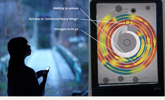
Figure 1. Affective Health interface: The continuous measurements of skin conductance, pulse and movement are presented in a spiral form with the most recent data in the middle and history spiralling outwards. The resulting visual representation is legible to the user in the sense of recalling specific situations and forming the basis for interpretations.
The key to this design is the use of colour and shape elements forming a whole, a Gestalt that represents Camilla’s recent bodily-emotional experiences in a way that is conducive to recollection, but open enough to accommodate individual interpretation. Our aim is to help users reflect on their everyday experiences and perhaps deal with issues and discover possibilities in their lives. What the vignette shows is how Camilla’s interaction with the system strikes a dynamic balance between familiarity and openness. The interaction is evocative in the dual sense that it evokes the recent event of talking about her past relationship and it evokes interpretations, perhaps the formation of new intentions about letting go of the whole thing.
The system that Camilla uses in the vignette—Affective Health—is one of our design experiments within affective interaction where we have devoted significant effort to users’ ability to reflect, express themselves and engage in profound meaning-making. We call this overall direction Interactional Empowerment and have found repeatedly that the balance between evoking the familiar and evoking the new is an experiential quality that plays a key role in determining the success of our designs.
Affective interaction is a relatively new field (Boehner, DePaula, Dourish, & Sengers, 2005, 2007; Höök, Ståhl, Sundström, & Laaksolaahti, 2008) that has recently spawned a wave of explorative research. In a typical affective interaction system, users express themselves in various ways, sometimes using gestures or bio-sensors picking up on the physical, corporeal side of emotional experience. This input is then transformed into expressions or interactions where users interpret, make sense of and sometimes re-shape what the system picked up as part of the system functionality. This may be useful when learning more about yourself (Ståhl, & Höök 2008; Ståhl, Höök, & Kosmack Vaara, 2011; Ståhl, Höök, Svensson, Taylor, & Combetto, 2009) and when communicating with others (Sengers, Boehner, Warner, & Jenkins, 2005; Ståhl, Sundström, & Höök, 2005), as well as in applications such as interactive arts (Khut, 2006), interactive dance (Wilde, 2011), interactive installations (Sengers et al., 2002), and games (Zangouei, Gashti, Höök, Tijs, de Vries, & Westerink, 2010).
It turns out that the Gestalt of an affective interaction system is quite sensitive to detailed design choices where even a slight mistake runs the risk of crippling the interaction experience. If emotional expressions are overly literal or unambiguous, there is little room for interpretation, meaning-making and growth. On the other hand, if the expressions come across as arbitrary and abstract, there will be no resonance in lived bodily experience and the whole topic of the interaction becomes unfamiliar and insignificant. To reiterate, the balance between evoking the familiar and evoking the new is a key experiential quality in affective interaction and specifically when interactional empowerment is sought. We call this quality evocative balance.
In the course of our design experiments, when evocative balance is attained in affective interaction the user experiences a resonance with familiar, lived experience while at the same time finding openings for new interpretations and the making of new meaning.
This article is devoted to elaborating the experiential quality of evocative balance by means of retrospective reflection on three of our design projects. First, we briefly situate our work in terms of research methodology and introduce the background necessary to appraise the Interactional Empowerment program and the idea of experiential qualities as a form of design knowledge.
Methodology and Background
The general context of our work concerns academic research where design practice forms part of the knowledge production process. This has been a concern for quite some time in the interdisciplinary field of design research, particularly in accordance with the global trend to incorporate the creative, practice-based design disciplines into academic structures of knowledge production and communication. Frayling’s (1993) tripartite taxonomy of research into, for and through design has been a particularly sticky meme in spite of its conceptual shortcomings.
Our academic field is interaction design. Within this field there has been a longstanding tradition reaching back to applied behavioural science and human-computer interaction (HCI) studies where design is undertaken as a subordinate means of creating an instrument for behavioural testing, yielding the empirical data that was traditionally seen as the actual knowledge contribution. However, developments in design research have been noted within interaction design in recent years and the concept of research-through-design in particular has been promoted as a fruitful methodological direction (Zimmerman, Forlizzi, & Evenson, 2007).
The general gist of this emerging direction recognizes the knowledge value that lies in proficient design practice as such and in the artefacts it yields. As yet, there is no mature consensus on the details of how this “should be done” in a research context. What seems to be clear is that there are potentially fruitful contributions to be had for the academic interaction design community in the form of design knowledge, that is, knowledge that is pertaining to design and that academic peers can assess and appropriate for further research processes involving design practice. Furthermore, it seems clear that such knowledge draws on abstractions from particular design artifacts to an intermediate level, abstaining from claims to universal generality. Beyond that, suggested conceptualizations abound, including knowledge forms such as patterns, experiential qualities, strong concepts (Höök & Löwgren, 2012) and annotated portfolios (Bowers, 2012; Gaver & Bowers, 2012) (for a brief survey, see Löwgren, 2013).
On the slightly broader level of characterizing research processes involving design practice, an influential idea by Johan Redström and colleagues has been to appropriate the established notion of design programs to form programmatic design research (Hallnäs, Melin, & Redström, 2002; Binder & Redström, 2006; Brandt, Redström, Eriksen, & Binder, 2011). Briefly, the idea is to organize inquiry including design practice under a set of aims or desiderata forming a program and perform design experiments within the program in order to grow the understanding of the chosen line of inquiry. The exact dynamics of program and experiments are often seen as dialectic (Redström, 2011) or hermeneutic, and the experiments serve to suggest further inquiry as well as to form the basis for abstractions or even hypothesis testing. In either case, it is found that programmatic design research is an overall form of knowledge production that accommodates the nature of design practice quite well and draws on its inherent strengths, such as the ability to explore possible futures and to frame and reframe key concerns in under-constrained design situations.
The work reported here was specifically undertaken as part of a design research program called Interactional Empowerment. Design practice was an essential part of this program and here we report three specific design experiments called eMoto, Affective Diary and Affective Health, each including several iterations of explorative design and experimentation “in the wild”, that is, engaging participants over longer periods of time throughout the course of everyday life. The participants’ experiences and emerging use practices were elicited through qualitative observation and debriefing methods, forming the ground for new design iterations. One recurring insight from the work concerned the significance of the experiential quality we came to call evocative balance. This article is our attempt to articulate it as an academic knowledge contribution. The following introduces the details of the Interactional Empowerment program and the notion of experiential qualities before moving on to the concrete design and articulation work that forms the main part of the paper.
The Interactional Empowerment Program
Interactional Empowerment is a program that captures our view on designing for affective interaction. The key ideas of Interactional Empowerment are to allow users to be expressive, to reflect and to engage in profound meaning-making (Höök et al., 2008). It views users as autonomous and considers interaction as potentially empowering. Designing within Interactional Empowerment entails providing means for users to co-construct meaning and contribute their interpretations of what a system portrays to them (Höök et al., 2008; Boehner et al., 2005, 2007). It is through interaction over time that the system starts making sense by mirroring bio-data or users’ experiences back to them for example. An interactional view sees meaning, emotions and dialogue as constructed in and through the interaction.
In our Interactional Empowerment program, we aim to support people in understanding and experiencing their own expressions subjectively, be it bodily or otherwise. In an interactional view, the aim is not to detect what is the “right” or “true” interpretation of the data and tell the users about it, but rather to make experiences available for reflection. This requires a representation that combines familiarity of lived experience with openness for interpretation. Users’ interpretations form a more relevant account of what they are experiencing. This perspective on how to design puts users’ interpretation of their own life, bodily processes or sociality at the centre. It empowers them to make their own choices, rather than being told by a system what they are experiencing.
Experiential Qualities
Experiential qualities (previously known as use qualities) are characterizations of interaction experiences: how an interaction feels, how it is experienced in use (Löwgren, 2009). An experiential quality forms a concept on an intermediate level between a concrete artefact and a general theory, typically articulated and communicated by means of a relatively brief characterization in words and a relatively rich body of examples highlighting the intended experiential quality in play through reports of interaction scenarios.
Experiential qualities are primarily discussed among design researchers as analytical concepts, emerging from erudite criticism or other forms of systematic reflection and abstraction combined with various sorts of empirical data. They are typically presented as indications of key concerns in certain genres of interaction design, that is, qualities that characterize or distinguish the use of artefacts belonging to the genre of concern.
As should be clear, experiential qualities are relational concepts in the sense that they reside in the interaction, neither being properties of the artefact itself nor of the user. This means that a designer can never know for sure that an artefact will render a specific experiential quality when it is actually used. However, the designer can set the scene to create conditions under which the experiential quality is likely to manifest itself in use. Even though experiential qualities are predominantly analytical concepts, manifesting themselves only in actual use, they are not entirely without value in practical, generative design. They serve as sensitizing devices for the designer, drawing attention to core qualities of the users’ experience and, in a sense, of ideal use. If the designer accepts and appreciates that insight, it is then quite feasible to proclaim a particular experiential quality as a desirable one in a new design project and to arrange the work such that the use of the new artefact is likely to exhibit that quality.
Finally, from the point of view of design research, experiential qualities form a useful abstraction level for articulating emerging insights over a range of experiments performed within a program. In the following, we illustrate how the experiential quality of evocative balance serves as a centre of gravity to draw together insights from three design experiments within our emerging program of Interactional Empowerment.
Three Design Cases
This section provides a brief introduction to three design experiments within our Interactional Empowerment program: eMoto (Ståhl et al., 2005), Affective Diary (Ståhl et al., 2008; Ståhl et al., 2009) and Affective Health (Ståhl et al., 2011). For each case, what we describe in the brief introduction is the “final” design after explorative work of iterative design and qualitative experiments in the wild. We then move on to a discussion of the experiential quality we call evocative balance, primarily grounded in the iterative design exploration and qualitative data of the three design cases.
Case I: eMoto
In eMoto (2003–2005), users send text messages between mobile phones, but in addition to text the messages also have colourful and animated shapes in the background. The user writes the text message and then chooses which expression to use as a background from a big palette of expressions mapped on a circle. The expressions are designed to convey emotional content along the axes of arousal and valence (Russell, 1980). For example, aggressive expressions have high arousal and negative valence. They are portrayed as sharp, edgy shapes in strong red colours, with quick sharp, colliding animations. Calm expressions have low arousal and positive valence, which is portrayed as slow, billowing, harmonizing movements of big, connected shapes in calm blue-green colours. To navigate around the circle, the user has to perform gestures using pressure and movement with the stylus pen that came with some mobile phones at the time and which we have extended with sensors. Users are not limited to any specific set of gestures, but are free to adapt their gesturing style according to their personal preferences (see Figure 2).
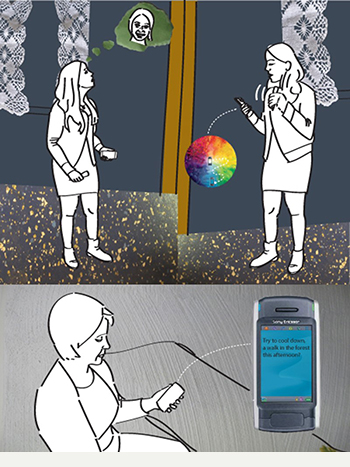
Figure 2. eMoto: Navigating the colour + animation space through gestures adding emotional expression to a text message in eMoto.
Case II: The Affective Diary
The Affective Diary (2005–2007) consists of a mobile phone (with camera), body sensors placed in a bracelet that users wear on their upper arm and a Tablet PC (see Figure 3). As a person starts her day, she puts on the body sensor. During the day, the bracelet collects sensor data on movement (by pedometer data) and arousal (from GSR-readings) of the user. Activities on the mobile phone are logged, such as text messages, photographs and Bluetooth presence. Once the user is back at home, she can transfer the logged data into her Affective Diary system on the Tablet PC. The collected sensor data are presented as somewhat ambiguously shaped and coloured ‘characters’ placed along a timeline, where the posture and colour of characters are mapped to movement and arousal data, respectively. Above the characters, the materials from the mobile phone are placed (see Figure 3). To support reflection on the day, the user can interpret and alter the representation, changing the posture or colour of the characters, scribbling notes onto the diary.

Figure 3. The Affective Diary.
Case III: Affective Health
Similar to the Affective Diary, the Affective Health system (2008–2012) monitors users’ skin conductance (GSR) related to emotional arousal, pulse (ECG) and movement (accelerometer). Instead of downloading the data to a computer once in a while, the data are transferred in real-time to users’ mobile phones (via Bluetooth) where users can engage in two kinds of activities. First, they can get into a so-called bio-feedback loop where the effects of trying to relax, breathing deeply or meditating are immediately visible, as are the effects of thinking about something stressful. Secondly, the system offers a history of prior states and users can find patterns in their own bodily reactions relating to their everyday behaviour. The system is intended to be used daily over a longer time period so that users gradually reflect and start to act on their everyday choices. The interface uses colour and animations in a shell-shaped figure to portray how skin conductance, pulse and movement change over time. The most recent data are shown in the middle and spirals outwards towards older data in three full laps. The view can be set to show either three minutes, three hours or three days. The spiralling bar consists of a background colour representing arousal and a foreground shape with colour for pulse and width for movement (see Figure 4).
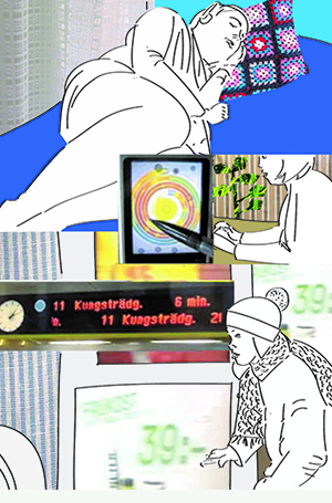
Figure 4. Affective Health.
Evocative Balance
Affective interaction has the experiential quality of evocative balance if the user finds the data to be familiar, recollecting lived experience, and at the same time suggestive and open for fruitful interpretation. Drawing on the dual meaning of the word “to evoke”, evocative balance is experienced when the design evokes the past and evokes the new in a dynamic interplay.
This is a deceptively simple statement in more ways than one. First, it is the provisional outcome of a long process of design experimentation, empirical data collection and systematic reflection. Moreover, it might be analytically accurate, but it lacks body and substance. In order to elaborate both of these aspects, this section focuses on actual examples of affective interaction involving our three experiments. The examples cover successful cases of evocative balance experiences as well as less successful ones to convey a sense of how the concept has emerged through our research process and to provide actionable design knowledge.
Openness in Expression and Interpretation
In eMoto, users express emotions through a combination of colours, shapes and animations portrayed in the background of a text message. In providing these expressive tools, we drew on a combination of inspirational sources such as colour theory (Goethe, 1976; Albers, 1975; Itten, 1970, 1974) and colour psychology (Sivik, 1974; Ryberg, 1991) where inspiration was taken from the energy level in colours and colours’ emotional influence on people. We also worked with energy levels in body language of emotions (Laban & Lawrence, 1974), product semantics (Monö, 1997), depth and layering techniques (Thomas & Johnston, 1981, pp. 306-312) and animation. In Affective Diary, characteristics of body posture were introduced. In the third design case, Affective Health, our main vehicles were colours and shapes. These sources all draw on familiarity to a great extent; we had to work deliberately with openness to provide room for interpretation. One of our eMoto users expressed her experience of adding emotional expressions to a text message like this:
I leave out things I think are implicit due to the colour… the advantage is that you don’t have to write as much, it is like a body language. Like when you meet someone you don’t say ’I’m sulky’ or something like that, because that shows, I don’t need to say that. And it’s the same here, but here it’s colour (see Figure 5).
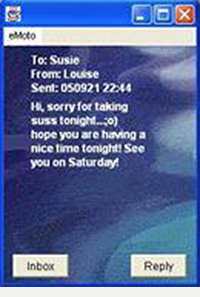
Figure 5. An eMoto message: Some of the intended content was expressed only through the choice of a particular background colour and animation (this and the subsequent screen shots are taken from our in-the-wild experiments with different iterations of our designs).
This indicates that the user experiences familiarity, but the representation is still open for her to add her own text to define the meaning more closely. In other words, the combination of text message and animated background to some extent forms a new expressive medium where the balance between familiarity and openness needs to be understood anew.
In general, we found that particular parts of the colour and animation space provided in eMoto were used relatively consistently to denote particular aspects of the emotional spectrum even though the range of possible interpretation was wide enough to accommodate different communicative intentions. In the middle screenshot in Figure 6, a user expresses the situation she is experiencing at a party. In the rightmost screenshot in Figure 6, a very similar expression is used for a conversation where two friends are planning to meet up at a restaurant in a couple of days.
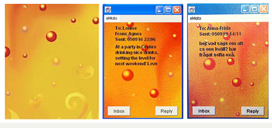
Figure 6. eMoto use: A specific part of the eMoto colour + animation space being used for two quite different communicative intentions.
However, we also learned something important about depictive representation. In an earlier iteration of eMoto, one part of the colour and animation space turned out to be seen by the users as a rose (see Figure 7). This led to unanimous use of that particular “pictogram” to denote love and passion, effectively closing off all other possibilities for more open and varied interpretations. The part in question was repeatedly revised in consecutive design iterations, gravitating towards a less depictive expression and thereby towards the evocative balance we sought.

Figure 7. Before and after redesign.
Moving on, the general framing of Affective Diary is one of introspective articulation and reflection (on biosensor data) rather than one of designing communication. This is clearly a different setting in terms of expressive openness and it may be one of the reasons why we found the final design of Affective Diary to be generally quite well balanced in use. The stylized body postures evoke memories of moving around, sitting or lying down; the character colours indicate emotional arousal, but the overall design is still suggestive enough in its character to be open for different kinds of experiences to be read into it (see Figure 8).
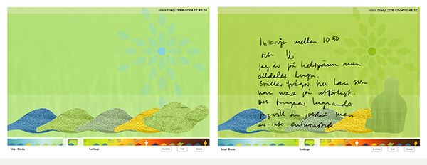
Figure 8. Screenshots from Affective Diary: similar representation, different interpretation.
(Fig. 8, left) ”Here it’s night time. I am a sleep. Then something happens here (referring to the character to the far left). Yes, here I wake up and then I get out of bed.”
(Fig. 8, right) ”I’m at a job interview, I start asking him things so he just keeps on talking which totally calms me down (referring to the blue and green colours intended to portray low arousal), when he reacts like that.”
The two screenshots in figure 8 are from the same user. They look very similar, but they arose from two completely different situations evoking different interpretations. This is a good example of evocative balance. The expressions are evoking recollection of actual situations, but they are balanced by a degree of suggestive openness so that the user can interpret and reason about them differently. Another example from the same design case illustrates a similar experience of evocative balance, but this time involving two different participants. Again, based on two fairly similar screenshots (see Figure 9), the two users reported quite different experiences.
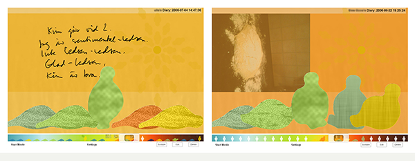
Figure 9. Affective diary: visual similarity does not preclude interpretive openness.
(Fig. 9, left) “And then I get like this, I’m like both happy and sad in a way (referring to the shift in colours of the characters), something like that. I like him and then it is sad because we don’t see each other that often.”
(Fig. 9, right) ”Here I was at home baking for midsummer’s eve, so I was very green. It’s like: “I love to bake, I love to cook and...” so it was really like green, yellow (referring to the colours and their change). Very positive.”
The design process leading up to this state reveals a significant insight, somewhat similar to the one reported above from eMoto. Previous versions (see Figure 10) of the characters were too detailed in terms of resembling specific human behaviours or appearances. For example, the character sitting down (second from left) was interpreted as being quite still in its movement, but interestedly listening to or looking at something. The yellow character in the picture was interpreted as being a male. When participants used our design, they could not relate back to the situations they had been in. One female participant was attending a boring phone conference. When she encountered our representation with the person listening interestedly and even a character with a male look, the overly depictive representation meant that the sense of familiarity that forms one side of evocative balance was largely missing. This led to a redesign from our side, where a set of less human-like and depictive characters was found to be more conducive to recollection and familiarity (see Figure 10).

Figure 10. Affective Diary characters: top row—initial version, second row—final design.
Examples like these indicated the complex and delicate nature of the balance we were aiming for and seemed to suggest that it was indeed attainable. However, the use of Affective Diary also included a number of borderline cases that seemed to indicate a larger issue (see Figure 11):
It is kind of, what does this mean? After a while when you think about it, it doesn’t say anything. I have landed and I am a bit tired, like jet lag and then you go to bed, or?
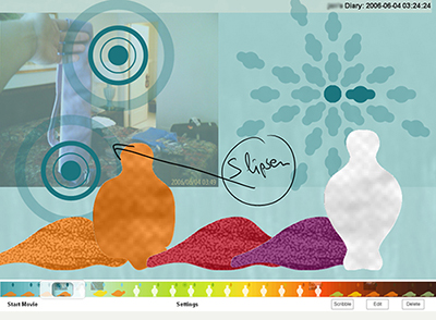
Figure 11. Affective Diary: an experientially opaque, non-evocative snapshot.
What became gradually evident in the use of the representations was that we had provided users with distinct states, which were only suggestive for interpretation within that specific character representation. This meant that the representations were too closed, particularly when it came to body postures. Moreover, the aim of Affective Diary was to mirror bodily emotional experiences, where key characteristics are gradual change and blending properties. It seems clear that the evocative balance of the interaction suffers from rendering a process-like view of emotions in terms of discrete character states. This issue was addressed rather comprehensively in the third design case: Affective Health.
From Discrete to Continuous Representation
In Affective Health, when users experienced evocative balance, they would talk about themselves as ‘being a colour’. They talked about ‘going down’ or ‘going up’ according to the colour scale:
OK, blue then I am calm. And then green and then I kind of move up in the colour-scale (referring to a place in the interface where the colours change from blue via green, yellow, orange and finally dark red). (Figure 12)
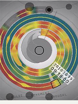
Figure 12. Affective Health: becoming a colour.
We also note signs of evocative balance in how they easily connected the width of the foreground shape to their movements and the colour to the pulse:
Then I am sitting still on the train, and then the pulse goes down (referring to the colour of the pulse going from red to yellow). And then there is a hill, as I live fairly high up, so I have to climb this hefty hill, and then there is plenty of pulse here, and It keeps that way as I am now at home (referring to the part where the shape of the movement grows and the pulse changes from yellow to red for a longer time). And now I need to fix food, and now I need to do this and that, the table needs to be set, and there has to… and here all of a sudden it starts to change colours, that is the pulse is higher which is really, really exciting compared to my, kind of, arousal-colour (referring to the colour of the pulse changing from yellow to orange and the colour of the arousal is green). (Figure 13)
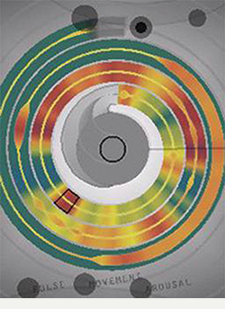
Figure 13. Affective Health familiarity and recollection.
A related example concerns longer-term behaviour with summaries of patterns that arose over time, where users saw the representation more as a picture, a Gestalt:
You know, if you look over all the days I am, I think, I am in summary kind of yellow, orange and when I see that, I know that it is as usual [as it should be]. (Figure 14)
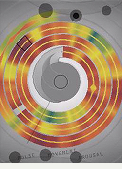
Figure 14. Affective Health: summarizing three days.
These examples show how the representation evokes familiarity, but is still balanced with openness so users can read in their own stories. This evocative balance is also experienced in following examples, where one user interpreted and constructed two completely different stories based on very similar screens. She was recently divorced and whenever her ex-husband called her she got an emotional reaction that she saw in the data as a red area:
And then I have talked to my husband again about this apartment-business. (Figure 15)
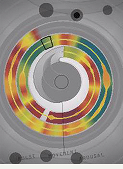
Figure 15. Affective Health: talking to ex-husband, becoming ‘red’.
But a similar screen-shot with a red area she related to a whole different experience:
It was a somewhat more stressful morning than it is usually is [..] other routines, made some calls, and that made it more rushed than usual. (Figure 16)

Figure 16. Affective Health: red signalling stress from morning chores.
This concludes the account of our detailed engagement with evocative balance in our design experiments and how it can be related to specific design traits in the realm of Interactional Empowerment. To summarize, we have found that we can design for users to be expressive, to reflect and to engage in interpretive meaning-making, in short, to be “interactionally empowered.” A common trait of these empowered interactions is the evocative balance of familiarity and openness. We now move on to a discussion of other related work within affective interaction with a view towards building a richer picture of the concept of evocative balance.
Related Work
One design example that we consider to be instructive in terms of evocative balance is the Breakaway sculpture (Jafarinaimi, Forlizzi, Hurst, & Zimmerman, 2005). It is intended to encourage people whose job requires them to sit for long time periods to stand up and move every now and then. The system builds on sensors in the office chair, activated when the user sits on it, sending signals to the Breakaway sculpture that reacts by changing its posture over time, going from a relaxed state to a more and more contorted and strained position (Figure 17). When the user stands up and moves about, the sculpture slowly returns to its relaxed position. The design of the bodily expressions was inspired by performing arts, such as dance, mimicry and theatre. Breakaway uses what is familiar with body posture and its movements, but balances this with openness without becoming a direct mirror of the user in the sense of being overly literal or depictive. This leaves room for users to reflect on their sitting habits and the way they organize their work.
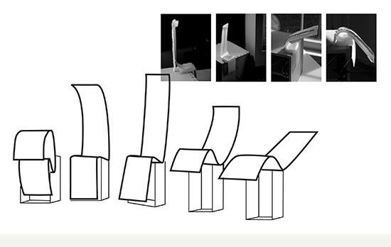
Figure 17. Breakaway: different postures of the sculpture, from strained to relaxed.
Moving on, we consider Mirò (Boehner et al., 2005) and Affector (Sengers et al., 2005) as examples where the interaction experience is overly open and suggestive, thus creating a slightly imbalanced overall effect in terms of evocative balance. The aim of these two pieces is to show how emotions are socially constructed and how technology can augment that process. Mirò aims to visualize the emotional climate in an office. The system consists of a set of input stations, a program running on all computers placed around the office where the office workers are expected to enter aspects of their ongoing experiences. Output is displayed on a big screen portraying animations and colours of objects using a Mirò-style design (Figure 18). The idea was that the users would learn how the Mirò-expressions changed over time by having the program around, gradually building an understanding of the relationship between their activities at the input stations and the output in the animated painting displayed on the big screen. As it turned out, although people in the office could sometimes guess what was going on, more often the expressions were too open to interpretation. This was shown in how the office workers made up explanations that were more or less unrelated to what the input had been. In our view, this system would have benefited from a clearer sense of evocative balance, specifically by designing output representations that would to some degree evoke familiar bodily experiences of working in an office.
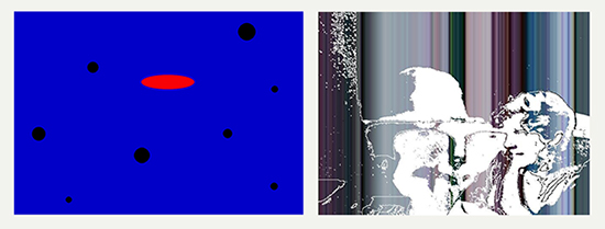
Figure 18. Miró (left), Affector (right).
Affector (Sengers et al., 2005; Boehner et al., 2007) is a two-way video window consisting of cameras and wall screens in two friends’ offices. The two offices are also instrumented with sensors picking up expressions of emotions. The analysis of the sensor data is made by a set of rules that the two users can configure and develop over time, translating the signals into distortions of the video feeds (Figure 18).
The Affector system is always on. Here, the meaning of the distorted video-feed is left to the users and it has to be negotiated and learnt/interpreted over time. Boehner and colleagues comment that what they ended up with was not so much a way to recognize the other’s mood, but rather a way of creatively experimenting with how to express yourself. The distorted video display could sometimes convey what the other person was up to in terms of activity level, but for the most part it became a system for companionable awareness of the other, rather than a mood awareness system. In the second version of Affector, Sengers and colleagues focused on how to make distortions mainly related to bodily movement.
In our view, the design of Affector could have been usefully informed by the concept of evocative balance. The first version was imbalanced in the sense of being too open, not evoking any bodily familiarity. Inventing a whole new expressive language without grounding in familiar bodily emotional expression turned out to yield mostly random results, perceived as rather meaningless and implying extraneous work. The second version drew on bodily movement to build the expression, but in our opinion it went too far towards the literal and depictive, thus closing off interpretation and meaning-making. Finding the middle ground between the two versions could have been a way to attain a balanced interaction experience.
Emotional communication at a distance is another area that addresses the problems of representing bodily emotional experiences and thus lends itself to analysis from the point of view of evocative balance. Kiss Communicator (Buchenau & Fulton, 2000) is one seminal example, where the design is completely open to interpretation. The design makes use of an animated light sequence that is composed and then sent to the other person. This light sequence can be formed as users please and is not grounded in familiar bodily experiences. The result becomes an expression that is not evocatively balanced. It only draws on openness and might thereby become too abstract for the other person to read meaning into. In that sense, the design leaves the users constructing their own language from scratch.
Equally, there are examples in emotional communication where the evocative balance has tipped too strongly towards evoking familiarity. In those cases, the designs tend to include iconic pictures or animations of emotions that are very precise in their representational form. We get one picture for happiness, another for anger and so on; each one very clear in their description, but at the same time closing off the possibility to express anything except those ready-made ideas of what emotions we can experience or that we may want to communicate. The range of communication acts is closed off rather than enriched (Boehner et al., 2007). Avatars, smilies and emoticons are well-known examples that would fall into this category. Smilies and emoticons tend to be labeled and distinct, with a certain look and feel and a quite depictive expression. When using smilies, it can be hard to find the right expression for your message, because they are only open for interpretation within certain limits, even though it is well-known that communicative subcultures can charge emoticons with surprisingly precise and highly localized connotations. This is closely related to how we found Affective Diary, with distinct character representations, to be problematic in the sense of drawing on discrete states. In general, we note that a problem with iconic representations is that they are too categorical and poorly suited to ad-hoc blending and nuancing of emotional expression and interpretation (see Figure 19).

Figure 19. Smilies (left), ExMS avatars (right).
Similarly, avatars can be designed with very much personality in looks and expression forms as in the system ExMS (Persson, 2003). Here the users choose one of the pre-made characters, that they can identify with, to represent them in their messages to others. Emotions are expressed by a set of animated expressions that will make their character move in certain ways. The avatars in ExMS and the specific animations used to portray emotions, had so much personality in themselves that it sometimes was hard for users to see their own personality and expression in them. For example, if your avatar starts crying every time you aim for it to express anger, you might feel misrepresented. The design of the avatars and their emotion animations did not foster interaction experiences of evocative balance as they were perceived as quite literal and thus closed for expression and interpretation (see Figure 19).
Discussion
So far, we have presented what hopefully amounts to a relatively rich picture of the experiential quality we call evocative balance where users in affective interaction find indications evoking actual lived experience, but are still free to interpret them in new ways to engage in ongoing meaning-making. In this section, we provide a critical discussion of this result as a knowledge contribution in the context of academic interaction design.
Experiential qualities in general represent abstractions or intermediate-level knowledge and as such they inhabit an epistemological realm similar to other kinds of interpretative qualitative knowledge forms. For instance, the concept of grounding is generally crucial when it comes to the results of qualitative research. A typical taxonomy in interpretive research would be to speak of empirical, analytical and theoretical grounding; our account above provides some concrete illustrations of what this means. The concept of evocative balance is empirically grounded through our reports of user interaction experiences with the eMoto, Affective Diary and Affective Health systems we have created and our analysis of these reports. It is analytically grounded mainly through the way we are using it as a lens for discussing other examples of affective interaction experiences, where we hope to have shown how evocative balance is an apt way to articulate certain desirable traits of interaction, as well as to explain some of the discomforts apparent in less successful interaction experiences. Finally, it is theoretically grounded to some degree by referring to the general theories informing our design work and conceptual development. Further, theoretical grounding requires relating evocative balance to other concepts addressing similar interaction experiences or design aspirations. From our viewpoint of writing within the academic disciplines of interaction design and human-computer interaction, the most salient concept to address here is the one of ambiguity.
Gaver, Beaver and Benford (2003) were prescient in seeing ambiguity as an opportunity at a time when transparency was a given and ambiguity would generally be seen as a problem in design and use. They describe how ambiguity can be a resource:
Ambiguity can be frustrating, to be sure. But it can also be intriguing, mysterious and delightful. By impelling people to interpret situations for themselves, it encourages them to start grappling conceptually with systems and their contexts, and thus to establish deeper and more personal relations with the meaning offered by those systems. (p. 233)
Their interest lies in how ambiguity can be used to positively affect the design of digital systems, instead of just being viewed as a negative side effect. The aim is to make the designs evocative rather than didactic and mysterious rather than explicit. It is also stated that ambiguous situations require people to participate in meaning-making. A number of tactics on how to use ambiguity for making sense of information and its context are presented, where the one most closely related to our notion of evocative balance is to use imprecise representations to emphasize uncertainty.
Moreover, Gaver and colleagues state that ambiguity is not a virtue in itself and that many ambiguous systems become frustrating and meaningless, but on the other hand they argue that used in the right way ambiguity can, for example, use inaccurate sensors to provide a frame of reference for people to contribute their own interpretations. What they are touching upon here is actually the dynamic nature of evocative balance, in the sense of distinguishing meaningless interaction experiences from ones that open a space for interpretation, but they never develop this theme into a discussion of how to deliberately design for such balance.
Sengers and Gaver (2006) pick up on the theme of staying open to interpretation by operating with multiple meanings. In their analysis, HCI has been dominated by a concern for clear interpretation and designs that convey information unambiguously to users. Sengers and Gaver point out that the landscape of HCI is changing, in terms of addressing new use contexts as well as picking up influences from art where openness to multiple interpretations is generally seen as a positive trait. From this, it would follow that multiple meanings may increasingly become a resource and an aim in interaction design.
In relation to evaluation, the dominant tendency in HCI has been to seek confirmation in the sense that the expression intended by the designer is the one perceived by users. Sengers and Gaver point out that a system may very well be working even though the user’s interpretation is different from what the designer intended. Within conventional HCI standards, such deviations would indicate design flaws, however:
[s]ystems that are open to interpretation don’t need to be tailored to every possible niche audience; instead, the same system may support many ways of experiencing and acting in the world. (Sengers & Gaver, 2006, p. 101)
Our work in Interactional Empowerment and the concept of evocative balance in many ways builds directly on the critical stance articulated by Sengers and Gaver. They touch upon the significance of balancing openness to interpretation with familiarity (which they treat in terms of “usability”). However, our detailed design accounts extend upon their work by providing actionable design knowledge specifically within affective interaction. Further, we find that the explicit articulation of evocative balance usefully extends the concept space by proposing a notion that encapsulates the dynamic tension explicitly. In addition, our definition of evocative balance is not finding the balancing point between ‘openness to interpretation’ and ‘usability’. Instead, we have tried to capture those experiences that resonate with our lived, everyday, social and bodily experiences. Those experiences that we can recognise in ourselves and, through empathy, in others (Gallagher & Zahavi, 2008; Fuchs & De Jaegher, 2009).
One final aspect of a critical discussion concerns the scope of the proposed knowledge contribution: In what other situations can we reasonably expect this piece of knowledge to be applicable? Or, to be more concrete, in what other interaction situations can we expect evocative balance to be a salient feature or a key concern?
The empirically grounded parts of our analysis are confined to the Interactional Empowerment program. However, we suggest through reflective analysis how evocative balance brings clarity to certain issues of design discomfort in other examples of affective interaction, including ones that are not explicitly related to Interactional Empowerment. Thus, we propose that the scope of the experiential quality we call evocative balance extends also into other regions of affective interaction as well as those relating to experiences in general, but the exact extent of that elaboration would be a topic for further research.
Conclusion
To conclude, we propose the experiential quality of evocative balance to be a key aspect in designing for interactional empowerment in affective interaction. Evocative balance draws on the dual meaning of the word “evoke” in characterizing the user’s sense that data and actions evoke familiar recollections of lived experience, yet are open enough to evoke multiple interpretations in an ongoing process of co-constructive making of meaning. To tie back to the initial vignette, recall how Camilla recognized bio-data in Affective Health as reminiscent of recent bodily-emotional experiences of talking about her recently ended relationship, while at the same time engaging in new interpretations pointing towards a resolve of starting to let go and move on.
The concept of evocative balance is constructed through reflective analysis and empirical studies of our own design work, as well as the work of others. Further, we demonstrate how evocative balance can serve as an analytical lens for untangling the perceived shortcomings of less successful designs in the same genre and for suggesting possible directions of improvement. Finally, we relate evocative balance to the existing concept of ambiguity.
Thus, what emerges is an attempt to articulate and communicate a partly analytical, partly generative concept in the form of a novel experiential quality that is grounded empirically, analytically and theoretically, and tied to a specific program within a design genre with potential extension within that genre. In essence, we argue that our work illustrates an amenable approach to academic knowledge production in interaction design research involving research through design.
Acknowledgements
The research presented in this article is a compilation of work done over many years, with many different collaborators and funders. The most important contributors were Petra Sundström, who worked on several of the projects with us, Madeleine Lindström, Marco Combetto, Alex Taylor and Roberto Bresin, who worked on the Affective Diary project, and Elsa Kosmack Vaara, Pedro Sanches, Pedro Ferreira, Johanna Mercurio, Marie Sjölinder, and Claus Weymann who worked on the Affective Health system. Funding came from Mobile Life VINN excellence centre, Strategic Research Foundation (SSF) and EIT ICTlabs. Special thanks go to the anonymous participants in our various user studies.
References
- Albers, J. (1975). Interaction of colour. New Haven, CT: Yale University Press.
- Binder, T., & Redström, J. (2006). Exemplary design research. In K. Friedman, T. Love, E. Corte-Real, & C. Rust (Eds.), Proceedings of Design Research Society International Conference—Wonderground (Paper No.0152). Lisbon, Portugal: Centro Editorial do IADE.
- Boehner, K., DePaula, R., Dourish, P., & Sengers P. (2005). Affect: From information to interaction. In Proceedings of the 4th Decennial Conference on Critical Computing (pp. 59-68). New York, NY: ACM.
- Boehner, K., DePaula, R., Dourish, P., & Sengers P. (2007). How emotion is made and measured. International Journal of Human-Computer Studies: Evaluating Affective Interactions, 65(4), 275-291.
- Bowers, J. (2012). The logic of annotated portfolios: Communicating the value of ‘research through design’. In Proceedings of the 9th Conference on Designing Interactive Systems (pp. 68-77). New York, NY: ACM.
- Brandt, E., Redström, J., Eriksen, M. A., & Binder, T. (2011). Xlab. Copenhagen, Denmark: Danish Design School Press.
- Buchenau, M., & Fulton, J. (2000). Experience prototyping. In D. Boyarski & W. A. Kellogg (Eds.), Proceedings of the 3rd Conference on Designing Interactive Systems (pp. 424-433). New York, NY: ACM.
- Frayling, C. (1993). Research in art and design. Royal College of Art Research Papers, 1(1), 1-5.
- Fuchs, T., & De Jaegher, H. (2009). Enactive intersubjectivity: Participatory sense-making and mutual incorporation. Phenomenology and the Cognitive Sciences, 8(4), 465-486.
- Gallagher, S., & Zahavi, D. (2008). The phenomenological mind: An introduction to philosophy of mind and cognitive science. New York, NY: Routledge.
- Gaver, W. W., Beaver, J., & Benford, S. (2003). Ambiguity as a resource for design. In Proceedings of the SIGCHI Conference on Human Factors in Computing Systems (pp. 233-240). New York, NY: ACM.
- Gaver, B., & Bowers, J. (2012). Annotated portfolios. Interactions, 19(4), 40-49.
- Goethe, J. V. von (1976/1810). Utkast till en färglära [Theory of colours]. Stockholm: Kosmos förlag.
- Hallnäs, L., Melin, L., & Redström, J. (2002). A design research program for textiles and computational technology. Nordic Textile Journal, 1(2), 56-63.
- Höök, K., & Löwgren, J. (2012). Strong concepts: Intermediate-level knowledge in interaction design research. ACM Transactions on Computer-Human Interaction, 19(3), No. 23.
- Höök, K., Ståhl, A., Sundström, P., & Laaksolaahti, J. (2008). Interactional empowerment. In Proceedings of the 26th SIGCHI Conference on Human Factors in Computing Systems (pp. 647-656). New York, NY: ACM.
- Itten, J. (1970). The elements of color. New York, NY: Van Nostrand Reinhold.
- Itten, J. (1974/1922). The art of color: The subjective experience and objective rationale of color. New York, NY: Wiley.
- Jafarinaimi, N., Forlizzi, J., Hurst, A., & Zimmerman, J. (2005). Breakaway: An ambient display designed to change human behavior. In Extended abstracts of the SIGCHI Conference on Human Factors in computing systems (pp. 1945-1948). New York, NY: ACM.
- Khut, G. (2006). Development and evaluation of participant-centred biofeedback artworks (Unpublished doctoral exegesis), Sydney, Australia: University of Western Sydney.
- Laban, R., & Lawrence, F. C. (1979). Effort: Economy of human movement (2nd ed.). London, UK: Macdonald and Evans.
- Löwgren, J. (2009). Toward an articulation of interaction esthetics. New Review of Hypermedia and Multimedia, 15(2), 129-146.
- Löwgren, J. (2013). Annotated portfolios and other forms of intermediate-level knowledge. Interactions, 20(1), 30-34.
- Monö, R. (1997). Design for product understanding: The aesthetics of design from a semiotic approach (1st ed.). Stockholm, Sweden: Liber.
- Persson, P. (2003). Exms: An animated and avatar-based messaging system for expressive peer communication. In Proceedings of the International SIGGROUP Conference on Supporting Group Work (pp. 31-39). New York, NY: ACM.
- Redström, J. (2011). Some notes on program/experiment dialectics. In Proceedings of the 4th Nordic Conference on Design Research (pp. 129-136). Helsinki, Finland: Aalto University School of Art and Design.
- Russell, J. A. (1980). A circumplex model of affect. Journal of Personality and Social Psychology, 39(6), 1161-1178.
- Ryberg, K. (1991). Levande färger [Living color]. Västerås, Sweden: Ica.
- Sengers, P., Liesendahi, R., Magar, W., Seibert, C., Muller, B., Joachims, T., Geng, W., Mårtensson, P., & Höök, K. (2002). The enigmatics of affect. In Proceedings of the 4th Conference on Designing Interactive Systems (pp. 87-98). New York, NY: ACM.
- Sengers, P., Boehner, K., Warner, S., & Jenkins, T. (2005, March). Evaluating Affector: Co-interpreting what “works”. Paper presented in CHI Workshop on Evaluating Affective Interfaces: Innovative Approaches. Retrieved December 12, 2013, from http://www.cs.cornell.edu/people/simeon/pubs/CHI2005/SENGERS+05.pdf
- Sengers, P., & Gaver, B. (2006). Staying open to interpretation: Engaging multiple meanings in design and evaluation. In Proceedings of the 6th Conference on Designing Interactive Systems (pp. 99-108). New York, NY: ACM.
- Sivik, L. (1974). Colour meaning and perceptual colour dimensions: A study of colour samples. Gothenburg, Sweden: University of Göteborg.
- Ståhl, A., & Höök, K. (2008). Reflecting on the design process of the Affective Diary. In Proceedings of the 5th Nordic Conference on Human-computer Interaction: Building Bridges (pp. 559-564). New York, NY: ACM.
- Ståhl, A., Höök, K., & Kosmack Vaara, E. (2011). Reflecting on the design process of Affective Health. In Proceedings of the 4th IASDR Conference on Design Research (paper id 106). Delft, the Netherlands: TU Delft.
- Ståhl, A., Höök, K., Svensson, M., Taylor, A. S., & Combetto, M. (2009). Experiencing the affective diary. Personal and Ubiquitous Computing, 13(5), 365-378.
- Ståhl, A., Sundström, P., & Höök, K. (2005). A foundation for emotional expressivity. In Proceedings of the Conference on Designing for User eXperience (No. 33). New York, NY: American Institute of Graphic Arts.
- Thomas, F., & Johnston, O. (1995). The illusion of life: Disney animation (1st ed.). New York, NY: Hyperion.
- Wilde, D. (2011). Swing that thing: Moving to move. In Proceedings of the 10th International Conference on Tangible and Embedded Interaction (pp. 303-304). New York, NY: ACM.
- Zimmerman, J., Forlizzi, J., & Evenson, S. (2007). Research through design as a method for interaction design research in HCI. In Proceedings of the SIGCHI Conference on Human Factors in Computing Systems (pp. 493-502). New York, NY: ACM.
- Zangouei, F., Gashti, M. A. B., Höök, K., Tijs, T., de Vries, G. J., & Westerink, J. (2010). How to stay in the emotional rollercoaster: Lessons learnt from designing EmRoll. In Proceedings of the 6th Nordic Conference on Human-computer Interaction: Extending Boundaries (pp. 571-580). New York, NY: ACM.

