Physical Interaction in a Dematerialized World
Product Development, Faculty of Design Sciences, University of Antwerp, Antwerp, Belgium
Industrial Design, Eindhoven University of Technology, Eindhoven, The Netherlands
Faculty of Applied Economics, University of Antwerp, Antwerp, Belgium
Dematerialization is an ongoing process in today’s generation of intelligent, digital products; content becomes disengaged from fixed carriers, and flows freely through networks and devices. We have witnessed how music CDs and cash money have been replaced by MP3 files and digital payments, as well as how dematerialization has entered the field of books. In this study, the process of dematerialization is explored. We define it and focus on its benefits and drawbacks, while trying to find answers to the question of how to design dematerialized products without neglecting the rich values of the physical world. Regarding this, we take a look at the approach of Tangible Interaction, and find it inspirational. Subsequently, in two design cases of an audio system and a payment terminal, we lay the foundations for our own design approach, which is situated in between the Tangible Interaction approach and the approach that is applied in today’s generation of digital products. Finally, our approach is placed within the context of the Rich Interaction paradigm.
Keywords – Dematerialization, Tangible Interaction, Rich Interaction, Industrial Design, Research Through Design.
Relevance to design practice – Dematerialization of artifacts comes with benefits and pitfalls. Industrial designers should obtain a profound understanding of dematerialization in order to guide it, and to design products that exploit the benefits and avoid the pitfalls.
Citation: Van Campenhout, L. D. E., Frens, J. W., Overbeeke, C. J., Standaert, A., & Peremans, H. (2013). Physical interaction in a dematerialized world. International Journal of Design,7(1), 1-18.
Received December 21, 2011; Accepted January 20, 2013; Published April 30, 2013.
Copyright: © 2013 Van Campenhout, Frens, Overbeeke, Standaert and Peremans. Copyright for this article is retained by the authors, with first publication rights granted to the International Journal of Design. All journal content, except where otherwise noted, is licensed under a Creative Commons Attribution-NonCommercial-NoDerivs 2.5 License. By virtue of their appearance in this open-access journal, articles are free to use, with proper attribution, in educational and other non-commercial settings.
*Corresponding Author: lukas.vancampenhout@artesis.be
Introduction
Today, we can witness a striking phenomenon. As the microprocessor has found its way into our lives, the use of computation in products is widespread. This process causes a lot of products to miniaturize, and seems to completely absorb others, which then tend to disappear. This is the case with music CD’s, money (coins and bills), and books. We name this process dematerialization, and in this article, we aim to open it up for design.
In the proceeding, first we give an accurate description of what we mean with the term dematerialization. We lay out the dual reality of the physical environment and the digital world, and dematerialization is defined as a movement between them. We explore benefits and pitfalls of dematerialization and express our attempt to guide it with a suitable design approach.
Second, we focus on a popular research field within Human Computer Interaction (HCI): Tangible Interaction. From its origin, Tangible Interaction has tried to reconcile the digital world with the physical environment. We consider some of its basic concepts and find inspiration in the way it approaches the interaction with digital information. We compare Tangible Interaction with the approach that is used in the design of today’s digital products, and reveal the need for a third approach, which is situated somewhere in between them.
Third, we follow a research through design path (Zimmerman, Forlizzi, & Evenson, 2007) to explore this third approach. We went through two design cases, which are presented in this paper, and deduce from them the cornerstones of our approach, while elaborating this approach further.
Finally, we discuss some striking aspects of the design approach. These aspects establish the link with Rich Interaction, the interaction framework of our research group at Eindhoven University of Technology and University of Antwerp.
Dematerialization
Description
Dematerialization covers a large field of ongoing evolutions: miniaturization of products, servicizing, reducing material use by recycling, and the shift from matter to information. In the context of this study, we use the term dematerialization in order to describe a specific phenomenon. Dematerialization occurs when digital content becomes disengaged from its carrier (Dourish, 2001), and flows freely through networks and devices, while the carrier disappears. We illustrate this with a few examples:
- The music album has dematerialized. Traditional album carriers, CDs and LPs, have disappeared. The music itself only exists as files that are stored on digital music players and computers.
- Money is dematerializing. Coins and paper money are disappearing and being replaced by electronic payment transactions. We move to a society where the payment artifact itself has lost its physical shape and value, and is represented virtually by a number.
- Books, magazines and newspapers are dematerializing. More and more print content is moving away from hard carriers. The pattern shows content being released from material substrates to move lightly across networks and devices. Books are accessed by means of an e-reader or a tablet computer.
- Photos have dematerialized. Digital cameras have decoupled images from their material carriers, film and print paper. These carriers are replaced by the ubiquity of displays.
Together with these information carriers, a whole range of accompanying products is disappearing as well. In the case of music products, this includes the CD-box and booklet with artwork, as well as all sorts of storage and display products, like racks, shelves, and cases. In the case of money, we will witness the vanishing of money containers like wallets, purses, safe-deposit boxes, piggy banks, and cash registers.
Two Worlds
In order to give an accurate definition of the previously described phenomenon of dematerialization, we must obtain a more profound understanding of it. Ishii and Ullmer (1997) provide us with the basic concepts for a better articulation of dematerialization. To them, “we live between two realms: our physical environment and cyberspace” (p. 234). The “physical environment” refers to the habitat in which we, humans, live (Gibson, 1979). “Cyberspace” is the intangible world of bits and bytes, which, in the context of our study, we will call the “digital world”. Both worlds are said to be “parallel but disjointed” (Ishii & Ullmer, 1997). They are “parallel” because we interact with them simultaneously. We interact with the digital world through mediation, i.e. by interaction in and with the physical environment. However, they are “disjointed”, since they have opposite characteristics.
As Gibson (1979) states, the physical environment contains “substances”, like humans, animals, objects and liquids. In the context of this study, we will mainly consider the substances that are important to us: objects and artifacts. The digital world merely contains data or information. Objects and artifacts in the physical environment differ from information in the digital world in several ways. Objects and artifacts are tangible, static, and mainly persistent, where as information is intangible, dynamic, and transient (Figure 1). We shall illustrate this with some examples, and with similar arguments from a related research topic: The ongoing discourse on computational technology as design material (Hallnäs, Melin, & Redström, 2002).
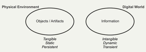
Figure 1. The physical environment versus the digital world.
Tangible versus Intangible
An artifact in the physical environment is tangible. Let’s take a simple wooden chair. It is available to our senses. It can be directly touched, sat on, lifted and manipulated. It has all the richness of the physical world: texture, temperature, mass, inertia etc. Moreover, its physical shape is meaningful. It guides our interaction with it by offering affordances (Gibson, 1979; Norman, 1988). The horizontal surface of the chair affords sitting on, while its vertical surface affords leaning against. In doing so, the chair mainly appeals to our perceptual-motor skills (Djajadiningrat, Wensveen, Frens, & Overbeeke, 2004).
Information in the digital world is intangible. In itself, digital information has no shape. This means that digital processes, i.e. displacements of electrical charges, although physical in nature (Vallgårda & Sokoler, 2010), are not suitable for human perception. They can only be perceived and manipulated indirectly through mediation, for example by displaying them on a screen, and through interaction with controls. In the current generation of digital products, information is mediated in a rather unilateral way. It mainly appeals to our cognitive skills (Djajadiningrat et al., 2004).
The idea of mediation is articulated in a striking way by Vallgårda and Sokoler (2010). They argue that computational technology is a design material, which is not perceivable through our human sensory apparatus. In order to make it available for our senses, it has to be combined with another material, which has human perceivable form. The combination of both constituents is referred to as a “computational composite”.
Static versus Dynamic
The chair is static. It will always be a chair, and will not suddenly become a bicycle. The chair is an artifact that is dedicated to one task: Having humans sit on it. In that way, a chair is directly and easily comprehensible to us. Information is dynamic. Different kinds of information can rapidly be presented in different ways. The above-mentioned display can adopt a myriad of functions. It can simply communicate data, like the hour schedule of a train, but it can also show a movie, or visually guide a computer game. Due to the dynamic nature of digital information, the display can change its identity over time. Hallnäs et al. (2002) state that an important property of computational technology is what they call “temporality”. Through the execution of programs, computational technology is characterized by the continuous creation of temporal structures. It is said to take “temporal gestalt” as a central element in its expressiveness.
Persistent versus Transient
The chair is persistent; it will not suddenly vanish. Gibson (1979) states that the environment is mainly rigid, mainly motionless, and mainly changeless. If you want the chair to vanish, you have to put it out of sight, or destroy it, for instance by burning it. We already discussed the dynamic character of digital information. Another property, which has a similar flavor, is its transience. On the previously mentioned display, digital information can vanish without leaving traces, and reappear out of the blue. Hallnäs et al. (2002) touch on this particular topic with their concept of “continuity”. Computers and digital products have a distinct on/off nature, and thus a discontinuous appearance, while artifacts generally have a more continuous presence. They give the example of a television set which, when activated, is vivid and colorful. The moment after that, when powered off, it is silent and dark.
These contradictions clearly illustrate the opposite characteristics of the physical environment and the digital world. They also show that both worlds indeed are disjointed and not easily reconcilable. There appears to be a tension field between them.
Definition of Dematerialization
Dematerialization, as we define it, occurs when an artifact from the physical environment is incorporated in the digital world. The artifact dissolves, and its content is liberated (Dourish, 2001) and added to the digital world (Figure 2). The latter extends, at the expense of the physical environment. This means that this particular artifact will lose its characteristics of the physical environment, and adopt characteristics of the digital world.
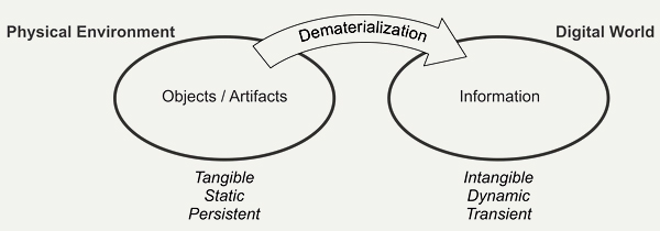
Figure 2. An artifact dematerializes when it moves from the physical environment to the digital world.
Why is dematerialization happening? By dematerializing, the artifact breaks loose from its physical limitations and becomes intangible, dynamic, and transient. Its manipulation demands less physical effort, and its content reaches limitless availability (Dourish, 2001; Verbeek, 2005), flexibility, and omnipresence. Thanks to dematerialization, we can take our whole music collection with us when we go for a run outside. More, we don’t have to carry around a certain amount of coins and bills: With a smartcard or a mobile phone, we have immediate access to our finances, anytime and anywhere. Thanks to dematerialization, we can exploit to a full extent the flexibility of the digital world.
Yet, we also see some pitfalls. The dematerialized music album has lost its tangible, dedicated, and persistent nature. The interaction with an MP3-player is limited to button pushing (be it on a touch screen or a physical control) and feedback through a display, and can be considered physically poor, compared to the rich action sequences that were used in, for example, the vinyl era. Until now, dematerialization has caused the departure of artifacts, and has increased the cognitive character of our interaction with the devices that surround us. This interaction reaches a higher level of abstraction. We, industrial designers at University of Antwerp and Eindhoven University of Technology, stress that humans are not merely cognitive, but also action-driven beings. We formulated the theory of Rich Interaction. With the Rich Interaction paradigm, we want to design digital products that offer embodied interaction by designing them with respect for all human skills: perceptual-motor, emotional, and cognitive skills (Frens, 2006, p. 56).
Dematerialization in Perspective
The notion of dematerialization is not new. Frens (2006, pp. 13-19) argues that mechanization, electrification, and digitization have lead to a decrease in physical richness and an interaction that is primarily based on cognition instead of action. A similar detection was made by Øritsland and Buur (2000), who examined the evolution of interaction with the products at Danfoss from 1933 until 2000.
John David Ebert (2011) argues that the first Graphical User Interface (GUI), as explored by Xerox PARC in the seventies, was already a form of dematerialization. He says that “images became simulacra of things”, denoting the encoding of physical objects (files, folders, the waste bin) in the form of icons.
The advent of the personal computer in the early eighties started the dematerialization of typed words (Ebert, 2011). Ever since, printed text is increasingly being replaced by text on screen. This has lead to the disappearance of books, newspapers, and magazines. Soffer and Eshet-Alkalai (2009) illustrate how the transition from static literal culture to fluid textual perception deeply influences human beings.
Jacob et al. (2008) discuss the rise of post-WIMP interfaces, which leads to a new wave of dematerialization. Electronic objects like cell phones, cameras, and agendas are absorbed by smart phones and tablets (Ebert, 2011). With them, music, book and retail stores tend to disappear (Keen, 2007).
On numerous occasions however, dematerialization has been recognized and successfully guided. The integration of digital technology in musical instrument design has led to “laptop music” (Armstrong, 2006, p.13) and the “laptop aesthetic” (Jaeger, 2003), referring to music being made and performed with a standard PC or laptop. On the contrary, Bongers (2000) illustrates that the design of some musical instruments indeed has exploited the interaction freedom that emerged from the miniaturization of internal components. Examples are the theremin by Leon Theremin and the “Hands” by Michael Waisvisz (1985).
Interactive Surfaces and Tabletop Tangible User Interfaces propose tangible objects on an augmented workbench (Ishii, 2008; Kobayashi, Hirano, Narita, & Ishii, 2003). This generation of interfaces offers a fruitful alternative for the omnipresent multi-touch interface, applied in smart phones and tablets. The tangible objects have all the richness of the physical world and thus provide a higher degree of embodiment (Fishkin, 2004). An example is seen in augmented reality board games (Ip & Cooperstock, 2011). We will discuss Tangible Interaction further in the next chapter.
In educative environments, we see tangible educative toys (Zuckerman, Arida, & Resnick, 2005) as complementary to the interactive whiteboard (Smith, Higgins, Wall, & Miller, 2005), which is merely a blown-up version of the above mentioned multi-touch interface.
Continuous Tangible User Interfaces (Ishii et al., 2004), propose another solution to the known 3D CAD systems, which tend to frustrate designers with their non-intuitive way of working (Massie, 1998). In this matter, added value is supplied by the current evolution of rapid prototyping.
Manifesto and Research Question
Although we, industrial designers, value the benefits that dematerialization brings us, we regret its drawbacks. Because of these drawbacks, we believe that dematerialization may not proliferate freely as it does now. It should be guided. A way should be provided to design products that capitalize on the benefits of dematerialization and do away with its drawbacks. We reformulate this question. How can we apply dematerialization in digital products with respect for their digital character? And how can we do it without closing the gate to the physical world?
Tangible Interaction
Definition
Tangible Interaction is an interaction paradigm that integrates the digital world and the physical environment. It strives for interaction with digital information in a non-digital, physical way by giving computational resources and data material form (Hornecker & Buur, 2006), and forms a remarkable discipline in the HCI movement. Obviously, it is related to the previously described tension field between the two worlds, and therefore, it is of interest to us. How does Tangible Interaction cope with the apparently inherent contradictions between the digital world and the physical environment? What can it teach us about the nature of these contradictions?
In this study, we mainly refer to the first formulations of Tangible Interaction, as they were proposed in the late nineties. We think that they reveal the Tangible Interaction principles in their most concentrated and pure form.
Containers versus Tokens
Holmquist, Redström, and Ljungstrand (1999) use physical objects as a means to interact with computer systems. These objects embody digital information aggregates, and make them graspable and manipulable. They are called tangibles. For example, a tangible can represent a digital image, a series of text files, or a software application. Three different classes of archetypical tangibles are distinguished: containers, tokens, and tools. They can be used separately or in combination with each other (Ullmer, Ishii, & Jacob, 2005). The first two capture our interest in this discussion. We briefly consider their definition and illustrate each tangible with an example. We summarized the characteristics of both tangibles in a scheme (Figure 3).
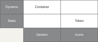
Figure 3. Characteristics of containers and tokens.
Containers
The container is a tangible to which digital information can be coupled and decoupled. Its nature is generic: It can be associated with any type of information (Holmquist et al., 1999). For example, the container can contain an image file, as well as a whole software patch. The nature of the container is inherently transient and flexible, since it is associated with a different information aggregate over and over again. Its task generally consists of moving information from one device to another. This makes it a dynamic tangible. Due to its generic nature and flexibility, the container does not physically reflect the nature of the digital information it is associated with (Holmquist et al., 1999). It does not provide any additional cue about its content.
A beautiful example (Figure 4) of a container is delivered by the MediaBlocks system (Ullmer, Ishii, & Glas, 1998). The MediaBlocks are small wooden blocks with which information can be associated. The information can then be stored and accessed through a variety of different means. When a text document is associated with a MediaBlock, it can be printed by inserting the MediaBlock in a slot attached to the printer. The MediaBlock provides physical manipulation of the document.
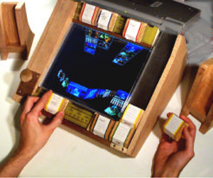
Figure 4. MediaBlocks (Ullmer, Ishii, & Glas, 1998). (Reprinted with permission)
Tokens
The token is a tangible that is permanently tied to the information it represents (Holmquist et al., 1999). Therefore a token is not transient. As opposed to the container, the digital information which is associated with a token, is reflected in the physical properties of the token. The token is static and iconic.
An example of a token (Figure 5) is found in the MetaDESK System (Ullmer & Ishii, 1997). By placing a small physical model of MIT’s Great Dome onto a digitally augmented desk, a two-dimensional map of MIT appears on the desk, bound to the Dome object at its location on the map. The tangible physically represents the building. For us, industrial designers, the token beholds a promise of great value, since it can display what it represents and, even more important, what can be done with it. It opens the gates to the physical world, with its natural, rich affordances (Gibson, 1979), and can achieve a heightened legibility and seamlessness of interaction between people and information (Ishii & Ullmer, 1997). In other words, the token introduces industrial design to Tangible Interaction.
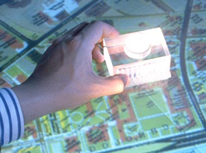
Figure 5. MetaDESK (Ullmer & Ishii, 1997). (Reprinted with permission)
Discussion
Tangible Interaction seems to strive towards more matter and physical interaction, instead of less. In that way, it makes a move in a direction that is opposite to the direction of dematerialization (Figure 6).
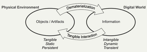
Figure 6. Tangible Interaction as an opposite process of dematerialization.
The container, with its flexible and generic nature, leans more towards information in the digital world. The token, being dedicated and physically iconic, represents the substances of the physical environment. The fact that a theoretical distinction is made between containers and tokens is significant. It reflects the previously discussed opposition between the digital world and the physical environment.
Industrial Design
Two Design Approaches
Tangible Interaction, unlike the traditional HCI approach, inspires us to adopt a different way to design digital products in general, and to guide dematerialization in particular. We give a short description of both design approaches:
Design Approach by the Rules of the Digital World
This is the design approach which is adopted by today’s generation of digital products, and which emerges directly from traditional HCI. It fully accepts the nature of the digital world and is driven by availability and flexibility. As yet, it has reached a climax in the dematerialization of artifacts. With today’s MP3 player, an album collection of a music lover consists of several thousands of albums, compared to a few hundred two decades ago. The owner can carry his whole album collection in his pocket.
The drawback of this approach is that the interaction with these products is standardized (Klemmer, Hartman, & Takayama, 2006), computeresque, and mainly cognitive. In fact, today’s generation of digital products all share the same interface; Microwave ovens, digital cameras, stereo installations, washing machines, smartphones, and MP3-players are operated through a keypad and/or a display (Djajadiningrat et al., 2004; Djajadiningrat, Matthews, & Stienstra, 2007).
Design Approach by the Rules of the Physical Environment
This is the approach that Tangible Interaction proposes. We will demonstrate it with an example. In Token-Based Access to Digital Information, Holmquist et al. (1999) elaborate the above-mentioned concept of the token as a physical embodiment of digital information. They state that the token-based system will rapidly break through into the mainstream. As an illustration for a possible application, a music device with token-based access is described. The first author of this article interpreted and visualized this music device (Figure 7). The actual music information is not stored on a music carrier, a CD or a DVD, but is associated with a token by means of a reference tag. The left picture on Figure 7 shows a token, embodying a music album. The token has the size of a large coin. It is placed on a music player, which recognizes its tag, and plays the associated music album, stored on an internal hard disk. The interaction with the music system happens through a multi-touch display (Figure 7, right). Please note that this system was proposed in 1999, before Apple’s iTunes and the rise of the MP3 player. We visualized it when we wrote this article.

Figure 7. Left: The token is placed on the music player. Right: The music player in action.
This token-based music device separates the music album from its carrier and brings up several advantages with respect to the LP or CD, such as extended durability (less risk of scratching) and protection of the music through encryption of unique IDs. The size and shape of the tokens offers design freedom, since they become a lot smaller and more manageable than CD’s. Moreover, they can physically express their content. In our interpretation of the music system, the shape of a token represents what the token embodies (Figure 8).
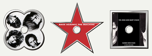
Figure 8. Music albums, embodied by tokens.
Holmquist’s music device physically embodies digital information into graspable artifacts. It offers digitized music albums that are highly manipulable and tangible in the physical environment and appeal to our perceptual-motor skills. To us, it is a valuable application of Tangible Interaction, and a visionary view on the development of digital music. Nevertheless, it never happened. Music albums were not only separated from their carriers. Along with this separation, the carriers disappeared. Today, music albums are not embodied by any artifact whatsoever. Apparently, dematerialized music albums appeal to us in a way that Holmquist did not foresee.
With the knowledge that we have today, we can say that Holmquist overlooked the values of the digital world: its flexibility and availability. With Holmquist’s system, I can carry 10 music albums in my pocket, compared to 10,000 with an MP3 player. This music device and the current MP3 player demonstrate the inherent contradiction that goes along with the embodiment of digital information. The more a digital system or device wants to exploit its inherent flexible (digital) nature, the further away it moves from full tangibility and the physical environment.
The Third Approach
We advocate a third design approach. We want to design products that unify the benefits of both worlds: the flexibility of the digital world and the richness of the physical environment. With this approach, we will be able to properly guide the process of dematerialization. In Tangible Interaction terms, this means that we are looking for a separate category of tangibles that offers the flexibility of the container, combined with the physical expressiveness of the token. The first author explored possible approaches by means of the “research through design” method (Zimmerman et al., 2007), where he designed an audio installation and a payment terminal.
Audio Installation
Description of the Design Project
Inspired by Holmquist’s idea of a token-based music system, we decided to design a home audio device ourselves. Our starting point, however, was different. We started from the premise that all music albums had dematerialized. Our device does not operate with carriers or music album-referencing tokens, but directly processes MP3 files, or in general, digitized music files. Its function is limited to enjoying music in the form of sound files, which are stored on an internal hard disk. The hard disk can be attached to a computer, in order to alternate its content. Each information unit contains the information that stands on one traditional music album. Our music device is the equivalent of the former CD-player and a rack of CD’s, and contains no tuner.
Figure 9 shows what it looks like. The device consists of the player itself, and two speakers. The player can be hung on the wall, or placed upon a cupboard in a nearly horizontal position. In the latter case, it is slightly angled, referring to a turntable (Figure 9). The player is subdivided into three square boxes.
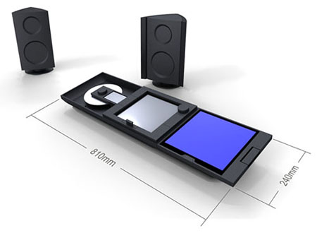
Figure 9. Visual of our audio system: the player and its two speakers.
In the following steps, we go through the process of enjoying music through this device.
Activating the Player and Browsing through the Music Albums
The player is activated by pulling out the drawer in the middle box (Figure 10). The display of the middle box is activated, and a selection list rolls upwards out of the drawer (Figure 11, left). This list contains all albums of the user’s collection, ordered alphabetically. The user scrolls through the list by turning the wheel (Figure 11, right). The list moves up and down, and each time, the middle album is highlighted.

Figure 10. Activating the player.

Figure 11. Left: The middle box is activated. Right: Scrolling through the album list.
The display is an electronic paper display, it is not backlit and monochrome. It follows the overall sober form language of the device, and expresses the nature of the search task, which is mainly cerebral.
Looking at the Album’s Artwork and Lyrics
When the user has found the album of his or her choice, the rectangular button is pushed at the right of the middle box (Figure12), which is a part of the border surrounding it. By pushing this button, the border is broken, and the box seems “open”. The button slides in and aligns with the glass plates of the middle and right boxes. One surface is created and forms a path through which information can flow (Figure 12). The highlighted album thus flows under the user’s fingers to the right box. Its display is activated, and a large, colorful image of the album is generated (Figure 13, left). This display is a full color LCD with backlight. Its sudden activation causes an explosion of color and shape, which contrasts heavily with the display in the middle box and the overall styling of the device. We intend this to be experienced as a “reward” for the album quest.
The user can walk through the album’s artwork by pulling or pushing the toggle switch on the right of the right box (Figure 13, right). Pulling the switch causes the next page to pop up, pushing it lets the user navigate to the previous page. When the user decides to have a look at another album, the user just lets a new album flow in the right container, where it will take the place of the former one. When the user wants to deactivate the right box, the slider at its bottom can be pulled (Figure 14). The slider moves down and, because of its wedged shape, opens the border which surrounds the right box. The information “flows” through this opening out of the device, and the display is deactivated (Figure 14, right). This way, the user can take a look at an entire album collection, or have a discussion about it with a friend.

Figure 12. Pushing the rectangular button at the right of the middle box.

Figure 13. Left: The right box is activated. Right: Walking through the album’s artwork.

Figure 14. Deactivating the right box.
Listening to Music
Next, the user wants to listen to the album just looked at, and pushes the rectangular button at the left of the middle box (Figure 15). An effect analogous to the previously described one takes place. The music album flows under the user’s fingers to the left box, the display of which is activated and shows the track list of the chosen album (Figure 16, left). The aluminum disk starts to turn, and the music is heard through the speakers. By turning the wheel next to the display, the user can go to the track of his or her choice (Figure 16, right). When the user wants to pause the music, he or she simply stops the aluminum disk from turning manually. To proceed playing music, the user spins the disk (Figure 17). An actuator picks up the movement, and the disk starts turning again as the music starts playing. When the user wants to deactivate the left box and stop the playing of the music, the slider at its bottom can be pulled as described previously (Figure 18, left). The display is deactivated, the disk stops turning, and the music “leaves” the box through the created opening (Figure 18, right).

Figure 15. Pushing the rectangular button at the left of the middle box.

Figure 16. Left: The left box is activated. Right: Selecting a music track.
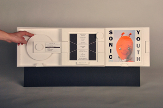
Figure 17. Stopping and spinning the disk for pausing and resuming the music.

Figure 18. Deactivating the left box.
When the user is enjoying the music, the right box can be detached from the device (Figure 19). Since this box is wirelessly connected with the rest of the device, the user can have a seat and enjoy the artwork and the lyrics while listening.
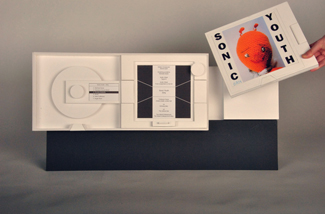
Figure 19. Detaching the right box.
Sound Controls
To turn up the volume, the user goes to the device where the sound is produced, the speaker. One of the speakers is provided with controls (Figure 20). The user takes one of the wings of the speaker and moves it outwards (Figure 21, left). The other wing moves symmetrically, since both wings are mechanically connected. Opening the wings turns up the sound volume. The wider the angle, the “larger” the speaker becomes, and the louder the sound (Figure 21, right). When the wings open, new control elements are revealed: control of bass tones and treble tones. Both controls are naturally mapped to the speaker that they control (bass speaker versus high frequency speaker). Sliding up a control brings the sound of that speaker in the foreground, sliding it down pushes it to the background (Figure 22). When the wings are closed, no sound is heard, and the controls are hidden (Figure 20).

Figure 20. Speaker with volume turned down.

Figure 21. Left: Turning up the volume. Right: The volume is at maximum.

Figure 22. Left: Adjusting the high tones. Right: Adjusting the bass tones.
Description of our Design Approach
When we were designing the audio system, we discovered four main product functionalities:
- Navigating through the album collection, and picking the album of choice
- Looking at the album’s artwork and reading information about it
- Listening to music
- Adjusting the sound
We gave each product functionality its own physical territory. The four functionalities are embodied by four product modules: the three square boxes in the player, and a speaker, as shown in Figure 23. Included are:
- A module to navigate and select music albums: the player’s middle box
- A module to look at the album’s artwork: the player’s right box
- A module to listen to the album’s music: the player’s left box
- A module to adjust the sound: the speaker
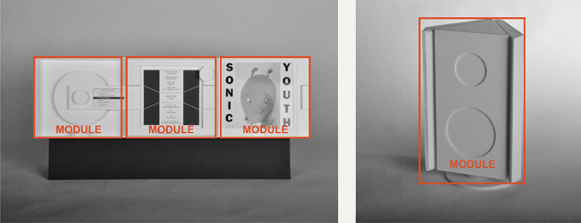
Figure 23. The module-based architecture of our audio system.
Each product functionality contains different controllable functions. For example, “music listening” contains play, pause, and stop functions, a track-navigation function, an activation function and a de-activation function. Within each module reside all controllable functions of the module-specific functionality. Although we came to it from our specific starting point of dematerialization, the clustering of functions as a design principle is not new. It is coined by Norman (1988), and called “modularisation”. Further, we designed the functions of each module not merely as standard controls, but we externalized them in a plastic, expressive way, taking into account the principles of Rich Interaction (Frens, 2006, pp. 56-58). This set of modules forms the first foundation of our approach. It represents the physical environment, with its rich characteristics. The four modules are:
- Tangible. The module’s functions are embodied in a rich way.
- Static. Each module is dedicated to its own functionality.
- Persistent. The modules are always physically present, even when they are not activated.
The second foundation of our approach represents the digital world. It is ensured by the digital information that flows through this preset structure of modules. This digital information (the dematerialized music album) flows from one module to another. Once in a module, the information materializes into an appropriate build. It transforms into a form that suits the functions that are module-specific. Within a module, the information becomes tangible and approachable, and thus a nearly physical component itself. This component has got degrees of freedom. It is able to move, within the predefined limits of the module-based field. We gave the dematerialized information back some of its former action-potential (Djajadiningrat et al., 2004). In the module on the right side of the player, the information is literally materialized on a temporary carrier, which makes it graspable. This module can be taken of the device, and becomes a portable, stand-alone object (Figure 19). It “becomes” the album’s cover and booklet. The information is:
- Intangible. The information in itself is intangible. It becomes only temporarily tangible, in a module.
- Dynamic. The information aggregates that flow through our system differ in content, but share the same nature. They are the different music albums.
- Transient. The information enters and leaves each module, without leaving a trace.
The combination of these two foundations in one product offers the opportunity to approach dematerialization in a more balanced way. In our audio system, the music album has become tangible, but keeps its digital flexibility. Our framework takes into consideration values of both the physical environment and the digital world. However, it does not exactly indicate where, between these two worlds, the product should be positioned, for this depends on the particular product context. We count on the skills of the designer to define this position.
A New Category of Tangibles
When we relate our design approach to the field of Tangible Interaction, we can say that we developed a category of tangibles, which are based on clustered product functionality, and which combine characteristics of several tangible archetypes. We call these tangibles “clusters”. In our audio-system, each module is defined as a cluster. The cluster physically reflects product functionalities, and in that way, inherits the expressiveness of the token. By having the information flow dynamically through the structure of clusters, we give the cluster a flexible character. It can contain different information aggregates, as long as they share the same nature. In our audio-system, they are the different music albums. In this way, the cluster has a characteristic of yet another tangible, the container. The cluster is an iconic tangible that can be dynamic (Figure 24).
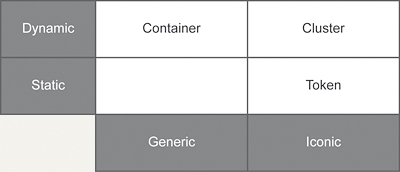
Figure 24. The cluster as a new category of tangibles.
We will now explore our design approach further through the design of a digital payment terminal.
Digital Payment Terminal
In the world of money and payment, dematerialization occurs in a striking way. Cash money disappears, and instead, payment is performed by inserting a smart card in a terminal and entering a PIN-code. These payment terminals can be seen in shops, supermarkets, train, and bus stations. Due to the evolution of NFC technology (Near Field Communication, http://www.nfc-forum.org), smartcards will, in turn, dematerialize and be integrated in our smart phones. We will then pay “contactless”, by waving our smart phone through an invisible electromagnetic field generated by an NFC antenna. Payment has shifted from a specific, meaningful action pattern between two persons exchanging cash money, to an abstract gesture of one person in front of a device that has minimal physical presence (Verbeek, 2005). In that way, our payment aspirations are not as oriented and realized up to the same degree as they are by exchanging coins and bills. On the other hand, we are liberated from bulky wallets and the need to carry enough cash in our pockets. We have access to the whole of our possessions, anytime and anywhere.
Description of the Design Project
Our goal was to design a payment terminal, which made the payment interaction more tangible. We took into account NFC-technology. The payment was to be done contactless with a smart phone. Figure 25 shows the result. The terminal stands on the shop counter, and has two opposite sides: the vendor side, and the customer side. It consists of two main components: a static component, the housing, and a dynamic component, the drawer. The drawer can move with respect to the housing, when pushed by either the vendor or the customer, and provides the terminal with two distinct physical states. When in vendor mode, the drawer offers a keypad to the vendor. In customer mode, it offers the NFC symbol to the customer. This symbol indicates the center of the electromagnetic field.
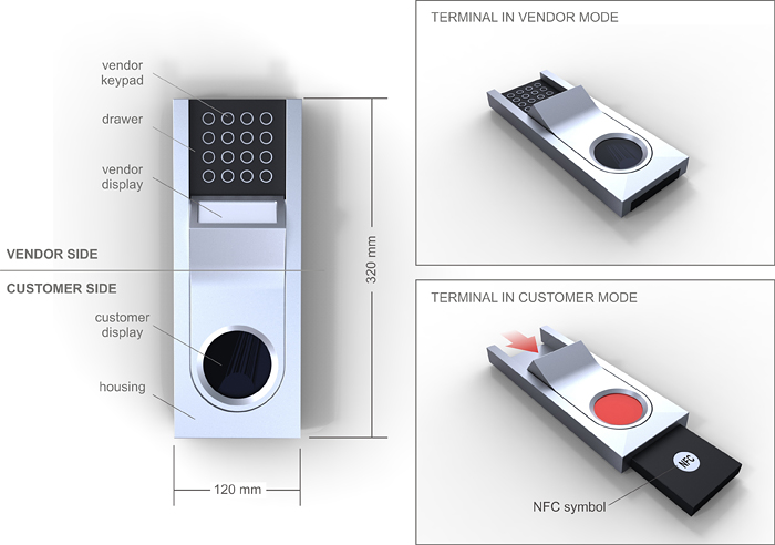
Figure 25. Our concept for a digital payment terminal.
We will now demonstrate the process of a payment transaction.
Input and Display of the Payment Amount
The vendor and the customer take their places on either side of the payment terminal. At the beginning of the transaction, the terminal is in vendor mode. The vendor manually enters the payment amount on the keypad (Figure 26, left). The amount is shown on the vendor display. Next, he or she pushes the drawer towards the customer (Figure 26, right). The customer display is activated: An image slides on it, along with the movement of the drawer (figure 26, right). It is the payment amount, which is revealed to the customer (Figure 27). The terminal is now in customer mode. The drawer sticks out at the customer side and shows the NFC symbol, which indicates the zone where the smart phone is to be positioned.

Figure 26. Left: The vendor enters the payment amount. Right: The vendor pushes the drawer towards the customer.
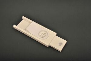
Figure 27. The payment amount is revealed to the customer.
Payment Transaction
The customer prepares his smart phone, and holds it above the NFC symbol. Alternatively, he or she can lay a smart phone on the drawer, which sticks out of the housing (Figure 28, left). Once the smart phone is detected by the NFC-field, the money transaction is executed. The smart phone’s display and the customer display of the terminal show a visual “flow”: A red liquid seems to flow from the smart phone in the terminal (Figure 28, right). When the liquid stops flowing (Figure 29, left), the transaction is completed, and the customer can take away the smart phone (Figure 29, right).

Figure 28. Left: The customer lays a smart phone on the drawer.
Right: A red liquid flows from the smart phone in the terminal.

Figure 29. Left: The liquid stops flowing. Right: The customer takes away the smart phone.
Payment Confirmation
To confirm the payment, the customer pushes back the drawer towards the vendor. Again, the image on the customer display slides along with the movement of the drawer (Figure 30). The terminal is again in vendor mode (Figure 31, left). The vendor display is filled with the red color. The customer display shows a wrap up message (Figure 31, right).
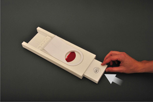
Figure 30. To confirm the payment, the customer pushes back the drawer towards the vendor.

Figure 31. Left: The drawer is pushed back. Right: The terminal, after the transaction, seen from the vendor’s viewpoint. The vendor display colors red, and the customer display shows a wrap up message.
Description of Our Design Approach
What does this project add to the approach that we developed through the design of the audio system? In the design of our payment terminal, we followed the principles that were revealed in our audio system. In the payment transaction, we distinguished two main functionalities:
- The functionality belonging to the vendor: input of the payment amount, communication of the payment amount to the customer.
- The functionality belonging to the customer: preparation and execution of the payment transaction, confirmation of this transaction.
Again, we gave both product functionalities their own physical territory. They are embodied by the two main modules of the payment terminal: the vendor module and the customer module. To enhance the realism of our design, we added the smart phone as a personal payment device. It forms a third module that embodies a part of the customer’s functionality (Figure 32). The two main modules of the terminal induce the presence of two persons during the transaction, and give them a physical position. They create an environment in which the action is to take place, and divide it in two zones. The different function controls are clustered in each module. The movement of the drawer reveals both modules one at a time. It orchestrates the actions of both the vendor and the customer and turns these actions into a choreography (Klooster & Overbeeke, 2005). This fixed set of modules again forms the structure through which the information can flow. It is the first fundamental of our approach.
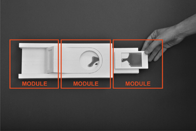
Figure 32. The module-based architecture of our payment terminal.
The second fundamental is formed by the information that flows freely from one module to another and materializes, this time almost literally, once inside a module. The money is represented on the displays by the red liquid. The movement of the drawer controls the flow of the information through the terminal and is meaningful in itself. It is a metaphor for the communication of the payment amount to the customer and the transaction of the money to the vendor and visually orients both data flows. The sliding of the image on the customer display reinforces this effect.
Our payment terminal obeys to the same conceptual framework as our audio system.
Rich Interaction
Rich Interaction found its origin in a perceptual-motor-centered view on Tangible Interaction (Djajadiningrat et al., 2004). We consider the traditional view on Tangible Interaction as data-centered, since its main objective is to embody and physicalize digital data into graspable artifacts (Fitzmaurice, Ishii, & Buxton, 1995). We do not focus on the digital data themselves, but rather on what can be done with them. How does the user interact with these data? What should be his actions in the physical environment?
In our two design projects, we did not literally embody the dematerialized digital data (music albums and cash money). We rather focused on the interaction that was needed to guide the flow of these data through the respective devices. This interaction was translated in functionalities and user actions, i.e. concrete bodily movements. This is why our approach fits into the Rich Interaction Paradigm.
In the next section, we want to deepen the connection with Rich Interaction, by focusing on three other characteristics that can be found in our audio system as well as in our payment terminal.
A Different Approach to Displays
In today’s digital products, displays are used to guide and clarify the interaction process by feed forward (“Please enter your PIN code”) and feedback (“Transaction completed”). Traditionally, displays are carriers of information.
In our two concepts, the displays form an active part of the spatial concept of the product and the flow of the information. The displays act as temporary storage places for dematerialized artifacts. Music albums and amounts of money move from one display to the other, as a consequence of the movements of the user. In our approach, displays are, next to carriers of information, carriers of matter. The current generation of displays, with their color and resolution capabilities, are perfectly suited for moving images and animations. Our design approach values these capabilities, and exploits them as functional elements within the interaction pattern. User actions and the display’s reactions are linked by timing, flow, and rhythm (Hummels, Overbeeke, & Klooster, 2007).
Transformation as An Instigator to Aesthetic Experience
Norman (2004) states that “attractive things work better” (p. 17). For example, users may engage and persist in interaction because products tempt them, raise curiosity or are intriguing (Djajadiningrat et al., 2007). Wensveen, Djajadiningrat, and Overbeeke (2004) state that “electronic products instill moments of magic and surprise that seem to surpass the laws of nature and physical causation” (p. 179). We believe that our design approach causes such moments of magic and surprise. More specifically, the moment where the dematerialized information enters the module and materializes into a tangible shape, is a captivating moment. It is a moment of transformation, a striking event in the interaction flow. This moment of transformation can be compared with an old trick that is used in children’s theater. Figure 33 shows a fragment of a particular theater performance: A witch on a broom is seen on stage (Figure 33, left). She pretends to take off on her broom and disappears behind the scenes. The stage darkens and a puppet theater lightens up where we see a little witch puppet flying in a nightly sky (Figure 33, right). The witch “has become” this puppet.
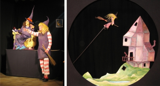
Figure 33. A scene from a children’s theater performance:
The witch becomes a puppet.
(www.theater-o.be) (Reprinted with permission).
Mode-relevant Action-possibilities
Frens (2006, pp. 87-88) coined mode-relevant action-possibilities. Mode-relevant action-possibilities are action possibilities that are only offered when they are relevant for the mode-of-use. Our audio system and our payment terminal obviously make use of them.
The wings of the speaker in our audio system control sound volume (Figure 21). When they are open and the sound is up, they reveal other controls for bass tones and treble tones (Figure 22). Likewise, the drawer of the payment terminal offers different action possibilities to its different users. The keyboard is offered to the vendor when the terminal is in vendor mode (Figure 26). When the vendor pushes the drawer towards the customer, the keyboard is hidden. Now, the terminal is in customer mode and the antenna and the NFC-field are revealed to the customer (Figure 27). The drawer forms a tray on which the customer can place a smart phone. When the customer has completed the payment transaction, the drawer is pushed back, and the NFC-field is no longer available (Figure 31).
Our design approach makes use of the mode-relevant action-possibility concept in yet another way. By considering the information as a physical component with the capacity to move, the product gets a new opportunity to react to the user’s actions. It can respond by generating a movement itself, i.e. by moving its information to another module. The result of this movement is the arrival and residence of the information in this other module. This module is activated, and not only reflects, but also guides the user’s actions. It offers new action possibilities that are relevant at that moment. In this way it is an application of the mode-relevant action-possibility principle.
Conclusion
We coined and defined dematerialization as a phenomenon where artifacts from the physical environment move towards the digital world. In doing so, these artifacts lose their physical properties and limitations and transform into intangible information. This poses benefits and pitfalls. The great benefit of dematerialization is that the dematerialized artifact reaches limitless flexibility and availability. The pitfalls are related to the loss of physical richness and a higher degree of abstraction and cognition. We want to provide a design approach that can guide dematerialization in a more balanced way.
We revealed two different approaches in the design of digital products: The design approach by the rules of the digital world, as applied in the current generation of digital products, and the design approach by the rules of the physical environment, as explored by the tangible interaction community. We expressed the need for a third approach, which is situated in between them.
Through two design projects, an audio system and a digital payment terminal, we articulated this third design approach. It is founded on the above mentioned entities, the physical environment and the digital world. It mainly contains the embodiment of product functionality into different physical territories, so-called modules. The dematerialized information aggregates flow through this preset structure of modules.
Finally, we highlighted some key aspects of our approach, and thus positioned it within the larger context of the Rich Interaction paradigm.
In further research, we will continue to investigate this third design approach. By designing more conceptual products that build upon it, we want to articulate the approach further, and sketch the context where it can be applied.
References
- Armstrong, N. B. (2006). An enactive approach to digital musical instrument design (Doctoral dissertation). Princeton, NJ: Princeton University. Retrieved October 12, 2011, from http://silvertone.princeton.edu/~newton/enactive.pdf
- Bongers, B. (2000). Physical interfaces in the electronic arts. Interaction theory and interfacing techniques for real-time performance. In M. M. Wanderley & M. Battier (Eds.), Trends in gestural control of music (pp. 41-70). Paris: IRCAM – Centre Pompidou.
- Djajadiningrat, J. P., Matthews, B., & Stienstra, M. (2007). Easy doesn’t do it: Skill and expression in tangible aesthetics. Personal and Ubiquitous Computing, 11(8), 657-676.
- Djajadiningrat, J. P., Wensveen, S., Frens, J., & Overbeeke, K. (2004). Tangible products: Redressing the balance between appearance and action. Personal and Ubiquitous Computing, 8(5), 294-309.
- Ebert, J. D. (2011). The mythology and metaphysics of the Macintosh. In J. D. Ebert (Ed.), The new media invasion: Digital technologies and the world they unmake (pp. 116-125). Jefferson, NC: McFarland Books.
- Dourish, P. (2001). Getting in touch. In P. Dourish (Ed.), Where the action is - The foundations of embodied interaction (pp. 25-53). Cambridge, MA: MIT Press.
- Fishkin, K. P. (2004). A taxonomy for and analysis of tangible interfaces. Personal and Ubiquitous Computing, 8(5), 347-358.
- Fitzmaurice, G., Ishii, H., & Buxton, W. (1995). Bricks: Laying the foundations for graspable user interfaces. In Proceedings of the SIGCHI Conference on Human Factors in Computing Systems (pp. 442-449). New York, NY: ACM Press.
- Frens, J. W. (2006). Designing for rich interaction – Integrating form, interaction and function (Doctoral dissertation). Eindhoven, the Netherlands: Eindhoven University of Technology. Retrieved October 12, 2011, from: http://alexandria.tue.nl/extra2/200610381.pdf
- Gibson, J. J. (1979). The ecological approach to visual perception. London, UK: Lawrence Erlbaum Associates.
- Hallnäs, L., Melin, L., & Redström, J. (2002). Textile displays: Using textiles to investigate computational technology as design material. In Proceedings of the 2nd Nordic Conference on Human-computer Interaction (pp. 157-166). New York, NY: ACM Press.
- Holmquist, L., Redström, J., & Ljungstrand, P. (1999). Token-based access to digital information. In Proceeding of the 1st International Symposium on Handheld and Ubiquitous Computing (pp. 234-245). Berlin, Germany: Springer-Verlag.
- Hornecker, E., & Buur, J. (2006). Getting a grip on tangible interaction: A framework on physical space and social interaction. In Proceedings of the CHI Conference on Design for Tangible Interactions (pp. 437-446). New York, NY: ACM Press.
- Hummels, C., Overbeeke, C. J., & Klooster, S. (2007). Move to get moved: A search for methods, tools and knowledge to design for expressive and rich movement-based interaction. Personal and Ubiquitous Computing, 11(8), 677-690.
- Ishii, H. (2008). Tangible bits: Beyond pixels. In Proceedings of the 2nd International Conference on Tangible and Embedded Interaction (pp. 15-25). New York, NY: ACM Press.
- Ishii, H., Ratti, C., Piper, B., Wang, Y., Biderman, A., & Ben-Joseph, E. (2004). Bringing clay and sand into digital design – Continuous tangible user interfaces. BT Technology Journal, 22(4), 287-299.
- Ishii, H., & Ullmer, B. (1997). Tangible bits: Towards seamless interfaces between people, bits and atoms. In Proceedings of the SIGCHI Conference on Human Factors in Computing Systems (pp 234-241). New York, NY: ACM Press.
- Ip, J., & Cooperstock, J. (2011). To virtualize or not? The importance of physical and virtual components in augmented reality board games. In Proceedings of the 10th International Conference on Entertainment Computing (pp. 452-455). Berlin, Germany: Springer-Verlag.
- Jacob, R. J. K., Girouard, A., Hirshfield, L. M., Horn, M. S., Shaer, O., Solovey, E. T., & Zigelbaum, J. (2008). Reality-based interaction: A framework for post-WIMP interfaces. In Proceedings of the SIGCHI Conference on Human Factors in Computing Systems (pp. 201-210). New York, NY: ACM press.
- Jaeger, T. (2003). The (anti-) laptop aesthetic. Contemporary Music Review, 22(4), 53-57.
- Keen, A. (2007). The day the music died (side a). In A. Keen (Ed.), The cult of the amateur: How blogs, MySpace, YouTube, and the rest of today’s user-generated media are destroying our economy, our culture, and our values (pp. 97-113). New York, NY: Doubleday.
- Klemmer, S. R., Hartman, B., & Takayama, L. (2006). How bodies matter: Five themes for interaction design. In Proceedings of the 6th Conference on Designing Interactive Systems (pp. 140-149). New York, NY: ACM Press.
- Klooster, S., & Overbeeke, C. J. (2005). Designing products as an integral part of choreography of interaction: The product’s form as an integral part of movement. In L. M. G. Feijs, S. Kyffin, & B. Young (Eds.), The 1st European Workshop on Design and Semantics of Form and Movement (pp. 23-35). Newcastle, UK: Northumbria University.
- Kobayashi, K., Hirano, M., Narita, A., & Ishii, H. (2003). A tangible interface for IP network simulation. In Extended Abstracts of the SIGCHI Conference on Human Factors in Computing Systems (pp. 800-801). New York, NY: ACM Press.
- Massie, T. (1998). A tangible goal for 3D modeling. IEEE Computer Graphics and Applications, 18(3), 62-65.
- Norman, D. A. (1988). The design of everyday things. New York, NY: Basic Books.
- Norman, D. A. (2004). Emotional design: Why we love (or hate) everyday things (Chap. 1, pp. 17-34). New York, NY: Basic Books.
- Øritsland, T. A., & Buur, J. (2000). Taking the best from a company history – Designing with interaction styles. In Proceedings of the 3rd Conference on Designing Interactive Systems (pp. 27-38). New York, NY: ACM Press.
- Smith, H. J., Higgins, S., Wall, K., & Miller, J. (2005). Interactive whiteboards: Boon or bandwagon? A critical review of the literature. Journal of Computer Assisted Learning, 21(2), 91-101.
- Soffer, O., & Eshet-Alkalai, Y. (2009). Back to the future: An historical perspective on the pendulum-like changes in literacy. Minds & Machines,19(1), 47-59.
- Ullmer, B., & Ishii, H. (1997). The MetaDESK: Models and prototypes for tangible user interfaces. In Proceedings of the 10th annual ACM symposium on User Interface Software and Technology. New York, NY: ACM Press.
- Ullmer, B., Ishii, H., & Glas, D. (1998). MediaBlocks: Physical containers, transports, and controls for online media. In Proceedings of the 25th Annual Conference on Computer Graphics and Interactive Techniques (pp. 379-386). New York, NY: ACM Press.
- Ullmer, B., Ishii, H., & Jacob, R. J. K. (2005). Token + constraint systems for tangible interaction with digital information. ACM Transactions on Computer-Human Interaction, 12(1), 81-118.
- Vallgårda, A., & Sokoler, T. (2010). A material strategy: Exploring material properties of computers. International Journal of Design, 4(3), 1-14.
- Verbeek, P. (2005). De daadkracht der dingen [What things do] (R. P. Crease, Trans.). University Park, PA: Pennsylvania State University Press. (Original work published 2000)
- Waisvisz, M. (1985). The hands, a set of remote MIDI-controllers. In Proceedings of the International Computer Music Conference (pp. 313-318). Ann Arbor, MI: Mpublishing.
- Wensveen, S. A. G., Djajadiningrat, J. P., & Overbeeke, C. J. (2004). Interaction frogger: A design framework to couple action and function through feedback and feedforward. In Proceedings of the 5th Conference on Designing Interactive Systems (pp. 177-184). New York, NY: ACM Press.
- Zimmerman, J., Forlizzi J., & Evenson, S. (2007). Research through design as a method for interaction design research in HCI. In Proceedings of the SIGCHI Conference on Human Factors in Computer Systems (pp. 493-502). New York, NY: ACM Press.
- Zuckerman, O., Arida, S., & Resnick, M. (2005). Extending tangible interfaces for education: Digital Montessori-inspired manipulatives. In Proceedings of the SIGCHI Conference on Human Factors in Computing Systems (pp. 859-868). New York, NY: ACM Press.

