Touching Materials Visually: About the Dominance of Vision in Building Material Assessment
Lisa Wastiels 1,*, Hendrik N. J. Schifferstein 2, Ine Wouters 3, and Ann Heylighen 4
Division of Sustainable Development and Renovation, Belgian Building Research Institute, Brussels, Belgium
Department of Industrial Design, Delft University of Technology, Delft, the Netherlands
Department of Architectural Engineering, Vrije Universiteit Brussel, Brussels, Belgium
Department of Architecture, Urbanism & Planning, KU Leuven, Leuven, Belgium
Designers’ visual way of knowing and working tends to be highly valued in design research. In architecture such an approach is increasingly criticized. Since people experience buildings with all their senses, architects’ visual focus is said to the run the risk of disregarding non-visual aspects. This study focuses on the visual and tactile assessment of building materials. Analyses show that architecture students assess several experiential qualities differently by touch than by vision. Vision dominates the overall assessment, yet does not always anticipate touch correctly. Moreover architecture students seem to be unaware of how common building materials feel, and are unable to identify them by touch only. This identifies the need for a more elaborate consideration of non-visual aspects during design in general and design education in particular.
Keywords – Architectural Design, Built Environment, Design Education, Materials, Perception.
Relevance to Design Practice – This study investigates the visual and tactile assessment of materials in an architectural context. The results reveal a dominance of vision and highlight the need for a more elaborate consideration of tactile material aspects in architectural education.
Citation: Wastiels, L., Schifferstein, H. N. J., Wouters, I., & Heylighen, A. (2013). Touching materials visually: About the dominance of vision in building material assessment. International Journal of Design, 7(2), 31-41.
Received January 18, 2012; Accepted June 2, 2013; Published August 31, 2013.
Copyright: © 2013 Wastiels, Schifferstein, Wouters, and Heylighen. Copyright for this article is retained by the authors, with first publication rights granted to the International Journal of Design. All journal content, except where otherwise noted, is licensed under a Creative Commons Attribution-NonCommercial-NoDerivs 2.5 License. By virtue of their appearance in this open-access journal, articles are free to use, with proper attribution, in educational and other non-commercial settings.
*Corresponding Author: wastiels@post.harvard.edu
Lisa Wastiels is Project Leader at the Sustainable Development and Renovation Division of the Belgian Building Research Institute. She manages research projects related to both social and environmental aspects of sustainable design and has a special interest in building materials. Amongst others, her research focuses on the needs of the ageing society, the accessibility/adaptability of buildings, and environmental life cycle assessment. Lisa studied Architectural Engineering at the Vrije Universiteit Brussel and received an MDes degree in Product Design from Harvard University. She is a BAEF Fellow and Fulbright Fellow. She completed her PhD in Engineering at Vrije Universiteit Brussel and conducted postdoctoral research at KU Leuven. Lisa is the main author of several international journal papers and has presented her work at various international conferences.
Rick (H. N. J.) Schifferstein is Associate Professor at the Faculty of Industrial Design Engineering of Delft University of Technology. His topics of interest include (multi)sensory perception, experience-driven innovation, and designer intuition. He contributed to more than 60 papers in international scientific journals, including Acta Psychologica, Food Quality and Preference, Chemical Senses, International Journal of Design, and Journal of Experimental Psychology: Human Perception and Performance. He is co-editor of the books Food, People and Society (2001), Product Experience (2008), From Floating Wheelchairs to Mobile Car Parks (2011), and Advanced Design Methods for Successful Innovation (2013). With his company Studio ZIN, he provides personal coaching and facilitates workshops that stimulate the innovative and creative powers of people and organizations.
Ine Wouters is Professor and Head of the Department of Architectural Engineering at the Faculty of Engineering Sciences of Vrije Universiteit Brussel (VUB). Her research focuses on the performance and characterization of materials in building construction, both modern and historical. She received her M.Sc.degree in architectural engineering and her PhD degree in engineering at the Vrije Universeit Brussel in 1996 and 2002 respectively.
Ann Heylighen is an Associate Professor in the Research[x]Design group of the Department of Architecture, Urbanism and Planning at the University of Leuven (KU Leuven). Her research focuses on design processes in architecture and related design domains, in particular in the context of inclusive design. Central to the research projects she currently leads is the question whether and how the spatial experience of disabled people may expand the way in which space is understood and designed. Ann studied architecture/engineering at KU Leuven and ETH Zürich, completed a PhD at KU Leuven, and conducted post-doctoral research at Harvard University and the University of California-Berkeley. She was awarded several grants, including a Starting Grant and Proof-of-Concept Grant of the European Research Council.
Introduction
People interact with the built environment through all their senses: They see the light and colors of a space, hear sound reflections, smell and feel the properties of its materials. Despite all senses being involved in people’s architectural experience, during the design process architects often focus on the visual aspects (Pallasmaa, 2005). Numerous design projects are prized for their visual qualities. Nonetheless, some of these buildings, like Jørn Utzon’s Sydney Opera House and Zaha Hadid’s Fire Station in Vitra, have caused considerable problems for their occupants (Franck & Von Sommaruga Howard, 2010). Whereas the visual way of “conceiving architecture” may be considered as a strength of the design process by the design research community (Cross, 1982; Goldschmitt & Porter, 2004; Lawson, 2000), a multisensory approach to design is more likely to appeal to the building’s users.
This paper presents the results of an investigation into what extent architecture students are guided by the senses of vision and touch when assessing materials for indoor wall applications. The study shows that the students’ experience of material properties is largely determined by what they see, rather than by what they experience through touch.
Visual Focus in Architecture
Architecture is a visually oriented discipline. For instance, remarkable buildings are widely documented with pictures and drawings in architectural magazines and on architecture websites. In addition, architects—like other designers—use a number of visual representation techniques (such as sketches, diagrams, concept drawings) to not only communicate their ideas to others, but also as analytical tools to organize their thinking (Cross, 1982; Lawson, 2000; Schön, 1983). Designers think and work primarily in a visual way. It has been argued that this visual way of knowing and working is a skill specific to designing and distinguishes design from the sciences and humanities (Cross, 1982).
The visual focus in design has been identified as a strength specific to designers in several papers (Cross, 1982; Goldschmitt & Porter, 2004; Lawson, 2000). However, in the context of architecture, this visual focus is increasingly regarded as a weakness as well (Dischinger, 2006; Heylighen, 2011; Pallasmaa, 2005). Whereas the visual provides a practical means to represent and communicate ideas, it increases the distance to how space is actually perceived (Franck & Lepori, 2007; Heylighen, Devlieger, & Strickfaden, 2009). The way a space looks is obviously important, but people’s experience of architecture is intrinsically multisensory in nature (Pallasmaa, 2005; Rasmussen, 1962). Space is “a place for many senses: sight, sound, touch, and the unaccountable things that happen in between” (Auping & Ando, 2002, p. 31).
Experiencing Materials in Architecture
It is crucial for architects—as for other designers—to anticipate people’s experiences, by being aware of the different sensory inputs and assessing them as such while making design decisions. This is especially relevant in the context of material selection. An architect’s design intention and the materials used to realize it are inextricably bound up with each other. In addition, materials’ inherent and associative qualities carry much of the design content (Malnar & Vodvarka, 2004). For architect Eva Jiricna, for instance, the key early decision is almost invariably about materials: “In a way material dictates the concept . . . and materials are not interchangeable . . . to me the material really is the starting point of the story” (Lawson, 1994, p. 52). The materials architects select during the design process thus contribute significantly to the experience of a space or building. According to Holl (1994) the materials are as important to perception of architectural space as the flavors of authentic ingredients are to the taste of a meal.
The immediate impact of material use on the architectural experience has received only limited research attention. In a study on the symbolism of building materials, researchers found that people attribute personality characteristics such as warm-cold, artistic-nonartistic, or tough-tender to building materials non-randomly, and concluded that certain components of a material’s personality are associated with its sensory qualities (Sadalla & Sheets, 1993). In an architectural context, studies about the link between materials and people’s perception mainly focus on the direct impact of color. Color psychology and the meaning of color in different cultures has been studied extensively (e.g., Derefeldt, Swartling, Berggrund, & Bodrogi, 2004; Gao & Xin, 2006; Valdez & Mehrabian, 1994). In addition to the more fundamental color investigations and theories in architecture (Albers, 1971; Itten, 1970), a number of recent studies have focused on the impact of color in specific environments, such as hospitals or educational facilities (e.g., Dalke et al., 2006; Stone, 2001; Yildirim, Akalin-Baskaya, & Hidayetoglu, 2007). Researchers found, for example, that cool colors, such as blue and green, promote relaxation, while warm colors, such as red, orange, and yellow, promote physical and social activity (Gulak, 1991).
When architects select materials in the design process, they consider technical and functional aspects, as well as aspects related to sensory effects and experience (Wastiels & Wouters, 2012). It is the context and given condition that drives the architect’s considerations during this selection process and certain projects may invite architects to consider more carefully the (multi)sensory aspects. For example, when designing a concert hall, a performance space, or an auditorium it seems logical to consider the acoustic quality (Heylighen, Rychtáriková, & Vermeir, 2010). In the design of buildings for blind people, e.g., a school (Herssens & Heylighen, 2011) or a rehabilitation center (Nijs, Vermeersch, Devlieger, & Heylighen, 2010), touch is more likely to be taken into consideration explicitly while selecting materials. However, these multisensory considerations of feeling and hearing materials are also relevant in other circumstances. Building occupants tend to touch various types of building surfaces either consciously or unconsciously: People stroll over floors, lean up against walls, or open and close doors. It is up to the designer to account for these different interactions by considering different touch related aspects in the design—like spatial configurations and material parameters such as roughness, warmth, or weight (Herssens & Heylighen, 2011).
Knowing that architects are trained to think and work visually, we are interested in the dominance of vision in assessing materials. To what extent do architects have the tendency to be guided by visual arguments or features while selecting materials? In addition, we are interested in the differences in assessment in the presence or absence of vision. To what extent does the assessment of materials change when being forced to focus on one of the other senses, like touch? This paper explores how architecture students with different levels of educational training assess materials when using vision versus touch and considers the possible dominance of vision in their multisensory assessment.
The Present Study
The study presented here consists of two parts. In the first part, architecture students were asked to assess a set of building materials by using a list of attributes in three different sensory conditions: (1-VIS) vision only, (2-TAC) touch only, (3-GEN) general, meaning both vision and touch. The list contained visual aspects (e.g., gloss), touch related aspects (e.g., warmth) as well as aspects with an associative character (e.g., lively). In the second part, participants were asked to provide keyword associations for each material. The setup closely resembled the situation in which architects compare and select materials for a building, based on small-scale samples available from material manufacturers and suppliers, for instance in a showroom. In the light of the discussion above, the results provide insights in how architecture students prioritize their senses when evaluating materials based on small-scale samples.
Method
Participants
In the study 116 people participated (60 women and 56 men) with ages ranging from 17 to 25 (mean age 21). The participants were undergraduate and graduate students in architecture (Architectural Engineering, Vrije Universiteit Brussel). Research has shown that architecture students gradually take on language codes and stylistic preferences of architects over the years of their studies, while becoming increasingly remote from the way laypeople describe and prioritize architecture (Wilson, 1996). This suggests that the way experienced architecture students describe and assess materials may largely correspond to that of architects. An investigation of the effect of the years of study on the assessment of the materials will reveal whether the sensory assessment by the architecture students indeed evolves with the years of study.
Samples
The set of samples consisted of six building materials, commonly used in building projects: blue stone, brickwork, concrete, plasterwork, steel, and wood. They differed in material properties and appearance (thermal behavior, color, roughness) in order to provide different visual and tactile stimuli. Ideally, full scale material walls would have been used for the evaluation. However, due to practical limitations, the samples had a size of 0.4 m × 0.4 m. This implies that the whole hand could be used to touch the surface while differences in surface appearance could be spotted visually. The materials were fixed in white mdf-cases in order to provide a neutral and equal background for all samples. As the focus of the study is on indoor wall applications, the materials were presented vertically, at eye-height.
Procedure
The experiment was conducted in an isolated test room at the university under controlled lighting conditions. When participants entered the room, all samples were covered with a black cloth. Evaluation occurred for one material at a time; participants were unable to see different materials simultaneously. Participants were asked to imagine the materials to represent a full-scale wall and received instructions on how to interact with the material depending on the assigned sensory test condition. In the general test condition (GEN), participants could freely interact with the material samples using vision as well as touch. In the visual test condition (VIS), participants were kept at a distance of about one meter, which prevented them from touching the materials. In the third test condition, the samples were covered with a black cloth to focus on how the material feels without being distracted by vision. The latter condition is referred to as the tactile test condition (TAC). Auditory, smell and taste stimuli were constant for all test conditions, which allowed us to ignore their effect when comparing the different conditions.
During the first part of the test, participants were asked to complete, for each material, a list of 13 attribute pairs based on a 9-point itemized rating scale: unpleasant-pleasant, simple pattern-complex pattern, not fragile at all-extremely fragile, not lively at all-very lively, not fresh-very fresh, mat-glossy, soft-hard, not denting-denting, not massive-massive, obtrusive-neutral, smooth-rough, textured-flat, and cold-warm. This resulted in a set of quantitative data reflecting the assessment of the building materials in relation to the senses used for evaluation. During the second part of the test, participants were asked to provide three keywords for each material. Thoughts that first came to their mind while interacting with the materials were to be written down. The result was a qualitative data set containing keyword descriptions and associations for each material in relation to the senses used for evaluation. The test setup and procedure are described in more detail elsewhere (Wastiels, Schifferstein, Heylighen, & Wouters, 2012).
Data Analysis
The quantitative data from the first part of the study were analyzed using the statistical software SPSS. The 13 bi-polar attributes were the dependent variables. Responses on the 9-point itemized rating scales were converted into numbers and analyzed as interval variables. For example, in the mat-glossy pair, mat corresponds to 1 and glossy to 9. Missing values (0.1%) were replaced by group means to allow statistical testing without losing too many observations. The independent variables used in the analyses were: Material (blue stone, brickwork, concrete, plasterwork, steel, wood), Condition (GEN, VIS, TAC), and Education (1st year bachelor, 2nd year bachelor, 3rd year bachelor, 1st year master, 2nd year master student). The Material variable varies within participants, while the other two variables vary only between participants.
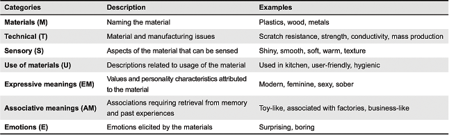
First, the effect of the years of study (Education) is discussed. Then, the effects of the senses of vision and touch (Condition) are discussed in relation to the growing critique on architects’ visual focus. Subsequently, the qualitative data from the second part of the study are presented. Different categories of material descriptions described in the literature were used to organize and analyze the keyword descriptions in relation to the senses used for evaluation. People describe (their experiences of) materials in different ways, such as naming the material, describing technical, and sensory properties, illustrating the use of materials, or describing the experiential behavior (van Kesteren, Stappers, & de Bruijn, 2007; Wastiels, Wouters, & Lindekens, 2007). Technical descriptions refer to material and manufacturing properties; sensory descriptions to all aspects of materials that can be sensed; descriptions of the material use relate to the usage (van Kesteren et al., 2007). Experiential behavior describes how materials are perceived and includes expressive meanings, associative meanings, and emotions elicited by the materials (Karana, Hekkert, & Kandachar, 2009). Expressive meanings, such as modern or feminine, and associative meanings, such as toy-like, are not factually part of a material’s physical entity or appearance but refer to the meanings associated with the material (Karana, Hekkert, & Kandachar, 2010). Descriptions of emotions refer to the emotions elicited by the materials (Karana et al., 2009). Table 1 provides an overview of these categories with description and examples as suggested by Karana et al. (2009) and van Kesteren et al. (2007).
Table 1. Categories of material descriptions used to organize the keywords.
Results
Years of Education versus Material Assessment
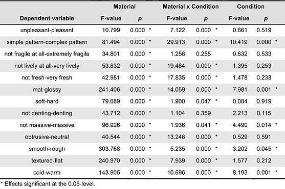
Analyses of Variance (ANOVAs) are used for testing differences in means between different groups. First, we verified whether students with different levels of education assessed the materials differently for the investigated attributes. This was done by performing a doubly multivariate ANOVA (Stevens, 2002), with the ratings on the 13 attributes as multiple dependent measures and Material, Education, and Condition as independent variables. The values of Rao’s F, corresponding to Wilks’ Λ are used to report the multivariate effects. Material, Condition, and Education all showed significant main effects (p ≤ 0.05). Also the Material × Condition interaction effect was significant (p < 0.05). No significance was found for any of the Education interactions (p > 0.05). Hence, only the main effect of Education is discussed in further detail to verify the differences in responses related to the years of education.
To further investigate the main effect of Education, we continued with univariate analyses for the 13 attributes, with the same set of independent variables. The degrees of freedom were corrected with the Greenhouse-Geisser ε if ε < 0.7 and the Greenhouse-Geisser and Huynh-Feldt ε-values were averaged for ε > 0.7 (Stevens, 2002). These analyses showed that the Education main effect was significant for pleasant, hard, and flat. For all other attributes no significant main effects of Education were found (p > 0.05). Paired comparisons with Bonferroni corrections revealed that first year students evaluated the materials to be flatter and harder than the more experienced students. For pleasant no significant differences were found between the different years of study. The latter outcome can be explained by the fact that the Bonferroni test is very strict, which might conceal the significance of certain paired comparisons. Given the few differences found between first year students and the other students (only for the attributes flat and hard), we can conclude that the years of architectural education hardly affected the participants’ assessment of building materials concerning the attributes under study.
Visual, Tactile, and Multisensory Assessment of Attributes
Overall ANOVA
The Material × Condition × Education repeated measures ANOVA also provides insights in the roles of the different senses in the assessment of building materials by investigating the effects of Condition. The Condition main effect was significant for five attributes (complex pattern, glossy, massive, rough, and warm) and the Material × Condition interaction was significant for 11 attributes (all except fragile and denting, see Appendix 1). These results reveal that the test condition—and thus the sense(s) used for evaluation—has a major impact on the assessment of the building materials. More detailed comparisons of the general and visual evaluations provide insights in the dominance of vision (or not) in the assessment of building materials. Comparisons between the visual and tactile assessment of materials reveal to what extent the assessment by touch differs from the assessment by vision.
Condition main effects
Paired comparisons with Bonferroni corrections allow us to investigate the main effect of Condition for the five attributes that showed significant differences between the test conditions (Table 2). We found no significant differences between the general and visual evaluations of the materials (p > 0.05 for all attributes). This indicates that the participants’ visual (VIS) and multisensory (GEN) evaluations are similar for all attributes.
Table 2. Paired comparisons with Bonferroni corrections: presenting the differences between the individual test conditions.
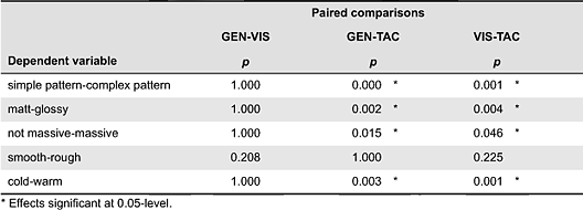
The tactile assessment (TAC) of complex pattern, glossy, massive, and warm was significantly different (p ≤ 0.05) from the evaluations where participants used vision (both GEN and VIS). For rough no significance was found. These results suggest that the sense of touch picks up different sensory cues than vision while assessing a material’s pattern, its gloss, its massiveness and its warmth. The materials are generally perceived to be less massive during tactile evaluation than in the other conditions (Figure 1a). For the other attributes, the differences in assessment are material dependent (Figure 1 b-d), e.g., the pattern of wood and blue stone is perceived to be far more complex when using vision, whereas the pattern of plasterwork seems more complex when using touch.
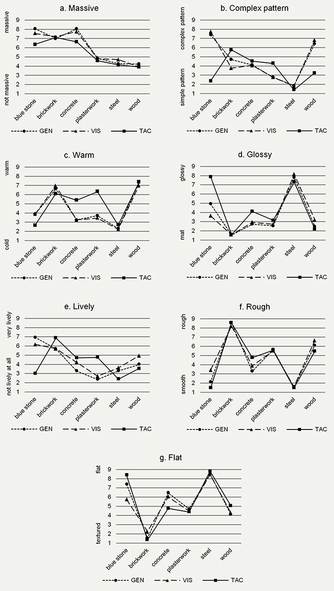
Figure 1. Mean responses to the different attributes, varying between 1 and 9, for the investigated building materials, according to the three test conditions (GEN, VIS, TAC). Represented attributes: (a) Massive, (b) Complex pattern, (c) Warm, (d) Glossy, (e) Lively, (f) Rough, (g) Flat.
Material × Condition interactions
In order to conclude that the GEN and VIS conditions produce similar assessments for all attributes, we should also investigate the significant Material × Condition effects of the overall analysis in more detail. These interactions are most likely due to deviant responses in the TAC condition, but some might be due to differences between VIS and GEN for some specific materials. Therefore, we performed Material × Condition × Education ANOVAs with the data from the GEN and VIS conditions only. In the latter analyses, the Material × Condition interaction was significant for only 4 of the 11 attributes (lively, glossy, rough, and flat). Mean responses for these attributes (Figure 1 d-g) generally revealed similar responses in the general and visual test condition for the different materials. Nonetheless, we can see some small deviations, especially for the blue stone sample, which appears to be assessed differently for these attributes. Despite these few instances of deviations, our overall conclusion remains that participants’ assessment of building materials generally does not change when being allowed to use both vision and touch compared to vision only, which indicates that the architecture students’ general assessment of these aspects for indoor walls is dominated by vision.
Keyword Associations
Different categories of material descriptions (Table 1) were used to investigate the kind and number of keyword descriptions in relation to the senses used for evaluation. The Use of materials and Emotions were described only incidentally by the participants and, therefore, they will not be discussed here. All other categories of descriptions can be richly documented by the data.
Naming materials
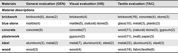
Participants used material names, such as concrete, metal, or wood, to describe the materials they were seeing and/or touching. These material labels were found in all test conditions, but were clearly used more in the tactile test condition, e.g., steel was labeled with a material name by 40% of the participants using vision only, but by 80% of the participants using touch only. The test condition related significantly to the number of material labels named by the participants, Χ2(2) = 97.9, p < 0.001. One fifth of the descriptions were material names in the tactile test condition (21.0%), whereas this was only 4.8% in the general test condition and 7.0% in the visual test condition. This suggests that the desire to identify the material is larger when not being able to see it.
Another difference found between the sensory conditions concerns the correctness of the material labeling. Table 3 shows the material names the different samples were associated with by at least two participants. In the conditions where participants were able to see (GEN and VIS), all material labels corresponded (closely) to the actual material being assessed. When participants relied on touch only (TAC), many material labels did not match the material being assessed. During tactile evaluation the concrete sample was commonly associated with wood, for example, and glass was named repeatedly in association with the blue stone sample. Only the steel sample was correctly identified as a metal during blind assessment. Whereas it was relatively easy to identify the material by vision, participants seemed to be misled when relying on touch only.
able 3. Materials associated with the different samples during visual, tactile, and general evaluation by at least two participants. Number of participants naming the association are given between parentheses.
Technical and sensory descriptions
A number of aspects of the materials’ behavior were mentioned throughout the different test conditions by use of technical and sensory descriptions. Examples for each material are provided from the data in Table 4. The data showed a significant effect of the test condition, Χ2(2) = 53.8, p < 0.001. Technical and sensory descriptions were used more frequently in the tactile condition (43.9%) than in the other conditions (28.4% for GEN, 22.2% for VIS).
Table 4. Examples of technical and sensory descriptions associated with the different samples during visual and tactile evaluation. (Click to enlarge this table.)
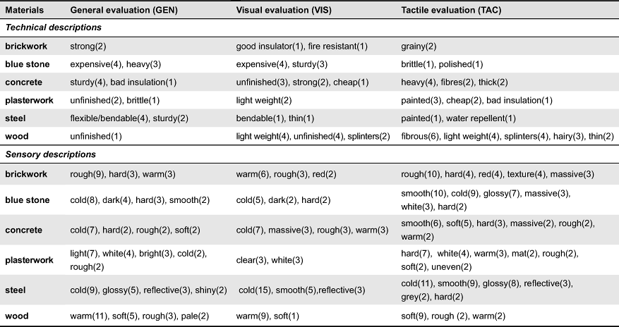
Whereas certain aspects appear to be related more to vision (e.g., color) or to touch (e.g., warmth), these sensory descriptions were not that strictly bound to the respective senses used for evaluation. Concrete was, for example, most commonly associated with cold during the evaluation in the visual test condition, whereas none of the participants taking the tactile test mentioned coldness in their associations. In all test conditions brickwork was associated with rough, blue stone with cold, steel with glossy, and wood with warm. And although color cannot be perceived by touch, several participants named color properties in association to the materials they touched blindly.
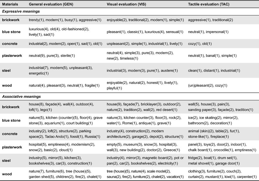
Meanings
Participants described expressive characteristics and associative meanings of the materials throughout all sensory test conditions. Examples of expressive characteristics are cozy, industrial, or modern. Associations were made to typical building applications and functions (e.g., kitchen, façade, floor), objects (e.g., snake skin, chocolate, lego), places (e.g., Flanders, home, church, beach), persons (e.g., mason, Le Corbusier, doctor), activities (e.g., adventure, vacation), and atmospheres (e.g., work atmosphere, coziness). More examples of expressive and associative meanings from the study are presented in Table 5 per material. A significant effect of the test condition was found, Χ2(2) = 86.5, p < 0.001. Expressive and associative meanings—mostly relating to participants’ personal experiences—were mentioned only to a limited extent by the participants in the tactile test condition (34.6%), but came up frequently when they used vision for the assessment (65.7% in the general test condition and 69.3% in the visual test condition).
Table 5. Examples of expressive and associative meanings mentioned by the participants during their visual and tactile evaluation of the building materials. (Click to enlarge this table.)
Discussion
Tactile Evaluation Differs from Visual Evaluation
In this study we investigated to what extent the senses used for evaluation affect architecture students’ assessment of materials. The results of the first part of the study showed that most attributes are scored differently when using vision versus using touch for evaluation. Only for fragile and denting no effects of the test condition were registered.
As the same list of attributes was used for the different test conditions, this result suggests that a distinction can be made between visual and tactile perceptions of the attributes. These perceptions may be affected by parameters that differ between modalities. Changes in color and/or lightness across the surface, for example, influence the visual pattern of a material. For instance, the graining of the wood and the stained surface of the blue stone are likely to have contributed to the high scores in terms of pattern complexity. Because variations in color and light cannot be perceived by touch, the tactile pattern of a surface will be determined by other aspects, such as changes in surface texture or roughness. The even and (relatively) smooth surfaces of the wooden and blue stone samples may explain the low scores on complex pattern during tactile evaluation. Because the perception of an attribute depends on the senses used for evaluation, it is important for architects to be aware of both visual and tactile aspects of a material when assessing and selecting materials.
The qualitative analyses showed that when participants use vision, they make associations to aspects, objects or situations the material reminds them of: construction site, industry, outdoor, etc. Participants relying on touch make associations that describe the material itself: smooth, soft, heavy, etc. Judging from these descriptions, participants mainly seem to describe the physical characteristics of the material when evaluating a material by touch only, whereas the actual physical behavior loses importance and participants start to associate meanings to the materials when using vision. This suggests that when using vision participants are guided more by personal experiences than the momentary physical/sensory observation and this corresponds to the finding that visual information leads to more cognitive interpretations and less sensory impressions (Hinton & Henley, 1993).
The fact that concrete was evaluated to be colder when using vision compared to using touch can be explained by a combination of the findings mentioned above. First, one can distinguish between visual and tactile warmth. Tactile warmth refers to how cold or warm a material feels to touch (Ashby & Johnson, 2002). Concrete’s thermal properties play an important role in this warmth perception and explain why concrete feels rather warm to the touch (see Figure 1d). When including vision for the assessment, visual parameters such as gloss or color influence the warmth perception. This way, the cold grey color of concrete contributes to the perception of coldness during visual evaluation (Wastiels et al., 2012). Second, participants are guided more by cognitive interpretation when using vision: The associated meaning that concrete is a cold material, appears to take dominance over the actual physical characteristics and sensations when vision is included for the evaluation. Finally, the actual warm feeling (during blind touching) might explain why participants associated the sample with wood. In addition, the hairiness of the surface—associations such as hairy, little hairs, tickling, threads or fur were made—probably also contributed to warmth perception and/or the idea that one was touching a wooden surface.
Vision Dominates Material Assessment
In a balanced multisensory assessment, one expects the consideration of both visual and tactile aspects to have an impact on the overall judgment. The results of our study show that the visual and tactile assessment of a material can lead to distinctively different results. Importantly, the tactile components (e.g., the thermal properties or the complexity of the tactile pattern) appear to be disregarded completely by participants when including vision for the evaluation. The fact that no substantia differences were found between the visual and general assessment for any of the attributes suggests that vision is by far the dominant sensory modality when assessing materials. This finding corresponds with the general finding that many objects are perceived first and foremost visually (Schifferstein & Cleiren, 2005; Schifferstein, 2006).
In the present study, the identification of materials on the basis of touch was in many cases inaccurate, while visual identification was, in the main, accurate. These findings contrast with observations for the identification of entire objects, where the performance for touch comes close to performance for vision (Klatzky, Lederman, & Metzger, 1985; Klatzky, Loomis, Lederman, Wake, & Fujita, 1993; Schifferstein & Cleiren, 2005). It would appear that the identification of materials alone on the basis of touch is much more difficult than the identification of objects, where also shape information is available. This seems to hold, even though the sense of touch has been shown to be more suitable for the precise assessment of material properties than the sense of vision, which is better equipped for the assessment of geometric properties (e.g., Lederman & Klatzky, 1987, 1997; Lederman, Summers, & Klatzky, 1996).
The present study was not designed to evaluate the architects’ material selection process, but to investigate the perception of materials. Hence, the roles of tactile, auditory, and olfactory perception during materials selection remain to be established. During the process of selecting materials for a specific application within a specific project, architects possibly pay more attention to the different sensory implications than when they evaluate building materials in an existing building. A study investigating architects’ real-life material selection process for a project could provide a more realistic representation of the importance of the senses while selecting materials. Our study made use of small-scale samples and focused only on the role of vision compared to touch in the assessment of building materials. Future research using larger samples applied within concrete architectural settings or spaces could provide further insights in the perception of full-scale walls and should include all the senses.
Attention for Non-Visual Material Aspects in Architectural Education
As the participants for this study were students in architecture, the findings presented here are relevant in the context of architectural education. The statistical analysis of the quantitative data revealed that the years of study of the participants (ranging between one and five years) hardly affected the way the different materials were assessed: Only the first year students produced systematically different results for the assessment of flat and hard. This suggests that, from their 2nd year on, students’ visual and tactile assessment of the experiential qualities of materials does no longer evolve during their training. The fact that the number of years of training hardly affected the outcomes of the current experiment might imply that professional architects may have similar perceptual biases as naive consumers. In the context of the importance of the senses, this implies that vision dominates their experience of building materials and wall coverings.
In product experience research, Fenko, Schifferstein, and Hekkert (2009) observed that the sense of vision dominated the buying process for several products, but that the relevance of the other senses increased during the use stage. As architects and designers are expected to be able to anticipate the future use and experience of what they design, they should be trained to go beyond the initial distraction of vision. Whereas this study focused on interior walls, the tactile aspects of materials are likely to gain importance in architectural elements where the use of touch is more explicitly present, like floors being walked on, handrails guiding people along a staircase, or doors being pushed and pulled by people’s hands or arms. For these elements, the dominance of vision may become problematic and begs the question for more conscious consideration of touch in materials selection and architectural design in general.
Practical Implications
This study suggests that architecture students are mainly guided by vision when assessing building materials, even for outspoken tactile aspects like material warmth. The finding that vision steers their perception of building materials is in line with observations on consumers’ perception of industrial products, suggesting that vision seems to capture the majority of people’s attention during user-product interactions and, thereby, distracts from the other senses (Schifferstein & Desmet, 2007). In fact, our observation that the number of years of training hardly affected the outcomes of the current experiment might imply that professional architects may have similar perceptual biases as naive consumers.
The finding that several building materials were assessed differently when excluding vision for the evaluation illustrates the need for a more elaborate consideration of the non-visual senses during design as argued by Pallasmaa (2005). When selecting materials for a building project, architects should consider both visual and other sensory aspects of the material, keeping the final application and (sensory) interaction with the user in mind. In doing this, it is important to be sensitive to the different sensory cues that may affect the experience and be conscious about the different meanings or interpretations of certain aspects. Looking for a massive material or one with an outspoken pattern, for instance, should be considered both in a visual and tactile way. The extensive use of visual representations in architecture unfortunately does not really help in taking these aspects into further consideration. As several design tools already allow for a multisensory approach, e.g., the material palette (Nijs et al., 2010) or Schifferstein’s (2011) Multi Sensory Design approach, a first step towards a more sensitive approach to multisensoriality in architectural design would be to become more aware of what exactly architects assess when they select materials.
Acknowledgements
The research reported in this paper was made possible thanks to funding from the Research Foundation—Flanders (FWO) and the European Research Council under the European Community’s Seventh Framework Programme (FP7/2007-2013)/ERC grant agreement n° 201673. The authors thank the VUB Architectural Engineering students for participating in the study and the staff members of the VUB Engineering Departments ARCH, MeMC and TONA for helping with the setup and measurements of the samples.
References
- Albers, J. (1971). Interaction of color. New Haven, CT: Yale University Press.
- Ashby, M. F., & Johnson, K. (2002). Materials and design: The art and science of material selection in product design. Oxford, UK: Butterworth-Heinemann.
- Auping, M., & Ando, T. (2002). Seven interviews with Tadao Ando, November 1989 - April 2002. Surrey, UK: Modern Art Museum of Fort Worth.
- Cross, N. (1982). Designerly ways of knowing. Design Studies, 3(4), 221-227.
- Dalke, H., Little, J., Niemann, E., Camgoz, N., Steadman, G., Hill, S., & Stott, L. (2006). Colour and lighting in hospital design. Optics & Laser Technology, 38(4-6), 343-365.
- Derefeldt, G., Swartling, T., Berggrund, U., & Bodrogi, P. (2004). Cognitive color. Color Research and Application, 29(1), 7-19.
- Dischinger, M. (2006). The non-careful sight. In P. Devlieger, F. Renders, H. Froyen, & K. Wildiers (Eds.), Blindness and the multi-sensorial city (pp. 143-176). Antwerp, Belgium: Garant.
- Fenko, A., Schifferstein, H. N. J., & Hekkert, P. (2009). Shifts in sensory dominance between various stages of user-product interactions. Applied Ergonomics, 41(1), 34-40.
- Franck, K. A., & Lepori, B. (2007). Architecture from the inside out. London, UK: Wiley.
- Franck, K. A., & Von Sommaruga Howard, T. (2010). Design through dialogue: A guide for clients and architects. London, UK: John Wiley & Sons.
- Gao, X., & Xin, J. H. (2006). Investigation of human’s emotional responses on colors. Color Research and Application, 31(5), 411-417.
- Goldschmitt, G., & Porter, W. (Eds.). (2004). Design representations. London, UK: Springer Verlag.
- Gulak, M. B. (1991). Architectural guidelines for state psychiatric hospitals. Hospital and Community Psychiatry, 42(7), 705-707.
- Herssens, J., & Heylighen, A. (2011). Haptic design research: A blind sense of place. In Proceedings of the 7th International Conference on Architectural Research. Washington, DC: Architectural Research Centers Consortium.
- Heylighen, A. (2011). Studying the unthinkable designer. In J. Gero (Ed.), Design computing and cognition ’10 (pp. 23-34). Dordrecht, the Netherlands: Springer.
- Heylighen, A., Devlieger, P., & Strickfaden, M. (2009). Design expertise as disability and vice versa. In Proceedings of the Communicating (by) Design Conference (pp. 227-235). Brussels, Belgium: Hogeschool voor Wetenschap en Kunst St.-Lucas (Belgium).
- Heylighen, A., Rychtáriková, M., & Vermeir, G. (2010). Designing spaces for every listener. Universal Access in the Information Society, 9(3), 283-292.
- Hinton, P. B., & Henley, T. B. (1993). Cognitive and affective components of stimuli presented in three modes. Bulletin of the Psychonomic Society, 31, 595-598.
- Holl, S. (1994). Questions of perception: Phenomenology of architecture. In S. Holl, J. Pallasmaa, & A. Pérez-Gómez (Eds.), Questions of perception. Tokyo, Japan: a+u Publishing.
- Itten, J. (1970). Kleurenleer. Utrecht, the Netherlands: Cantecleer.
- Karana, E., Hekkert, P., & Kandachar, P. V. (2009). Meanings of materials through sensorial properties and manufacturing processes. Materials & Design, 30(7), 2778-2784.
- Karana, E., Hekkert, P., & Kandachar, P. V. (2010). A tool for meaning driven materials selection. Materials & Design, 31(6), 2932-2941.
- Van Kesteren, I. E. H., Stappers, P. J., & De Bruijn, S. (2007). Materials in product selection: Tools for including user-interaction in materials selection. International Journal of Design 1(3), 41-55.
- Klatzky, R. L., Lederman, S. J., & Metzger, V. A. (1985). Identifying objects by touch: An “expert system.” Perception & Psychophysics, 37(4), 299-302.
- Klatzky, R. L., Loomis, J. M., Lederman, S. J., Wake, H., & Fujita, N. (1993). Haptic identification of objects and their depictions. Perception & Psychophysics, 54(2), 170-178.
- Lawson, B. (1994). Design in mind. Oxford, UK: Butterworth Architecture.
- Lawson, B. (2000). How designers think: The design process demystified (3rd ed.). Oxford, UK: Architectural Press.
- Lederman, S. J., & Klatzky, R. L. (1987). Hand movements: A window into haptic object recognition. Cognitive Psychology, 19(2), 342-368.
- Lederman, S. J., & Klatzky, R. L. (1997). Relative availability of surface and object properties during early haptic processing. Journal of Experimental Psychology: Human Perception and Performance, 23(6), 1680-1707.
- Lederman, S. J., Summers, C., & Klatzky, R. L. (1996). Cognitive salience of haptic object properties: Role of modality-encoding bias. Perception, 25(8), 983-998.
- Malnar, J. M., & Vodvarka, F. (2004). Sensory design. Minneapolis, MN: University of Minnesota Press.
- Nijs, G., Vermeersch, P. -W., Devlieger, P., & Heylighen, A. (2010). Extending the dialogue between design(ers) and disabled use(rs): From conversation to embodied skill. In Proceedings of the 11th International Design Conference (pp. 1817-1826). Glasgow, UK: Design Society.
- Pallasmaa, J. (2005). The eyes of the skin: Architecture and the senses. London, UK: Wiley-Academy.
- Rasmussen, S. E. (1962). Experiencing architecture (2nd ed.). Cambridge, MA: MIT Press.
- Sadalla, E. K., & Sheets, V. L. (1993). Symbolism in building materials: Self-representational and cognitive components. Environment and Behavior, 25(2), 155-180.
- Schifferstein, H. N. J. (2006). The perceived importance of sensory modalities in product usage: A study of self-reports. Acta Psychologica, 121(1), 41-64.
- Schifferstein, H. N. J. (2011). Multi sensory design. In Proceedings of the 2nd Conference on Creativity and Innovation in Design (pp. 361-362). New York, NY: ACM.
- Schifferstein, H. N. J., & Cleiren, M. P. H. D. (2005). Capturing product experiences: A split-modality approach. Acta Psychologica, 118(3), 293-318.
- Schifferstein, H. N. J., & Desmet, P. M. A. (2007). The effects of sensory impairments on product experience and personal well-being. Ergonomics, 50(12), 2026-2048.
- Schön, D. (1983). The reflective practitioner: How professionals think in action. New York, NY: Basic Books.
- Stevens, J. P. (2002). Applied multivariate statistics for the social sciences (4th ed.). Mahwah, NJ: Erlbaum.
- Stone, N. J. (2001). Designing effective study environments. Journal of Environmental Psychology, 21(2), 179-190.
- Valdez, P., & Mehrabian, A. (1994). Effects of color on emotions. Journal of Experimental Psychology, 123(4), 394-409.
- Vermeersch, P.-W., Strickfaden, M., Herssens, J., & Heylighen, A. (2009). Architects and visually impaired people. In Proceedings of the 17th International Conference on Engineering Design [CD ROM]. Glasgow, UK: Design Society.
- Wastiels, L., Schifferstein, H. N. J., Heylighen, A., & Wouters, I. (2012). Relating material experience to technical parameters: A case study on visual and tactile warmth perception of indoor wall materials. Building and Environment, 49(3), 359-367.
- Wastiels, L., & Wouters, I. (2012). Architects’ considerations while selecting materials. Materials and Design, 34(2), 584-593.
- Wastiels, L., Wouters, I., & Lindekens, J. (2007). Material knowledge for design: The architect’s material vocabulary. In S. Poggenpohl (Ed.), Proceedings of the 2nd Conference of the International Association of Societies of Design Research [CD ROM]. Hong Kong, China: Hong Kong Polytechnic University.
- Wilson, M. A. (1996). The socialization of architectural preference. Journal of Environmental Psychology, 16(1), 33-44.
- Yildirim, K., Akalin-Baskaya, A., & Hidayetoglu, M. L. (2007). Effects of indoor color on mood and cognitive performance. Building and Environment, 42(9), 3233-3240.
Appendix 1
Appendix 1. Results of repeated measures ANOVAs (Material x Condition x Education): presenting the main and interaction effects of the material and the test condition.