
Symbolic Meaning Integration in Design and its Influence on Product and Brand Evaluation
University of Twente, Enschede, The Netherlands
Previous research and theorizing in product design and consumer psychology testifies to the importance of congruence among symbolic meanings connoted through elements in visual communications such as advertisements, product appearance, and product packaging. However, understanding of the processes whereby meaning congruence impacts consumer response is limited. In this paper, we propose a framework for understanding congruence effects in design based on recent studies addressing processing fluency. Based on these findings, the authors propose that incongruence thwarts impression formation of product and brand by inducing ambiguity, thereby negatively affecting attitude formation. However, research indicates that congruence effects may vary across consumers. Hence, in the experimental study presented, effects of ‘advertising slogan-product shape’ (in)congruence were studied as a function of consumers’ tolerance for information ambiguity. Results from this study indicate that incongruencies are particularity distressing for consumers with a low tolerance for ambiguity in everyday life. Theoretical and practical implications are discussed.
Keywords – Congruence, Processing Fluency, Impression Formation, Symbolic Meaning, Consumer Needs.
Relevance to Design Practice – Results testify to the importance of careful selection of visual elements of consumer products and the symbolic meanings they connote. Specifically, they suggest that symbolic meanings connoted across product appearance might best be congruent in terms of the underlying theme in order to create a first favorable impression of product and brand.
Citation: Van Rompay, T. J. L., Pruyn, A. T. H., & Tieke, P. (2009). Symbolic meaning integration in design and its influence on product and brand evaluation. International Journal of Design, 3(2), 19-26.
Received March 02, 2009; Accepted July 02, 2009; Published August 31, 2009
Copyright: © 2009 Van Rompay, Pruyn, and Tieke. Copyright for this article is retained by the authors, with first publication rights granted to the International Journal of Design. All journal content, except where otherwise noted, is licensed under a Creative Commons Attribution-NonCommercial-NoDerivs 2.5 License. By virtue of their appearance in this open-access journal, articles are free to use, with proper attribution, in educational and other non-commercial settings.
*Corresponding Author: T.J.L.vanRompay@utwente.nl
Introduction
Previous research has demonstrated positive effects of various types of stimulus congruence on consumer response. For instance, with respect to product design, design principles stressing the importance of unity or congruence among visual design elements are well established (e.g., Hekkert, 2006). In line with such principles, Veryzer (1993) showed that perceived unity in the visual appearance of consumer products positively affects consumers’ aesthetic responses. But although various types of congruencies have been studied, controlled studies addressing congruence effects among symbolic meanings portrayed by visual product elements (or elements of visual communications in general) are few, and understanding of the processes whereby meaning congruence or incongruence impacts consumer response is limited.
Moreover, research suggests that stimulus-congruence effects (conceptualized as a type of meaning ambiguity) may vary depending on contextual and dispositional factors such as product type (e.g., consumer products versus works of art; cf. Leder, Belke, Oeberst, & Augustin, 2004) and consumer involvement (e.g., whether consumers engage in extensive processing of the product encountered; cf. Peracchio & Meyers-Levy, 2005). Of particular relevance to this paper is research that indicates that consumers’ tolerance for ambiguity in everyday life varies and this is reflected in consumers’ ‘need for structure’ (Neuberg & Newsom, 1993). Arguably, stimulus congruence is particularly valued by consumers who value clear and unambiguous information (i.e., consumers with a high need for structure).
One way to understand stimulus-congruence effects, in relation to consumer products, is through processing fluency; stimuli that can be easily processed are generally evaluated in positive terms and inspire favorable attitudes. This research takes up literature indicating that symbolic meanings connoted by consumer products are important with respect to consumer evaluations and attitude formation. Extending on that literature, we report on an experimental study in which stimulus-congruence effects were studied as a function of consumers’ tolerance for information ambiguity.
Symbolic Product Meaning
Long standing findings from design, art, and advertising research indicate that visual elements such as shape, color, logo, and typeface are not only perceived in terms of their formal or technical properties but also in terms of the symbolic or affective connotations they embody. With respect to the experience of art, for instance, the artist Wassily Kandinsky discussed the basic elements of abstract painting (e.g., points, lines, planes, and their spatial orientation) in terms of their ‘affective sounds’, relating, for instance, the ‘above’ to emancipation and freedom, and the ‘below’ to heaviness and constraint (Kandinsky, 1926). In explaining such relations, Kandinsky proposed an artistic sensitivity which he referred to as the artist’s ability to “feel the breathing of the still untouched plane” (p. 116). Although the reception of such meanings may indeed involve a heightened sensitivity, in modern times structural relations between visual-spatial elements and symbolic meanings have been proposed and ‘scientific’ explanations for such relations have been provided.
In a recent study, for instance, Zhang, Feick, and Price (2006) showed that rounded logos are generally perceived as more harmonious and less aggressive than angular logos. In line with the writings of Rudolf Arnheim (1974), they accounted for this relation by arguing that, on a perceptual level, angular shapes represent a confrontation between a stimulus and its surroundings, hence the aggressiveness connotation, whereas rounded shapes present no such clash between stimulus and surroundings (cf. Bar & Neta, 2006). Likewise, Van Rompay, Hekkert, Saakes, and Russo (2005) demonstrated a relation between a product’s relative height and perceived dominance, explaining this finding in terms of the experiential; being in a high position is associated with greater control (e.g., visual control over those below) or power (e.g., objects are easier to manipulate from above). Because of this association in everyday experience between verticality interactions and experienced affect (i.e., feeling dominant, proud or in control), variations in relative (product) height influence the extent to which products are perceived as expressive of related meanings (e.g., pride or dominance).
As illustrated by these examples, symbolic meanings come in different types; some (e.g., pride and dominance) are grounded in affective experiences arising from embodied interactions with the environment and may therefore be considered ‘affective’ or ‘embodied.’ Others involve cognitive evaluations (cf. Lakoff & Turner, 1989); typifying a product as modern or trendy, for instance, involves a cognitive comparison between the target product and other exemplars of the product category. Regardless of the type of symbolic meaning, on a more general level, symbolic meanings reflect those properties consumers discern in products that are not literally part of product appearance (cf. Blank, Massey, Gardner, & Winner, 1984). With respect to brands, such meanings reflect symbolic brand characteristics that shape a brand’s character or personality (Aaker, 1997), and the question becomes how such characteristics can be connoted through features of product design (cf. Karjalainen, 2007).
Insights into the structural relations between visual elements and symbolic meanings are important, not in the least because a considerable number of studies have demonstrated the increasing importance of symbolic (product) meaning with respect to consumer decision-making and the formation of brand impressions (Bloch, 1995; Childers & Jass, 2002; Creusen & Schoormans, 2005; Karjalainen, 2007). For instance, Creusen, and Schoormans (2005) showed that, apart from bringing aesthetic delight, for consumers the most important function of a product’s appearance is the portrayal of symbolic meanings. This importance of symbolic meaning can be understood, in part, by the notion that products are an important means for self-expression and identity formation (e.g., Belk, 1988). In addition, symbolic meanings exemplified by consumer products are important with respect to brand image perceptions (Bloch, 1995; Karjalainen, 2007). Consumer perceptions of the brand ‘Apple’, for instance, are to some extent informed by symbolic meanings connoted through the visual appearances of branded products such as the iPod and the iMac.
Although the importance of symbolic product meaning is well established, controlled studies accounting for relations between specific symbolic meanings and product appearance are sparse. In part, this relates to the fact that consumer products specifically and visual communications in general, are complex stimuli comprising multiple visual elements (e.g., shape, typeface, and color) through which symbolic meanings are communicated. In addition, consumer products are often embedded within a context comprising non-visual elements (e.g., brand slogans or product information). In order to account for consumer perceptions of product symbolism, it is, therefore, important for carriers of product meaning other than shape to be taken into account.
The research findings presented hold that symbolic meanings connoted across different elements of consumer products create a more favorable first impression of product and brand when there is congruence in terms of the underlying theme; something of particular importance in relation to consumer products where snap judgments are often all-important. That is, when meanings connoted across different elements are incompatible it is, arguably, difficult for consumers to form an image of product and brand, which may negatively affect attitude formation. In this paper we are concerned with the effects of symbolic meaning (in)congruence on evaluations of consumer products. More specifically, we examine how a match or mismatch of symbolic meanings connoted across product appearance affects product and brand evaluations.
Congruence, Processing Fluency & Impression Formation
In developing an understanding of stimulus congruence effects and the general preference for unity over disunity, recent theorizing on processing fluency is insightful. Processing fluency is underpinned by an understanding that stimuli that can be easily processed are generally evaluated in positive terms and inspire favorable attitudes (Lee & Labroo, 2004; Reber, Schwarz, & Winkielman, 2004). The basis for these effects can be traced to the finding that processing fluency is hedonically marked, i.e., fluent processing is experienced as positive (Reber et al., 2004). From an evolutionary perspective these positive affects may be understood as a marker of things in the environment being in equilibrium and, hence, safe as opposed to where a disruption of processing is indicative of an unexpected, potentially harmful, change.
A considerable body of research shows that this, fluency inspired, positive affect may be used as a cue in stimulus evaluations of various kinds. Zajonc (1968), for instance, showed that repeated exposures to nonsensical stimuli (e.g., Chinese characters presented to Western respondents) lead to increased liking; a psychological phenomenon known as the ‘mere exposure’ effect. Recently, this effect has been explained in terms of processing fluency, that is, with repeated exposures, stimuli can be more easily processed. The ease of processing it is argued, is what accounts for the increased liking (Reber et al., 2004). Similarly, fluent stimuli are generally also experienced as more beautiful or pleasing to the senses than non-fluent stimuli. For instance, ‘gestalt’ patterns such as figure-ground contrast, symmetry and goodness-of-form have been shown to facilitate processing (Reber et al., 2004), which can explain preferences for stimulus configurations which obey gestalt principles in perceptual experience.
In previous work Van Rompay and Pruyn (in press) argue that stimulus congruence may also facilitate processing and contribute to positive evaluations of products and their corresponding brands After all, when confronted with products, consumers face the task of integrating meanings connoted across product elements into an overall impression. Mixed signals (e.g., product shape connoting purity and typeface connoting artificiality) may inspire ambiguity with respect to the product and its brand identity, thereby, negatively affecting subsequent evaluations. In other words, products high in congruence are expected to facilitate impression formation, as opposed to products low in congruence (cf. Hekkert, 2006), explaining why congruent stimuli are preferred to incongruent stimuli.
To test whether impression formation was effected by congruence effects among symbolic meanings portrayed by shape and typeface design Van Rompay and Pruyn (in press) tested responses to a fictitious brand of bottled water. In one of their studies two product shapes and two typeface variants were selected either connoting masculinity or femininity. The shape manipulation was based on previous research indicating that shape angularity influences perceptions of product potency (Arnheim, 1974; Bar & Neta, 2006; Osgood, 1957; Zhang et al., 2006). Osgood (1957), for instance, showed that straight, angular forms are generally perceived as more potent or masculine than rounded, curved forms, generally perceived as more gentle, soft, or feminine. Hence, the shape manipulation was effected by varying the bottle’s curvature; resulting in a straight, angular bottle and a curved, rounded bottle. The typeface manipulation was based on research demonstrating relationships between specific typeface styles (i.e., ‘Helvetica’ and ‘Script’) and, respectively, perceptions of masculinity and femininity (Pan & Schmitt, 1996).
By cross pairing the shape and the typeface manipulations, four product variants were arrived at, either congruent in terms of the affective meanings connoted (for instance both shape and typeface connoting masculinity) or incongruent (shape connoting masculinity and typeface connoting femininity or vice versa). Using a between-subjects experimental design, participants rated the product variants on aesthetic liking and product value. Results were in line with predictions by showing positive effects of shape-typeface congruence on aesthetic evaluations and value perceptions; congruent variants, as opposed to incongruent variants, were considered more attractive, and in turn elicited higher price expectations (Van Rompay & Pruyn, in press).
Visual-Text Congruence and Consumer Information Processing
Stimuli such as advertisements, product packaging, and websites not only contain visual elements but also verbal elements such as brand slogans and product information; elements that should optimally convey the desired product qualities and related brand image. Similar to the processing of symbolic qualities portrayed by strictly visual product features, impression formation should also benefit from congruence among visual and textual elements. For instance, when exposed to an advertisement for a new brand, it is arguably less difficult for consumers to infer brand positioning and assess related product benefits when slogan and product appearance are congruent rather than incongruent in terms of the symbolic meanings connoted.
Previous research addressing visual-text incongruencies in advertising indicates that viewers have to engage in a somewhat extensive level of mental processing in order to pick up and integrate symbolic meanings connoted across advertisemensts (Peracchio & Meyers-Levy, 2005). In addition, research in the area of consumer psychology indicates that there are considerable differences in the extent to which consumers engage in and enjoy information processing which reflects consumers’ ‘need for cognition’ (Cacioppo & Petty, 1982). Thus, consumers who have a high need for cognition are likely to process (product and brand) information (e.g., communicated in advertisements) in a deliberate and extensive manner, whereas, consumers who have a low need for cognition generally process information less thoroughly and, hence, are arguably less sensitive to stimulus incongruencies (see Peracchio & Meyers-Levy, 2005, for a detailed discussion on the relation between extent of information processing and the reception of symbolic meanings).
To test whether congruence effects are qualified by participants’ need for cognition Van Rompay, De Vries, and Van Venrooij (2008) manipulated affective meanings connoted by pictures of hotel facades and accompanying descriptions on a fictitious hotel-booking site. Hotel pictures and hotel descriptions either connoted coziness or modernity. Again, the picture and description manipulations were crossed so as to arrive at web pages varying in terms of visual-text congruence. Apart from showing the expected overall positive effect of visual-text congruence on attitude formation (i.e., participants gave more positive evaluations of the hotels presented when product picture and hotel description portrayed congruent rather than incongruent symbolic meanings), subsequent analyses revealed that this positive congruence effect only appeared for participants high in need for cognition. In other words, these participants extensively processed meanings connoted by both hotel picture and hotel description, thereby undergoing the (negative) effects of visual-text incongruence.
Inspired by the relative neglect of consumer differences in accounting for design influences of (consumer) products on brand and product evaluations, we further explored the consumer side of reported congruence research, culminating in the experimental study reported next. Central to the findings of this study is the observation that stimulus incongruence can be considered a type of information ambiguity. That is, when different elements (e.g., slogan and product appearance) pertaining to the same source (i.e., the brand) communicate incongruent meanings, they result in ambiguity regarding product and brand identity. However, as suggested earlier, research in social psychology indicates that consumers’ tolerance for ambiguity varies in their everyday life, a trait referred to as the ‘personal need for structure’ (Neuberg & Newsom, 1993). In general, people high in need for structure display a strong aversion of ill-structured or ambiguous situations, and a longing for certainty and predictability.
Based on these insights, we expected that incongruencies among meanings connoted across two central elements of advertisements (i.e., product appearance and advertising slogan) would be particularly distressing for participants high in need for structure and much less so for participants low in need for structure (who rather value unexpected situations and ambiguity in general; cf. Neuberg & Newsom, 1993). As a consequence, stimulus incongruencies should negatively affect product and brand evaluations for participants high in need for structure. In order to test this prediction, product shape and slogan in an advertisement for a fictitious brand of soft drinks either connoted naturalness or artificiality, crystallizing in a 2 (product shape: natural versus artificial) * 2 (advertising slogan: natural versus artificial) * 2 (personal need for structure: low versus high) between participants design.
Experiment
Participants and Procedure
One hundred and nine shoppers at a Dutch supermarket (45 male and 64 female; mean age: 42.73 years) participated in the experiment. Participants were told that they were participating in an evaluation study exploring consumers’ impressions of ‘Flynt’: a new (fictitious) brand of soft drinks. The questionnaire comprised two forms: the first form containing a version of the advertisement (representing the manipulations) and the dependent measures, the second form containing the items of the ‘need for structure’ scale. After completion of the questionnaire there was no further involvement by the participants.
Stimulus Materials
Based on pretesting of twenty bottle shapes, two product shapes were selected; one shape connoting naturalness, the other artificiality. The natural shape was rated as more natural and less artificial than the artificial shape (p < .01). Similarly, two slogans were selected (translated from Dutch): “Lemonade too delicious to ignore” (the artificial variant) versus “Natural and honest: pure enjoyment” (the natural variant); the former was rated as more artificial and less natural than the latter (p < .01). Cross pairing the two slogans with the two product shapes resulted in four advertisement variants. Except for the variations discussed, the advertisements were identical (see Figure 1).
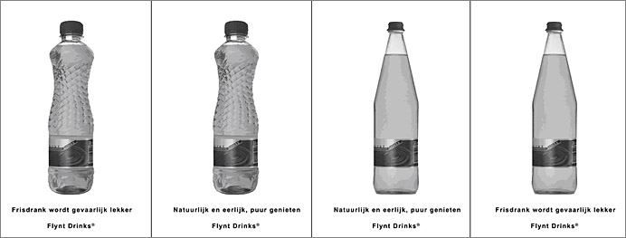
Figure 1. Stimuli used in the experiment (From left to right: artificial shape and artificial slogan; artificial shape and natural slogan; natural shape and natural slogan; natural shape and artificial slogan).
Measures
Product Attitude
Participants’ product attitude was measured with items reflecting the extent to which participants perceived the advertised product as eye-catching, superior, and of high quality. Participants indicated on 7-point likert scales the extent to which they considered these items descriptive of the product. A general measure for product attitude was formed by summing and averaging the scores on these items (α = .89).
Brand Evaluation
Brand evaluation was measured with items indicative of participants’ attitude towards the brand (“This brand appeals to me”, “This is a fine brand”, “I feel positive about this brand”, and “This is an attractive brand”). For each of these statements, participants indicated on a 7-point likert scale the extent to which they considered these descriptive of the brand. Again, a general measure for brand evaluation was formed by summing and averaging the scores on these items (α = .89).
Personal Need for Structure
Participants’ tolerance for information ambiguity was measured using the ‘need for structure’ scale (Neuberg & Newsom, 1993). The twelve items comprising this scale tap the extent to which participants can tolerate unexpected, unstructured and unpredictable people or situations as illustrated by statements such as “It upsets me to go into a situation without knowing what I can expect from it” and “I hate to be with people who are unpredictable” (α = .76). Based on a median split (Mdn = 4.25), participants were scored as either low or high in need for structure.
Results
An analysis of variance with product shape (natural versus artificial), advertising slogan (natural versus artificial) and participants’ need for structure (low versus high) as independent variables and the product attitude measure as dependent variable revealed non-significant main effects for advertising slogan, product shape, and need for structure (All F’s < 1). As expected, the interaction between product shape and advertising slogan was significant (F (1, 101) = 13.13, p < .01). Pair-wise comparisons revealed that the advertisement with the natural advertising slogan triggered more positive product evaluations when paired with the natural shape (M = 4.36; SD = 1.11) rather than with the artificial shape (M = 3.78; SD = 1.31) (F (1, 101) = 6.12, p < .02). Similarly, the advertisement with the artificial slogan triggered more positive product evaluations when paired with the artificial shape (M = 4.43; SD = 0.98 versus M = 3.51; SD = 1.33) (F (1, 101) = 7.04, p < .01).
The expected three-way interaction between advertising slogan, product shape and need for structure also reached significance (F (1, 101) = 11.73, p < .01), indicating that the reported ‘product shape-advertising slogan’ interaction only applies to participants high in need for structure (see Figure 2). Inspection of means reveals no significant differences between congruent and incongruent variants for participants low in need for structure, whereas for participants high in need for structure, the ‘natural-slogan’ advertisement induced more positive product evaluations when paired with the natural shape (M = 4.90; SD = 1.30) compared to the artificial shape (M = 3.15; SD = 1.30) (p < .01). Likewise, the ‘artificial-slogan’ advertisement induced higher ratings when paired with the artificial product shape (M = 4.65; SD = 1.06 versus M = 3.24; SD = 1.46) (p < .01).
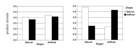
Figure 2: Three-way interaction between advertising slogan, product shape, and need for structure on product attitude
(left = low need for structure; right = high need for structure).
Similar results were obtained for the brand evaluation measure. Again, non-significant main effects of product shape, advertising slogan, and need for structure were obtained (all F’s < 1). As expected, the interaction between product shape and advertising slogan was significant (F (1, 101) = 11.30, p < .01). Pair-wise comparisons revealed that the advertisement with the natural slogan induced higher scores on brand evaluation when paired with the natural product shape (M = 4.54; SD = 1.08 versus M = 3.81; SD = 1.31) (F (1, 101) = 8.77, p < .01), whereas the advertisement with the artificial slogan induced (marginally) higher scores when paired with the artificial product shape (M = 4.59; SD = 1.08 versus M = 3.96; SD = 1.29) (F (1, 101) = 3.17, p = .08).
Again, the expected three-way interaction was significant (F (1, 101) = 10.07, p < .01), indicating that the reported ‘product shape-advertising slogan’ interaction only applies to participants high in need for structure. Inspection of means reveals no significant differences between congruent and incongruent variants for participants low in need for structure, whereas for participants high in need for structure, the ‘natural-slogan’ advertisement induced more positive brand evaluations when paired with the natural shape compared to the artificial shape (M = 5.08; SD = 1.26 versus M = 3.11; SD = 1.03) (p < .01). Likewise, the ‘artificial-slogan’ advertisement triggered higher ratings when paired with the artificial product shape (M = 4.82; SD = 1.09 versus M = 3.85; SD = 1.30) (p < .02).
Overall, these results provide evidence for the hypothesized positive effects of ‘shape-slogan’ congruence on product and brand evaluations. However, further analyses indicated that congruence effects were only apparent among consumers high in need for structure. As such, the results presented warrant against an oversimplified notion of stimulus congruence as something positive and therefore desirable at all times.
General Discussion
The results reported confirm the importance of congruence among visual and textual elements in visual communications such as product packaging and advertisements. Although we did not incorporate direct measures of processing fluency such as reaction times (Winkielman & Cacioppo, 2001), our results indicate that stimulus congruence facilitates impression formation, thereby positively affecting consumer responses. This study not only replicates the congruence effects observed in previous studies but it extends on those findings by clarifying the process by which stimulus congruence affects consumer response. That is, by demonstrating that congruence effects are qualified by participants’ need for structure, the results reported confirm that incongruence can be considered a form of information ambiguity, the effects of which are thus dependent on consumers’ tolerance for ambiguity (i.e., need for structure).
Although processing fluency can thus be considered a mediator of stimulus congruence effects on consumer evaluations (i.e., congruence affects evaluations via processing fluency), alternative constructs or consequences of (in)congruencies might also be considered in follow-up studies. For instance, in a previous study, (in)congruencies were shown to affect ratings of brand credibility (Van Rompay & Pruyn, in press). These findings suggest that (in)congruencies may also inspire (cognitive) evaluations of, for instance, the extent to which the brand is consistent in its claims, comes across as well-organized, or can be trusted to deliver high-quality products. Hence, in addition to the affect-driven process outlined in this paper, future research could incorporate alternative (cognition-based) mediators of stimulus congruence effects as well.
Of further interest are studies from advertising research indicating that some types of stimulus incongruencies (i.e., explicit incongruencies between advertisement elements rather than the relatively subtle incongruencies discussed in this paper) may be used as a means to attract attention and prompt elaborate rather than shallow processing (Heckler & Childers, 1992; Lee & Mason, 1999; Maheswaran & Chaiken, 1991; Meyers-Levy, Louie, & Curren, 1994). For instance, Heckler and Childers (1999) demonstrated positive effects of meaning incongruence on memory for advertisement elements, indicating that incongruence may prompt elaborate processing by presenting something unexpected or a ‘puzzle to be solved’. These overall findings suggest that stimulus congruence, similar to design laws or gestalt principles such as unity in variety and symmetry, gives rise to aesthetic pleasure by facilitating processing, whereas stimulus incongruence may positively impact consumer response by presenting something new or unexpected, and thus by disrupting background stimulus processing.
In addition to dispositional and situational influences qualifying stimulus congruence effects, factors such as product type and design expertise may also affect the extent to which consumers appreciate incongruencies in product appearance. For instance, consumers with an interest in design may more readily appreciate a deviation from the usual or may be better equipped to cope with ambiguity (cf. Hekkert & Van Wieringen, 1996). It should also be kept in mind that in the studies presented, first impressions resulting from visual encounters with consumer products were studied. Obviously, encounters with products of design usually extend far beyond a first (visual) impression. Arguably, positive effects of congruencies may fade away with increasing exposures whereas incongruencies may help sustain interest in the long run. In addition, ambiguity in art and design may, in general, be more readily appreciated, in part because one of the functions of art is to induce ambiguity that is open for the viewer to resolve (cf. Leder et al., 2004). In line with this proposal, Ludden, Schifferstein, and Hekkert (2008) recently showed that incongruencies in product appearance (e.g., incongruencies among impressions elicited by visual and tactile aspects of product appearance) might be used as a strategy to elicit surprise and to further interest.
Findings from previous research with respect to interest and appraisals of art, indicate that stimulus congruence effects are likely to vary depending on the availability of a meaningful context for the perceived incongruence (e.g., Leder, Carbon, & Ripsas, 2006; Lightfoot & Bullock, 1990; Silvia, 2005). For instance, Silvia (2005), addressing the appraisal structure of interest (an emotion starting with the appraisal of a stimulus as ambiguous or incongruent), demonstrated that incongruent stimuli (e.g., a complex, ambiguous poem) are positively evaluated when participants are provided with information that explains the perceived incongruence. Along similar lines, Leder et al. (2006) demonstrated that the presentation of explanatory titles increased viewers’ understanding of abstract paintings. Hence, relating ambiguity in product appearance to design intent or (in the case of consumer products) to brand character may render a perceived incongruence interpretable, and may even enhance, rather than harm, product or brand appreciation.
Although the implications of our findings are clear with respect to new brands, they are silent when it comes down to the question of how variations in product design affect perceptions of existing brands characterized by a relatively stable brand image (usually the resultant of many more factors besides product appearance such as advertising and promotional activities). Although we incorporated both product and brand evaluation measures in the study reported, it is arguably not surprising to learn that participants (lacking other sources of brand information) based their brand evaluations on product appearance. We can only hint at the extent to which variations in product appearance affect evaluations of existing, well-defined brands. For instance, how do design changes in the new Citroën line affect consumers’ perceptions of the brand Citroën in the short and in the long run?
Finally, follow-up studies are needed to increase understanding of relations between product elements and the portrayal of symbolic meanings. Although effects of variations in gestalt features such as verticality, shape angularity, and balance on (symbolic) meaning attributions have been proposed and tested (e.g., Van Rompay, 2008), insights in ‘product appearance-symbolic meaning’ relations are still limited. Awaiting follow-up studies addressing these and related issues, in the meantime the results presented testify to the importance of careful consideration of visual and textual elements figuring in visual communications such as advertisements and product packaging. However, our findings also illustrate that it is the interaction between product and user that ultimately shapes consumer experience. Hence, in order to account for design influences on consumer response, insights into the minds and likes of those who are to use and consume products are of equal importance.
References
- Aaker, J. L. (1997). Dimensions of brand personality. Journal of Marketing Research, 34(3), 347-356.
- Arnheim, R. (1974). Art and visual perception: A psychology of the creative eye. Berkeley, CA: University of California Press.
- Bar, M., & Neta, M. (2006). Humans prefer curved visual objects. Psychological Science, 17(8), 645-648.
- Belk, R. W. (1988). Possessions and the extended self. Journal of Consumer Research, 15(2), 139-167.
- Blank, P., Massey, C., Gardner, H., & Winner, E. (1984). Perceiving what paintings express. In W. R. Crozier & A. J. Chapman (Eds.), Cognitive processes in the perception of art (pp. 127-143). Amsterdam: North Holland.
- Bloch, P. H. (1995). Seeking the ideal form: Product design and consumer response. Journal of Marketing, 59(3), 16-29.
- Cacioppo, J. T., & Petty, R. E. (1982). The need for cognition. Journal of Personality and Social Psychology, 42(1), 116-131.
- Childers, T. L., & Jass, J. F. (2002). All dressed up with something to say: Effects of typeface semantic associations on brand perceptions and consumer memory. Journal of Consumer Psychology, 12(2), 93-106.
- Creusen, M. E. H., & Schoormans, J. P. L. (2005). The different roles of product appearance in consumer choice. Journal of Product Innovation Management, 22(1), 63-81.
- Heckler, S. E., & Childers, T. L. (1992). The role of expectancy and relevancy in memory for verbal and visual information: What is incongruency? Journal of Consumer Research, 18(4), 475-492.
- Hekkert, P. (2006). Design aesthetics: Principles of pleasure in design. Psychology Science, 48(2), 157-172.
- Hekkert, P., & Van Wieringen, P. C. W. (1996). Beauty in the eye of expert and nonexpert beholders: A study in the appraisal of art. American Journal of Psychology, 109(3), 389-407.
- Kandinsky, V. (1926). Point and line to plane. New York: Dover Publications.
- Karjalainen, T. (2007). It looks like a Toyota: Educational approaches to designing for visual brand recognition. International Journal of Design, 1(1), 67-81.
- Lakoff, G., & Turner, M. (1989). More than cool reason: A field guide to poetic metaphor. Chicago: University of Chicago Press.
- Leder, H., Belke, B., Oeberst, A., & Augustin, D. (2004). A model of aesthetic appreciation and aesthetic judgments. British Journal of Psychology, 95(4), 489-508.
- Leder, H., Carbon, C. C., & Ripsas, A. (2006). Entitling art: Influence of title information on understanding and appreciation of paintings. Acta Psychologica, 121(2), 176-198.
- Lee, A. Y., & Labroo, A. A. (2004). The effect of conceptual and perceptual fluency on brand evaluation. Journal of Marketing Research, 41(2), 151-165.
- Lee, Y. H., & Mason, C. (1999). Responses to information incongruence in advertising: The role of expectancy, relevancy, and humor. Journal of Consumer Research, 26(2), 156-169.
- Lightfoot, C., & Bullock, M. (1990). Interpreting contradictory communications: Age and context effects. Developmental Psychology, 26(5), 830-836.
- Ludden, G. D. S., Schifferstein, H. N. J., & Hekkert, P. (2008). Surprise as a design strategy. Design Issues, 24(2), 28-38.
- Maheswaran, D., & Chaiken, S. (1991). Promoting systematic processing in low-motivation settings: Effect of incongruent information on processing and judgment. Journal of Personality and Social Psychology, 61(1), 13-25.
- Meyers-Levy, J. M., Louie, T. A., & Curren, M. T. (1994). How does the congruity of brand names affect evaluations of brand name extensions? Journal of Applied Psychology, 79(1), 46-53.
- Neuberg, S. L., & Newsom, J. Y. (1993). Personal need for structure: Individual differences in the desire for simple structure. Journal of Personality and Social Psychology, 65(1), 113-131.
- Osgood, C. E. (1957). The measurement of meaning. Urbana, IL: University of Illinois Press.
- Pan, Y., & Schmitt, B. (1996). Language and brand attitudes: Impact of script and sound matching in Chinese and English. Journal of Consumer Psychology, 5(3), 263-277.
- Peracchio, L. A., & Meyers-Levy, J. (2005). Using stylistic properties of ad pictures to communicate with consumers. Journal of Consumer Research, 32(1), 29-40.
- Reber, R., Schwarz, N., & Winkielman, P. (2004). Processing fluency and aesthetic pleasure: Is beauty in the perceiver’s processing experience? Personality and Social Psychology Review, 8(4), 364-382.
- Silvia, P. (2006). What is interesting? Exploring the appraisal structure of interest. Emotion, 5(1), 89-102.
- Van Rompay, T. J. L. (2008). Product expression: Bridging the gap between the symbolic and the concrete. In: H. N. J. Schifferstein & P. Hekkert (Eds.), Product experience (pp. 333-351). Amsterdam: Elsevier.
- Van Rompay, T. J. L., De Vries, P. W., & Van Venrooij, X. G. (2008). Effects of picture-text congruence in online commerce on consumer response: A processing fluency account. Manuscript submitted for publication.
- Van Rompay, T. J. L., Hekkert, P., Saakes, D., & Russo, B. (2005). Grounding abstract object characteristics in embodied interactions. Acta Psychologica, 119(3), 315-351.
- Van Rompay, T. J. L., & Pruyn, A. T. H. (in press). When visual product features speak the same language: Effects of shape-typeface congruence on brand perception and price expectations. Journal of Product Innovation Management. In press.
- Veryzer, R. W. (1993). Aesthetic response and the influence of design principles on product preferences. Advances in Consumer Research, 20(1), 224-229.
- Winkielman, P., & Cacioppo, J. T. (2001). Mind at ease puts a smile on the face: Psychophysiological evidence that processing facilitation elicits positive affect. Journal of Personality and Social Psychology, 81(6), 989-1000.
- Zajonc, R. B. (1968). Attitudinal effects of mere exposure. Journal of Personality and Social Psychology, 9(2), 1-27.
- Zhang, Y., Feick, L., & Price, L. J. (2006). The impact of self-construal on aesthetic preference for angular versus rounded shapes. Personality and Social Psychology Bulletin, 32(6), 794-805.
