
Watch that Seam! Designing Hybrid Presentations with Data Visualisation in Augmented Reality
Andrea Bravo *, Anja M. Maier, and Philip J. Cash
DTU Management, Technical University of Denmark, Lyngby, Denmark
Presentations with Augmented Reality (AR) are becoming an essential tool of design teams. They allow designers to more easily connect the dots leading to design ideas. However, data visualisation with AR in the context of presentations are little researched to date. This leaves two key research questions: (1) How to design an AR data visualisation in presentations? and (2) How to orchestrate seams in presentations that include AR? In order to answer these, we report an in-depth Research through Design (RtD) case study, exploring the design process of two data visualisation prototypes in HoloLens. This research process highlights the implications of including a data visualisation in AR in the presentation structure, generating the appearance of seams or transitions between media channels. Based on our findings, we make three contributions. First, we propose the concept of hybrid presentations: as a type of presentation that blends, in the same narrative, at least two media channels that combine physical and virtual media. Second, we explain how seams can be orchestrated in hybrid presentations by introducing the idea of an interaction between channel seams and narrative seams. Third, we translate these insights into concrete guidelines for designers dealing with hybrid presentations and design of data visualisations in AR.
Keywords – Information Presentation, Data Visualisation, Augmented Reality, Mixed Reality, Narrative, Seams.
Relevance to Design Practice – This article provides (1) a framework for understanding the major factors affecting hybrid presentations, (2) a set of guidelines for understanding the implications of designing an AR data visualisation, and (3) guidelines for the design of seams in hybrid presentations.
Citation: Bravo, A., Maier, A., & Cash, P. J. (2021). Watch that seam! Designing hybrid presentations with data visualisation in augmented reality. International Journal of Design, 15(2), 1-15.
Received Sept. 29, 2020; Accepted July 20, 2021; Published August 31, 2021.
Copyright: © 2021 Bravo, Maier, & Cash. Copyright for this article is retained by the authors, with first publication rights granted to the International Journal of Design. All journal content is open-accessed and allowed to be shared and adapted in accordance with the Creative Commons Attribution-NonCommercial 4.0 International (CC BY-NC 4.0) License.
*Corresponding Author: abravo@dtu.dk
Andrea Bravo is a Ph.D. student in immersive data visualisations for engineering design at DTU Management, Technical University of Denmark. She holds a Bachelor degree in Design from ELISAVA School of Design and Engineering and the University of Southampton (2011), and a Master’s degree in Cognitive Systems and Interactive Media from Universitat Pompeu Fabra (2016). She has worked as a designer in the advertising and branding industries and as a lecturer in Paris (ISCOM) and Barcelona (ESART and ELISAVA). Her research interests are human-computer interaction, communication in design, and data visualisation and user experience with immersive technologies.
Anja Maier is a Professor of engineering systems design at DTU-Technical University of Denmark. Her research interests are in the areas of design process improvement, design communication, and human behaviour. Anja received a Ph.D. degree in engineering design from the University of Cambridge, Cambridge, UK, and has worked as a consultant in the manufacturing and software industries. She serves on the Advisory Board of the worldwide Design Society. Her research has been published in journals including Design Science, Design Studies, International Journal of Design, Journal of Engineering Design, and Research in Engineering Design.
Philip Cash received a Ph.D. degree in mechanical engineering from the University of Bath, Bath, UK, in 2012. He is an Associate Professor in Engineering Design with DTU Management, Technical University of Denmark. His research focuses on design activity and design team behavior as well as research quality in design. This is complemented by applied research in design for behavior change in close collaboration with industry. His research has been authored or coauthored in journals including Design Studies, Journal of Engineering Design, and Design Science.
Introduction
Rapid technological development affords new communication mediums that augment human interpersonal communication (Biocca & Levy, 1995). Here, Augmented Reality (AR) presentations pave the way for new types of experiences that allow the computer “to fade into the background” (Weiser, 1991, p. 3). As Lehman (n.d.) says: “you are able to not only see different aspects of your design idea, but you are also able to connect these different aspects into the advancement and evolution of the design idea.” Preliminary work has suggested that AR can enable a more intuitive presentation of information in design (Shen et al., 2010). Thus, AR is emerging as a critical area for the future of design work.
AR systems position graphics in 3D space, merge the real environment with computer-generated imagery and provide real-time interactive graphics (Azuma et al., 2001). In addition, AR allows for natural communication and coordination in collaborative spaces (Butscher et al., 2018) and creates an emotional link with the content presented (Parshina-Kottas & Patanjali, 2020). AR has been used in design to communicate product design alternatives during co-creative sessions (O’Hare et al., 2018), to enhance sketching affordances (Müller et al., 2004), and in usability testing (Choi & Mittal, 2015). AR has the potential to display data visualisations and enhance real-world objects for design communication. The domain that specialises in visualisations with immersive technologies such as AR is named immersive analytics. The agenda for this rapidly evolving domain highlights the use of engaging, embodied analysis tools to support data understanding and decision making (Dwyer et al., 2018). This has sparked numerous case studies exploring the embodiment of information with AR (West et al., 2015), which have revealed several unique grand challenges ranging from spatially situated data visualisations to collaborative analytics, to interaction with immersive analytic systems, and to user scenarios and evaluation (Ens et al., 2021).
Previous work in data visualisation in AR showcases the superiority of HoloLens (Microsoft, 2020) versus the uses of a computer when it comes to detailed manipulation tasks requiring high interactivity (Bach et al., 2018). Further, the exploration of AR for data visualisation fosters creative approaches to the display of information by combining HoloLens with mobile devices (Hubenschmid et al., 2021; Langner et al., 2021). In addition, beyond looking at creative combinations of displays afforded by immersive analytics, prior work emphasises the importance of research on information presentation. Most notably, Webb et al. (2016) state that “[w]hat is needed is a way to effectively present digital information that augments what the user experiences in the real world without distracting or overloading the user or making their task more difficult” (p. 382). There is, thus, a need for evidence-based guidelines on how to present information and data visualisation with emerging technologies such as AR “even if we find that the best way is to simply show abstract data on a flat 2D ‘billboard’” (Marriott et al., 2018, pp. 27). Hence our motivation for this research was to explore possible principles and guidelines for the design of data visualisation and information in AR. Therefore, our first Research Question (RQ) is: How to design an AR data visualisation in presentations?
In addition to data visualisation, it is also necessary to consider the presentation structure where data visualisation in AR will be included (Bravo & Maier, 2020) and the impact of the presentation format on the audience. Whyte et al. (2008) explain that: “visual representations that articulate and communicate a strategy do not end up being used simply as representations but instead become the strategy” (p. 87). This can be understood through cognitive fit theory, which mentions a link between the type of information presented and decision performance (Meyer, 2000; Speier, 2006; Teets et al., 2010). Further, combining several media1 in one presentation leads to having transitions, in other words, having seams between the use of different technologies; defined as a “discontinuity or constraint in interaction that forces the user to shift among a variety of spaces or modes of operation” (Billinghurst et al., 2008, p. 3). There are two main approaches to the design of seams: seamless design (Ishii et al., 1994) and seamful design (Chalmers et al., 2003). However, these only deal with technological discontinuities and do not consider the narrative or communicative storyline extant in typical presentations (Barry & Elmes, 1997). Therefore, our second RQ is: How to orchestrate seams in presentations that include AR?
In order to answer these research questions (RQs), we adopt a Research through Design (RtD) process of practice-based design research with the aim of knowledge production through pragmatic experimentation (Vaughan, 2017). Based on the data gathered during the AR data visualisation design process, we answered our RQs and derived several contributions for both design theory and practice. These include: (1) a theoretical framework for understanding hybrid presentations as a combination of physical and virtual media, (2) insights into how to orchestrate seams with regards to a narrative in a presentation, (3) and design guidelines that operationalise these insights for practitioners.
Methodology: Research through Design
The Research through Design (RtD) process builds on a grounded approach by focusing on a case study with domain experts (Krogh et al., 2015). The case was conducted over one-and-a-half years with an industry collaborator and industry domain experts. The industry collaborator was a company that specialised in developing AR solutions. The domain experts were a consulting company that specialised in financial valuation. To understand the value and emerging properties of including a data visualisation in AR in presentations, the first author worked both as a designer and researcher, designing the data visualisation in AR and examining its implications for research.
RtD is a design research method that considers both the design process and the results stemming from this practice-based research. The case provided the three elements that characterise RtD: research questions, a programme and design experiments (Brandt & Binder, 2007). Our initial research question (RQ) was: How to design an AR data visualisation in presentations? This was translated into an RtD programme corresponding to designing presentations in AR where our initial RQ was developed through pragmatic experimentation. The second RQ: How to orchestrate seams in presentations that include AR? emerged during this RtD process. In other words, we discovered this question through building the artefact (data visualisation). The artefact corresponds to the design experiment in the RtD process (Brandt & Binder, 2007; Nam & Kim, 2011). through the RtD process, concrete actions were undertaken as a vehicle for knowledge production. Thus, the goal of the design process, as reported in this paper, is not the data visualisation per se; but the knowledge stemming from the design process.
We iterated over two prototypes in our design process. Both of them can be considered vehicles for theory building according to the taxonomy presented by Giaccardi (2019). Each prototype had the same design process: user research, design, and user evaluation. While data was collected during the design process itself (e.g., user research and user evaluation), our focus when developing contributions is on the data derived from the overall RtD process concerning our RQs. As such, it is this aspect of data collection and analysis that forms the core of our methodological reporting.
Data Collection and Analysis
Data was collected from several sources (Yin, 2018; see Table 1) and used to inform both the RtD process and the design process. In prototype I, the data from the user research (interviews) informed the design process. Upon finalising the prototype, we made a user evaluation (workshop) and gathered data to inform the following iteration. A detailed description of the work can be found in (Bravo & Maier, 2020). Prototype II started with user research (workshop) to refine our insights from the prior user evaluation before getting into the design process. Finally, we concluded prototype II with the user evaluation (remote workshop). Given the above-noted focus on developing insights from the overall RtD process, we do not elaborate on specific aspects of design-related data collection.
Table 1. Data collected.
| Prototype | Phase | Method | Number and duration (min) | Comments |
| Prototype I | User research | Interviews | 7 (45-90) | Semi-structured interviews with domain experts from several companies. The interviewees included 3 data analysts and four managers. |
| User evaluation | Workshop | 1 (120) | The workshop involved the first author of the paper, one developer from the AR company and four domain experts from the same company. It consisted of an initial 10-minute training on using HoloLens, followed by an individual exploration of the data visualisation in AR. Finally, a collective review was held to share the common impressions of using a data visualisation in AR for the presentation of information. | |
| Documents | 2 | Consisting of two samples (documents) of presentations of valuation data that consultants used during the presentations with real clients. | ||
| Prototype II | User research | Workshop | 1 (150) | The workshop consisted of explaining a presentation of valuation and further questions and discussion on using a data visualisation in AR. The workshop involved the first author of the paper, five members of the AR company and one domain expert. |
| Documents | 5 | Including two sketches outlined during the discussions, two PowerPoint slides and a user journey of the presentation. | ||
| User evaluation | Remote Workshop | 1 (90) | Deployment of the AR data visualisation via mobile AR in a Zoom conference call. The participants in the workshop were the main author of the paper, three members of the AR company and two domain experts. The data visualisation was assessed and further discussed during the call. |
The data collected during the case study–via interviews, workshops, documents, and field notes by the first author served to triangulate the RtD process and informed the design work. Interview and workshop data was transcribed. The analysis was conducted following an iterative process. First, we coded the data inductively according to themes that emerged in this initial analysis. For example, two emergent themes were the importance of channels and narrative, as outlined in Table 2. Second, we refined the coding by linking the themes to the field notes, examining recurring patterns, and iterating the groupings in the data. In addition, we travelled back and forth between the data and the literature to ensure the conceptual validity of the themes, following theory-building best practice (Wacker, 2008). This resulted in refined themes, with for example, the initial theme of narrative (Table 2) being elaborated with respect to the degree of integration across a presentation (Table 3). At each stage we repeatedly iterated on the themes amongst the research team, as well as with respect to the multiple data sources and the literature. This ensured consistency in our analysis and characterisation of the themes, as well as triangulation of data for all themes, following thematic analysis best practices (Miles et al., 2014). The resulting analysis thus produced two major points of reflection corresponding to the sections the emergence of hybrid presentations (prototype I; Table 2), and refining understanding of hybrid presentations (prototype II; Table 3). Further detail of the analysis is found in each section.
Research through Design: Prototype Design and Evaluation
Here we present the RtD process of the two data visualisation prototypes. In concert with three developers from the AR company, the first author undertook the primary design and development work. Thus, the first author was in charge of the design and research aspects, and the developers were in charge of the development and deployment of the data visualisation in HoloLens. This data visualisation of financial data can be defined as explanatory-experiential2, according to Cairo (2013). Figure 1 outlines the different phases of the design process.
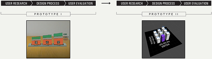
Figure 1. Design process of the two data visualisation prototypes.
An adaptation of design thinking methodology was used to iterate on the prototypes. Design thinking consists of 5 phases: empathise, define, ideate, prototype and test (Kimbell, 2011). In our case, we adapted this methodology for the design process as follows: (1) user research corresponding to the empathise and define phases; (2) design process, corresponding to the ideate and prototype phases; and (3) user evaluation corresponding to the testing phase.
Prototype I
User Research
First, the first author conducted a series of interviews with different company representatives who are used to present data visualisation in the context of presentations. In total, seven interviews with different profiles of interviewees were conducted, including three data analysts with different degrees of seniority, three managers, and one executive. A complete design-focused analysis of the interviews is found in a prior study (Bravo & Maier, 2020) and not further elaborated here as this is not required for understanding the overall RtD results related to our RQs.
The main takeaways of this study informed the direction to take in the design process. Two critical points included: (1) to reduce the amount of information presented to favour clarity in the message. This insight translated to design meant that we had to design a data visualisation that would keep the essential elements to favour clarity in the presentation. (2) To incorporate interactivity in the presentation to visualise other scenarios in the data to support shared understanding between participants.
Design Process
Entering the design process, we first identified the dataset to use. One of the participants in the prior user research provided the dataset based on real-case valuation data. Valuation data is used to determine the value of a company in the market. Based on this financial dataset, the first author outlined an initial sketch of the data visualisation in AR, keeping only essential information in the field-of-view to favour clarity in the message (see Figure 2).
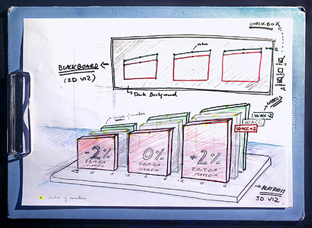
Figure 2. Original sketch of the first data visualisation prototype: including a 2D and a 3D data visualisation.
The development of the prototype started with one design sprint lasting two days with a team of three developers and the first author. One month later, an additional design sprint of three days was necessary to complete the prototype. In total, five days of full-time work from a team of four professionals was necessary to accomplish the prototype in Unity (see Figure 3).
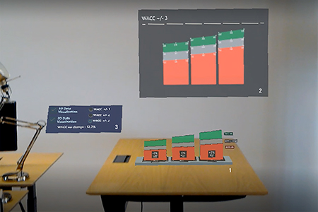
Figure 3. Screenshot of prototype I: (1) 3D data visualisation, (2) 2D data visualisation and (3) interaction panel.
In addition to the research insights gathered from the prior user research, the design process was informed by two theories to favour the understanding of the information presented: (1) cognitive fit and (2) cognitive load. Cognitive fit states that choosing to present information on a table or a graph depends on the type of task supported (Meyer, 2000; Teets et al., 2010). Cognitive load deals with keeping the essential quantity of information in the field-of-view of the user (Hart, 2012; Van der Land et al., 2013).
The data visualisation consisted of a stacked area graph (Figure 3) to enable the perception of the main information in the dataset at a single glance. We designed two variations of the stacked area graph (a 3D data visualisation and a 2D data visualisation) for both design and research purposes. On the one hand, we wanted to provide users with some filtering options (Ulusoy et al., 2018; design purpose). On the other hand, we wanted to understand the pros and cons of visualising information in 2D and 3D (research purpose). Some prior studies had already assessed the differences in 2D and 3D representations on a desktop (Amini et al., 2015; Dubel et al., 2015), in VR (Millais et al., 2018; Wagner Filho et al., 2018); and in an environment combining both screen and VR (Su et al., 2019). However, none of them had been conducted with HoloLens. The resulting prototype displayed a 2D and 3D data visualisation together with an interactive panel enabling three choices: 2D, 3D, or 2D and 3D. As illustrated in Figure 3, the 3D data visualisation was designed to be placed on a table surface. The 2D data visualisation was automatically placed on top of the 3D data visualisation, using the blackboard metaphor, and complementary to the 3D data visualisation.
Our data visualisation was made to compare general trends in the data. It displayed essential information, including the axes’ labelling, the interaction panel, and on-demand data-point values. This design decision was made following the visual information seeking mantra in which users get first a general impression of the dataset and subsequently explore the data (Shneiderman, 2003). For concrete values, we designed a feature that would reveal the value of a data point upon directing the gaze towards the data point. Therefore, our data visualisation presented a general overview of the patterns in the data together with precise information retrieved upon directing the gaze to the corresponding data point.
User Evaluation
Following the design of prototype I, user evaluation was used to gather insights about the prototype. Given the importance of participatory approaches in this context, we conducted a workshop with four domain experts specialised in presenting valuation data: an executive, a senior manager, and two data analysts. The workshop consisted of:
- Initial collective training. 10-minute dedicated to explaining how to use and wear the HoloLens.
- Individual exploration of the data visualisation. Each participant wore the HoloLens in turns. At the end of each exploration, the first author asked several questions to gain insights into the experience of visualising data in AR.
- Final collective review. Feedback dialogue between the first author and the workshop participants on the experience.
Participants agreed that the 2D data visualisation was not necessary for the experience. One of the data analysts commented: “2D is not different from what you could see on the screen, right? Because it is really obvious. So, I think it’s definitely the 3D that adds something.” The executive added: “I think the 3D version was better for the situation.” Following this insight, we decided to apply this knowledge to the prototype and eliminate the data visualisation in 2D to focus on the 3D data visualisation and the storytelling possibilities of having data and participants embedded in the same field-of-view. This concluded the first design iteration and prototype I and provided the basis for the first round of RQ focused data analysis and reflection.
Reflection on Theoretical Contribution I: The Emergence of Hybrid Presentations
This section presents the first RQ-focused data analysis iteration (see Data Collection and Analysis for an overview of the whole process). This was heavily informed by a critical insight that emerged during the design work: a clear transition from presenting with documents to presenting with AR. Here, we witnessed a break in the experience of the presentation when changing from one media channel3 (the use of documents) to another media channel3 (the use of HoloLens).
Each channel in the presentation (first, the documentation, and second, the data visualisation in AR) had been previously treated as independent, whereas the AR data visualisation was central to the overall presentation narrative. Therefore, the presentation had to be considered a single narrative entity with two channels using different media: (1) the printed documents and (2) the data visualisation AR. This constituted a breakthrough in understanding for the first author and highlighted a clear distinction from prior research where the connection between the data visualisation and the presentation had not been addressed. Hence, we coined the term hybrid presentation to refer to a presentation involving different media contributing to a unified presentation narrative. Table 2 presents the initially observed properties and exemplars of data associated with the proposed concept of a hybrid presentation. These are illustrative quotes that correspond to a broader body of evidence.
Table 2. Hybrid presentation analysis: Initial stage.
| Dimension | Property | Observation | Example quotes | Participant |
| Channels | Media | Augmented Reality | I would probably not have the glasses on in the entire meeting. | Executive |
| Printed Documents | So, I would present, you know, the case, the storyline and then I would show the results. | Executive | ||
| Seams | Disorientation at the beginning of the experience: where to look, what to look at, how to interact. | Oh! Now I used my hands, I should not do that. | Senior Manager | |
| Not knowing what to do at the beginning. | So, what should I do? | Executive | ||
| Difficulties implied in putting on the headset. | The barrier of wearing this [referring to the headset] in the meeting. | Executive | ||
| Simultaneous perception of the participants and the data in the meeting space. | You can sit around this table, look at each other, instead of turning around looking at a screen or pointing on a computer, you know. You have the same graph on the table and then we can look to each other and discuss while it’s still there. | Executive | ||
| Interaction | Introduction of the client input into the data visualisation in real-time. | I think it becomes very obvious for the client. If we add this to your business, it has this effect. If we take this out of it, it has this effect. | Senior Manager | |
| We would like to have the client input and, we have a margin of a 5% that we would like to switch around in the meeting. […] We would like to make it more dynamic to get the clients’ input into the conclusions. | Executive | |||
| Narrative | Course4 | Progressive introduction of content in AR (the data visualisation) coupled with the presentation narrative. | In a real meeting, you would probably start basically putting on the glasses without having anything on the table. Just a white base, and then you would slowly build up the storyline. Put more and more of the graphs into the table, while you are explaining what is happening. | Executive |
| If you can build it as you speak. | Senior Manager |
Table 2 shows how hybrid presentations are composed of two main dimensions: channels and narrative. Regarding channels, the presentation combined two types of media: printed documents and data visualisation in AR. The seam between the use of documents and AR was clear: participants were not familiar with the use of HoloLens and were disorientated and not knowing what to do. In addition, there were difficulties in putting on the headset for the first time.
An advantage was the simultaneous perception of data and participants in the same space, creating an integrated experience (see Figure 4). The interaction was discussed in terms of introducing new values in the data visualisation. This parameter was considered vital for the presentation of valuation data. The senior manager explained: “If we add this to your business, it has this effect. If we take this out of it, it has this effect.” In this way, the data visualisation could be updated during the meeting with the values mentioned in the conversation.
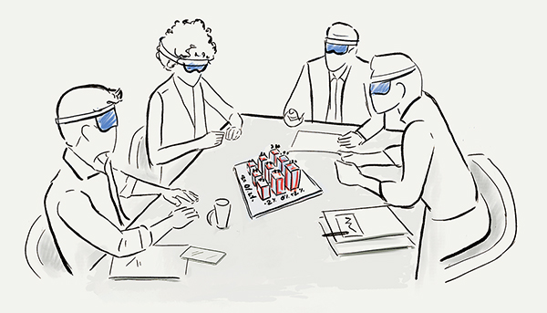
Figure 4. Illustration of a hybrid presentation with AR. Data visualisation with AR combined to printed documents in the meeting space.
Concerning narrative, the data visualisation in AR that we presented was not integrated with the presentation narrative. Participants suggested introducing it gradually in the corpus of the presentation. For example, the senior manager compared this gradual process with building up the story like Lego. In this manner, we could orient the audience’s attention to each element built upon the other. To conclude, prototype I led to the proposition of hybrid presentation as a distinct concept, with both channels and narrative. This formed the basis for the second design iteration (prototype II).
Prototype II
User Research
To start the second prototype, we conducted a 150-minute workshop to understand the presentation of valuation data better. Participants in the workshop included: five members of the AR company, the expert in valuation data and the first author. The workshop was presented in two stages:
- Presentation of valuation data. Held by the expert for 60 minutes.
- Discussion. On the use of the data visualisation in AR in the context of the presentation.
The first takeaway from the workshop helped us understand how presentations of valuation data unfold during a meeting. The presentation can be labelled as serious storytelling, using a narrative for serious contexts that are beyond entertainment purpose (Lugmayr et al., 2017). During a valuation data presentation, there is a discussion of the company’s estimated value accompanied by a rigorous analysis of the market. This data is explained with documents that include data visualisations. The narrative builds until consultants explain their calculations for the value of the company. Then, the presentation becomes a discussion of assumptions between the consultants and the clients. Here is where interactive features of the data visualisation in AR would become relevant: to visualise the values proposed both by the consultants and the clients at the end of the presentation. This would become a key design point to implement in the next phase.
The second takeaway concerned the data visualisation design. The expert giving the presentation proposed a different type of data visualisation than the one used in prototype I (see Figure 5). He proposed using a 3D bar chart, which is much more familiar and easier to understand to general audiences than the previous stacked area graph. The use of a more familiar type of data visualisation is in line with theory relating the level of understanding with familiarity in the visual representation used (Geraldi & Arlt, 2015). This suggestion would be implemented in the next phase.
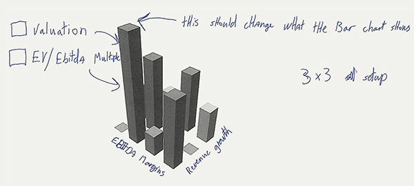
Figure 5. Proposition of different data visualisation design. Sketch made by the expert in valuation data.
Design Process
The design process proceeded differently from the first iteration: it did not consist of design sprints but of distributed work of the design and development team across two months. The data collected in the user research workshop led to two major design changes in the prototype. First, from designing a stacked area chart (prototype I) to designing a 3D bar chart (prototype II). A change in the nature of the data visualisation meant to restart the data visualisation design from scratch. We created the suggested 3D bar chart in Unity (as shown in Figure 6).
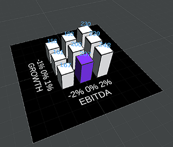
Figure 6. Data visualisation prototype II. 3D bar chart.
Second, we added real-time interactivity with the data presented. By selecting parameters on an Excel document, the numbers were automatically updated and displayed in the data visualisation. Hence, the bars increased or decreased according to the values shown in Excel. In addition, bars could be selected upon gazing at the bar and would be highlighted in a different colour (shown in purple in Figure 6). By using this interactive feature during the presentation, the consultants could include their clients’ input into the conclusion.
Furthermore, the development team added the functionality of visualising the dataset with mobile AR. This new feature enabled the deployment of the data visualisation with a mobile phone capable of displaying AR content and improved the accessibility of the data visualisation to a broader range of users. In addition, this feature was ideal for remote presentations.
User Evaluation
User evaluation consisted of a remote workshop held via Zoom. Participants in the workshop included three members from the AR company, two experts and the first author. One of the experts was familiar with the project, and the other expert, with more seniority, was new. The remote user evaluation consisted of a qualitative evaluation of the data visualisation prototype displayed through mobile AR. It was held as follows:
- Setting up the data visualisation. Each participant deployed the data visualisation with their mobile phones in the room where they were having the conference call.
- Discovery and interaction of the data visualisation. Some minutes to interact and discover the affordances of the data visualisation.
- Collective review. The design and development team proceeded to ask questions about the data visualisation shown to the experts.
During the collective review, the experts suggested recommendations on the data visualisation design to expand the possibilities of the data visualisation presented for use in a real case. Some of the suggestions were: (1) possibility of choosing between different types of data visualisations. This was understandable as different types of datasets require different types of representations. Therefore, having a more comprehensive range of data visualisations would enable to choose the most suitable visualisation adapted to the case presented. (2) Increased customisation options in the visual design of the data visualisation, such as choosing the colour palette. This was a crucial point to the experts, as their presentations were adapted to the client’s branding strategy.
Above all, this remote user session presented a novelty: the use of mobile AR. Mobile AR is a technology more familiar to the consultants that tested our prototype, and the experience was smoother than with the use of HoloLens (previous user evaluation session). In addition, this remote presentation required synchronising participants to perceive the experience at the same time. Therefore, in distributed multiuser settings, synchronising the experience at the beginning is key to the presentation’s success.
Reflection on Theoretical Contribution II: Refining Understanding of Hybrid Presentations
This section presents the second major RQ focused iteration of data analysis (see Data Collection and Analysis for an overview of the whole process). Here, we further developed the concept of hybrid presentations and elaborated on the properties of channels and narrative (Table 3). This results from the refinement of the previous analysis (Table 2) with the data collected in this second iteration. Again, the quotes are illustrative and correspond to a broader body of evidence.
Table 3. Hybrid presentation analysis: Refinement stage.
| Dimension | Property | Type | Observation | Data | Source |
| Channels | Media | Virtual | Augmented Reality | Novel element in the presentation, appearing after revealing the valuation results. |
Researcher field note excerpt |
| Physical | Printed Documents | The brochures that consultants usually print for valuation meetings. | Researcher field note excerpt | ||
| Seams | Visible Seam | The wow effect or surprise by using the data visualisation for the first time. | Oh, wow! | Data Analyst quote | |
| The use of mobile AR implied to have a smoother experience than the use of HoloLens. | Using mobile AR is easier because all participants are used to phones. | Researcher field note excerpt | |||
| Invisible Seam | The data visualisation in AR enables to change the data values presented in the graph while keeping the presentation mode. | The good thing about this tool would also be that you got to stay in presentation mode whereas if you have to pop up the Excel sheet, then you leave what I call “presentation mode”. | Senior Data Analyst quote |
||
| Staying in a presentation mindset and keeping the attention while changing data values. |
Keep the attention on the presentation and stay in that mindset. | Senior Data Analyst quote |
|||
| Interaction | Flexible | The data visualisation in AR enables to have an active discussion in the presentation by interacting with the items presented in the graph. | Think this [the data visualisation in AR] is a great tool for items that are at the centre of the discussion but not so necessary for things that are more like “passive” presentation. | Senior Data Analyst |
|
| The data visualisation in AR enables to change specific values in the graph and to visualise the effect in the data in real-time. | It could definitely add value to items like that where, you know, you are sitting and discussing “back and forth” […] where it makes sense to tweak things. | Senior Data Analyst |
|||
| Rigid | The data visualisation does not include data selection tools such as a slider. | If you could have sort of a slider that you could change the values on. | Senior Data Analyst |
||
| Narrative | Course | Integrated content | The data visualisation in AR is for key graphs in the presentation. | You wouldn’t do all your graphs on this […] it would lose importance. | Senior Data Analyst |
| Non-integrated content | The AR mobile application was not integrated in the presentation. | Introducing the mobile AR data visualisation creates a “seam” in the narrative of the presentation. |
Researcher field note excerpt |
Table 3 shows how hybrid presentations are composed of two main dimensions: channels and narrative.
With regards to channels, we refined the concept of hybrid presentations by specifying that it is a combination of virtual and physical media that interact with each other and contributed to a unified presentation narrative. Thus, the presentation combined one virtual channel corresponding to the data visualisation in AR and another physical channel corresponding to the use of documents. Furthermore, the transition between channels presented seams of different types: visible and invisible. In the literature, a visible seam is referred to as seamful design, and an invisible seam is referred to as a seamless design, where invisible seams help keep the attention and maintain the presentation mode. This insight comes from Reflection on Theoretical Contribution I and is expanded in this section.
There are two types of interaction possibilities between the channel and the narrative: either the channel is flexible (adaptable to the narrative), or it is rigid (the content of the channel is pre-defined and cannot be adapted to the narrative). In the case presented, real-time data input enabled changes to values in the data visualisation as the conversation unfolded. The experts emphasised this specific parameter as bringing value to the communication strategy used in the presentation. Experts could make the presentation active to the client’s inputs while maintaining a presentation mode.
With regards to the narrative, we differentiate between two types of integration of content in the flow of the presentation. (1) Integrated content specialises each channel for specific communication purposes in the overall presentation flow and adds value to the presentation delivery. (2) Non-integrated content creates seams in the presentation. In our study case, the data visualisation was integrated into the presentation for items that are at the centre of the discussion, as reported by the senior data analyst. However, given that it was the first time deploying mobile AR, the application was not integrated into the presentation’s content (for example, via a link).
To conclude, our RQ focused analysis from prototype II led to the refinement of the hybrid presentation concept and its relationships with the use of seams. Refinement of the theoretical insights from prototype I is mainly regarding the visibility of seams (an invisible seam helps maintain the flow of the presentation) and the flexibility of the affordances presented in the channel with regards to the narrative. Flexibility allows for an active presentation to discuss and change parameters with the audience as the presentation unfolds.
Discussion
Based on the results of the study (outlined in Tables 2 and 3), we answer our two research questions (RQs) and derive two major contributions to the design of presentations with data visualisation in AR: (1) a theoretical contribution for understanding hybrid presentations and seams (answer to RQ2), and (2) design guidelines derived from this (answer to RQ1). We elaborate and discuss these contributions in the following sections.
Hybrid Presentations
In this paper, the term hybrid presentations is the result of knowledge discovery through our RtD process and is defined as:
Hybrid presentation: a presentation involving virtual and physical media that interact with each other and contribute to a unified narrative.
Prior work has used hybrid as a notion that stands for the combination of two or more elements. In the visualisation community, the term hybrid refers to the combination of different types of visualisations within the same project for a common purpose (Arendt et al., 2015; Su et al., 2019). In the VR and AR community, the term is used to refer to the combination of both VR and AR for data analysis and presentation (Cavallo et al., 2019), as an extension of current data analysis tools (Wang et al., 2020) and in the context of smart homes (Seo et al., 2016). However, this has not been previously connected to the specific properties of presentations.
This distinction is essential for three main reasons. First, presentations use affordances from the real-world (through physical media that are documents in our study) and from the virtual world (through computer-generated media that is a data visualisation in AR in our study). Understanding the affordances of physical media combined with virtual media such as VR and AR becomes a key asset for storytelling and design in presentations. In media theory, there is a distinction between multi-, cross-, and omnichannel communication for delivering a message that supports several channels (Yrjölä et al., 2018). However, to our knowledge, these terms have not been previously connected to the context of presentations. Second, a presentation has a unified narrative as part of a communication strategy (Barry & Elmes, 1997). Therefore, taking into account the affordances of each channel towards a common and unified narrative is crucial to the coherent design of the presentation and a credible narrative. Again, this narrative element is lacking in prior work, particularly related to seams, which has to date only focused on technological aspects (Chalmers et al., 2003; Inman & Ribes, 2019; Ishii et al., 1994). Finally, when compared to media theory, the framework presented here is similar to cross-channel communication where the user chooses an appropriate combination of channels for purchasing processes (Yrjölä et al., 2018) with the difference that we apply the concept to presentations that are distributed among several channels that include physical and virtual media.
Given these distinctions, we illustrate an understanding of hybrid presentations as in Figure 7. This shows how hybrid presentations reflect a combination of physical media and virtual media with a unified presentation narrative. This is the sine qua non condition for a hybrid presentation. Interaction happens between media channels, and seams are found at the intersection of channels.
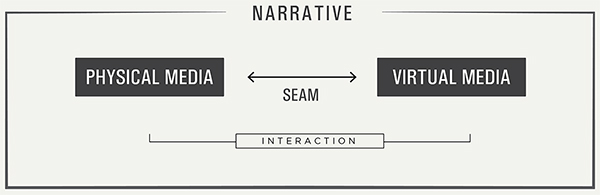
Figure 7. Hybrid presentation. Defined as a presentation that includes virtual and physical media that interact with each other across seams and contribute to a unified narrative.
Seams in Hybrid Presentations
Seams correspond to the transition between media channels and are about integrating a channel in the overall presentation flow. Literature on seams is controversial: there is the perspective that seams need to be minimised to make an experience seamless and thus make invisible the space of transition from one media channel to the other by creating continuity. This continuity is defined as integration in seamless design (Ishii et al., 1994). Another perspective aims for seamful experiences by treating seams as a resource by making them visible instead of trying to minimise them (Chalmers et al., 2003). However, these discussions have primarily focused on seams as technical discontinuities, also known as breaks in the technology (Chalmers et al., 2003; Inman & Ribes, 2019; Ishii et al., 1994).
In contrast, seams in hybrid presentations have two distinct dimensions: channel and narrative. An example of this is found in the introduction of the AR headset during a hybrid presentation. It is not possible to conceal the headset. Therefore we need to find a coherent way to incorporate the seam created by the change of channel (from the use of documents to the use of an AR headset) into the presentation’s narrative. This is contrary to some expectations from media communication in technology: “We expect media to be transparent in interpersonal communication. This means that we expect that the media will not be intrusive and the full effect of the relational message can be experienced” (Biocca & Levy, 1995, p. 285). Therefore, in the design of seams in hybrid presentations, it is essential to consider both channel and narrative, with the understanding that while channel seams can not usually be concealed, they can be mitigated or even leveraged by combining them with them the proper presentation narrative.
This interaction between channel- and narrative seams thus expands prior research on seams and highlights a novel aspect of hybrid presentations. Furthermore, this new situation brings the opportunity to think about seams in the context of a narrative: to design seams taking into account the narrative and not only considering seams as a consequence of technological implementation. In particular, we highlight the need to take a narrative perspective to seams to design a presentation with a coherent flow across technological discontinuities. Table 4 presents the differences in seam visibility between literature (channel perspective) and the one presented in this paper (narrative perspective). We emphasise that both perspectives are complementary, and considering both can guide a more effective orchestration of seams in hybrid presentations.
The channel perspective considers a visible seam as a break between media that may lead to cognitive load (Ishii et al., 1994). The invisible seam provides a smooth experience between media in the presentation. The narrative perspective considers the intentional design of seams to be aligned with the storyline and overall communication strategy. This perspective resonates with Chalmers’ affirmation on using seams as a resource for interaction (Chalmers et al., 2003). The designer of the presentation may design an interaction that breaks the narrative flow (visible seam) or that supports (invisible seam) the narrative flow. The former option would be in line with seamless design and the latter with seamful design. In the narrative context, seams may become attentional anchors that guide user behaviour. For example, in the above-noted example of putting on the headset, the participant shifts from a space that (s)he knows towards an unknown space (Furness, 2020). There is a need to orchestrate properly or choreograph that moment in Furness’s words. Therefore, the strategy is to design the presentation considering that seam to align the presentation narrative with it and embed the seam as a resource in the communication strategy.
Together, the concept of hybrid presentations (Figure 7) and the associated decomposition of channel and narrative seams (Table 4) extend understanding of how to orchestrate seams in an AR data visualisation, answering our second research question. In the next section, we provide some concrete design guidelines.
Design Guidelines for Hybrid Presentations and Data Visualisation in AR
Guidelines for designers fall into two main groups: (1) seams in hybrid presentations (RQ2) and (2) data visualisation in AR in presentations (RQ1).
Guidelines for Seams in Hybrid Presentations
- Consider both channel and narrative seams. Seams should be orchestrated following (1) the channel, determining the technological affordances and limitations of each channel, and (2) the aspect to convey in the narrative. Both channel and narrative are complementary perspectives.
- Synchronise seams. In presentations involving more than one person, it is vital to synchronise the seam moment between the audience. Therefore, the transition from one channel to another needs to be synchronised to live the seam as a collective experience. This is equally applicable in distributed settings.
- Mitigate the use of unfamiliar channels. The choice of an unfamiliar channel to the target audience creates a more visible seam. We observed this phenomenon contrasting the channels used in the user evaluation in prototype I (held with HoloLens) and the user evaluation in prototype II (held remotely using mobile AR). Both hardware created a seam in the moment of setting up the data visualisation. However, comparing the use of one channel with the other, we realised that mobile AR was smoother and easier to adopt for the audience. Therefore, we assume that familiar technology to the audience will result in a less visible seam. In addition, from a narrative perspective, the use of an unfamiliar technology had the risk of distracting the audience from the content presented, given that they may shift their attention to the hardware used. Thus, there is the risk that the medium becomes the message (McLuhan, 2017).
These guidelines are intended for the use of designers of hybrid presentations. They apply to a wide range of hybrid presentation use cases, from presentations that merge VR with documents to presentations that combine PowerPoint on a screen with tangible media such as a touchscreen.
Guidelines for an AR Data Visualisation in Presentations
These guidelines respond to our initial motivation for this research article: exploring the design principles applied to data visualisation in presentations in AR. We found that introducing novelty in visual representations that make use of new display technologies was not recommended. For example, suppose that you wear a headset for the first time, and on top of that, the information presented has no previous relation to what you are used to. A frame of reference is lacking. Thus, adopting familiar types of data visualisation and user interfaces is fundamental to presenting information in AR. While the guidelines below are not new per se, they take on particular significance and context-specific focus regarding new display types of information in presentations. Terms such as familiarity, simplicity, and flexibility are favoured; because the visualisation should be an enabler that is easily decoded to support the flow of the presentation.
- Simplicity in the presentation design to favour understanding and attention. This statement is in line with the field comment in (Bravo & Maier, 2020): You need to put in a real effort to make it simple enough to explain and make people understand. This includes two aspects: (1) the level of detail of the data presented and the complexity that should be comparable to the user’s level of knowledge; (2) Having the minimum number of elements required in the field-of-view of the user, to guide their attention and focus in the presentation. This includes showing one visualisation at a time. Exceptionally, some cases may present a combination of two data visualisations simultaneously. For example, prototype I combined a 2D and a 3D version of the same dataset. We combined both to provide the user with greater accuracy in perceiving the values in the data (Cleveland & McGill, 1985; Millais et al., 2018).
- Familiarity with the data visualisation to favour confidence. There should be a balance between familiarity and novelty in terms of display and in terms of data visualisation used. When a display is unfamiliar to the target audience (such as in this study), familiarity with the data visualisation is critical. Familiar data visualisations are recommended because they foster confidence in the information presented. Literature in project management (Geraldi & Arlt, 2015; Killen et al., 2020) and visualisation address this point (Dimara et al., 2017; Lyi et al., 2021; Van Biljon & Osei-Bryson, 2020). For example, although we initially designed a stacked area chart in prototype I (an unfamiliar type of data visualisation to our target audience), we changed to bar charts in prototype II, a much more familiar type of data visualisation.
- Flexibility in the interaction design to favour dynamic thinking. A flexible interaction brings a dynamic quality that allows a presenter to restructure a problem according to the perception of the situation (Kim & Maher, 2008). This parameter was emphasised during all our exchanges with the participants. The motivation was to introduce the values mentioned by the company owners and executives into the presentation when discussing and negotiating through real-time input of data. In this way, the data visualisation would create a live visual representation of the conversation and negotiation.
These guidelines apply to a broader context than the use of AR data visualisation in presentations given that they build on a general framework focused on the understanding of information in presentations.
Limitations and Future Work
Our work has led to the development of insights on hybrid presentations with data visualisation in AR. The derived insights are propositional and further study and testing is required. Specifically, the Research through Design (RtD) process used in this study is considered as practice-based design research, favouring participatory data collection. This may lead to group bias in the data collected and thus further case studies or experiments would be valuable. This could take the form of additional cases using the hybrid presentation framework (Figure 7) to identify contrasting contexts and thus more effectively refine how the various elements relate and act in different settings. Alternatively, experimental approaches could be used to examine the interaction between the different types of seams (Table 4) and their effect on, for example, user understanding. Future research may inquire and test differences in presenting information with channels that combine different media from the virtuality continuum (Milgram & Kishino, 1994). In addition, future research may explore the notion of touch and tangibility with seams in presentations (Nam & Kim, 2011).
Other future directions for hybridity can be expected in the years to come as merged reality and virtuality becomes the new normal (Ishikura, 2020). The COVID-19 pandemic and resulting social distancing measures has accelerated the process of integrating hybrid experiences in institutions such as museums: “The museum, as an intelligent hybrid of analog and digital, must open as many doors as possible to enable its public to take a critical approach to social developments. […] It must manage the balancing act between the physical and virtual worlds in order to reach the public of the twenty-first century” (ZKM, 2020). The entertainment sector is also going in this direction, and according to Vitillo (2020), proposing venues that bridge the gap between virtual and real. The term phygital has also recently emerged to describe experiences that connect physical and digital environments (Townsend, 2018). The concept is even extended to present the new type of workplaces in the post-COVID-19 era, defined as phygital spaces (Giacomelli, 2020). Hence, the proposed hybrid presentation concept has potential to inform numerous aspects of future design research in this area.
Conclusions
Advancements in AR technologies permit new ways of presenting and experiencing data beyond the screen. This research aimed to answer two main questions: (1) How to design an AR data visualisation in presentations? and (2) How to orchestrate seams in presentations that include AR? For this, an in-depth Research through Design case study was conducted. The study included two data visualisation prototypes in HoloLens, each of them developed over three phases based on a design thinking methodology: user research, design process, and user evaluation. This paper makes three main contributions and answers our two research questions. First, we propose the concept of hybrid presentations as a type of presentation that blends, in the same narrative, at least two channels that combine physical and virtual media (Figure 7). Second, we explain how to orchestrate seams in hybrid presentations (answering RQ2) by considering two perspectives on seam visibility: channel and narrative (Table 4). Seams are understood as transitions between media channels and may be visible (when the transition presents breaks) or invisible (when the transition is continuous). Our second contribution also introduces a narrative perspective on seams, and advocates for maintaining a coherent storyline and flow across media channels. Third, we translate these insights into concrete guidelines for designers dealing with hybrid presentations and design of AR data visualisations in presentations more generally (answering RQ1).
Looking forward, it appears that hybrid presentations are a natural evolution in the presentation of information. We bring to the fore in this paper the presentation of information focusing on the narrative, despite discontinuities caused by changes in media channels. Designing seams focusing on the narrative becomes a priority when bringing the message and communication experience to the forefront. This is particularly important in an era where technological means of presentation are rapidly changing. It forms the basis for identifying a number of directions for future research at the crossroads of design and communication research, and highlights the need for a more human-centred approach, which prioritises the delivery of message and experience.
Acknowledgments
This research has partially been funded by the H2020 EU Framework Programme for Research and Innovation through the EURITO project under Grant Agreement n° 770420. The authors would also like to thank the industry collaborator Virsabi ApS for developing the immersive visualisation in AR and participating in the data collection and recruitment of study participants.
Endnotes
- 1. Media: In this article, the term media is referred to as media of dissemination that includes writing, printing, and electronic broadcasting (Luhmann, 1995).
- 2. Explanatory and experiential data visualisation: Cairo (2013) defines three types of data visualisations: exploratory, experiential, and explanatory. (1) Exploratory data visualisations aim to explore datasets to find insights. They are used for data analysis. (2) Experiential data visualisations create an emotion and may lead to action. (3) Explanatory data visualisations explain the insights found in the data. This type of data visualisation is used in reports and presentations. This taxonomy allows for the combination of several types in the same data visualisation. For instance, the example we present in this article merges types 2 and 3.
- 3. Channel: There are many definitions of the term in media theory. Here we refer to the actual technology over which media are distributed that includes storytelling features (Lugmayr et al., 2017).
- 4. Course: A course is the sum of the narrated plot, including an audience’s interpretation of events. It orientates the unfolding of the story and implies knowledge creation (Lugmayr et al., 2017).
References
- Amini, F., Rufiange, S., Hossain, Z., Ventura, Q., Irani, P., & McGuffin, M. J. (2015). The impact of interactivity on comprehending 2D and 3D visualizations of movement data. IEEE Transactions on Visualization and Computer Graphics, 21(1), 122-135. https://doi.org/10.1109/TVCG.2014.2329308
- Arendt, D. L., Burtner, R., Best, D. M., Bos, N. D., Gersh, J. R., Piatko, C. D., & Paul, C. L. (2015). Ocelot: User-centered design of a decision support visualization for network quarantine. In Proceedings of the Symposium on Visualization for Cyber Security. New York, NY: IEEE. https://doi.org/10.1109/VIZSEC.2015.7312763
- Azuma, R., Baillot, Y., Behringer, R., Feiner, S., Julier, S., & MacIntyre, B. (2001). Recent advances in augmented reality. IEEE Computer Graphics and Applications, 21(6), 34-47. https://doi.org/10.1109/38.963459
- Bach, B., Sicat, R., Beyer, J., Cordeil, M., & Pfister, H. (2018). The hologram in my hand: How effective is interactive exploration of 3D visualizations in immersive tangible augmented reality? IEEE Transactions on Visualization and Computer Graphics, 24(1), 457-467. https://doi.org/10.1109/TVCG.2017.2745941
- Barry, D., & Elmes, M. (1997). Strategy retold: Toward a narrative view of strategic discourse. Academy of Management Review, 22(2), 429-452. https://doi.org/10.5465/AMR.1997.9707154065
- Billinghurst, M., Kato, H., & Poupyrev, I. (2008). Tangible augmented reality. Courses presented at the SIGGRAPH ASIA Conference. Suntec Singapore International Convention & Exhibition Centre, Singapore. https://doi.org/10.1145/1508044.1508051
- Biocca, F., & Levy, M. R. (1995). Communication in the age of virtual reality. Mahwah, NJ: Lawrence Erlbaum Associates. https://doi.org/10.1016/0363-8111(95)90123-X
- Brandt, E., & Binder, T. (2007). Experimental design research: Genealogy, intervention, argument. In Proceedings of the 2nd Conference of International Association of Societies of Design Research. Hong Kong, China: IASDR.
- Bravo, A., & Maier, A. M. (2020). Immersive visualisations in design: Using augmented reality (AR) for information presentation. In Proceedings of the 16th Conference on Design Society (pp. 1215-1224). Cambridge, UK: Cambridge University Press. https://doi.org/10.1017/DSD.2020.33
- Butscher, S., Hubenschmid, S., Müller, J., Fuchs, J., & Reiterer, H. (2018). Clusters, trends, and outliers. In Proceedings of the Conference on Human Factors in Computing Systems (No. 90). New York, NY: ACM. https://doi.org/10.1145/3173574.3173664
- Cairo, A. (2013). The functional art: An introduction to information graphics and visualization. Berkeley, CA: New Riders. https://doi.org/10.5860/choice.50-3652
- Cavallo, M., Dholakia, M., Havlena, M., Ocheltree, K., & Podlaseck, M. (2019). Dataspace: A reconfigurable hybrid reality environment for collaborative information analysis. In Proceedings of the Conference on Virtual Reality and 3D User Interfaces (pp. 145-153). New York, NY: IEEE. https://doi.org/10.1109/VR.2019.8797733
- Chalmers, M., MacCol, I., & Bell, M. (2003). Seamful design: Showing the seams in wearable computing. In Proceedings of the 3rd IEE Conference on Eurowearable (pp. 11-16). Stevenage, UK: IET. https://doi.org/10.1049/ic:20030140
- Choi, Y. M., & Mittal, S. (2015). Exploring benefits of using augmented reality for usability testing. In Proceedings of the 20th International Conference on Engineering Design (Vol. 4, pp. 101-110). Atlanta, GA: Georgia Institute of Technology.
- Cleveland, W. S., & McGill, R. (1985). Graphical perception and graphical methods for analyzing scientific data. Science, 229(4716), 828-833. https://doi.org/10.1126/science.229.4716.828
- Dimara, E., Bezerianos, A., Dragicevic, P., Dimara, E., Bezerianos, A., Dragicevic, P., …Dragicevic, P. (2017). The attraction effect in information visualization. IEEE Transactions on Visualization and Computer Graphics, 23(1), 471-480. https://doi.org/10.1109/TVCG.2016.2598594
- Dubel, S., Rohlig, M., Schumann, H., & Trapp, M. (2015). 2D and 3D presentation of spatial data: A systematic review. In Proceedings of the VIS International Workshop on 3DVi (pp. 11-18). New York, NY: IEEE. https://doi.org/10.1109/3DVis.2014.7160094
- Dwyer, T., Marriott, K., Isenberg, T., Klein, K., Riche, N., Schreiber, F., …Thomas, B. H. (2018). Immersive analytics: An introduction. Lecture Notes in Computer Science, 11190, 1-23. https://doi.org/10.1007/978-3-030-01388-2_1
- Ens, B., Bach, B., Cordeil, M., Engelke, U., Serrano, M., Willett, W., …Yang, Y. (2021). Grand challenges in immersive analytics. In Proceedings of the Conference on Human Factors in Computing Systems (pp. 1-17). New York, NY: ACM. https://doi.org/10.1145/3411764.3446866
- Furness, T. (2020). Virtual world society: A manifesto for virtual reality. Retrieved from https://www.awexr.com/usa-2020/agenda/1642-virtual-world-society-a-manifesto-for-virtual-real
- Geraldi, J., & Arlt, M. (2015). Visuals matter! Delaware County, PA: Project Management Institute.
- Giaccardi, E. (2019). Histories and futures of research through design: From prototypes to connected things. International Journal of Design, 13(3), 139-155.
- Giacomelli, G. (2020, June 2). Enabling a “phygital” post-COVID-19 corld of work. CXOtoday.com. Retrieved from https://www.cxotoday.com/digital-enterprise/enabling-a-phygital-post-covid-19-world-of-work/
- Hart, S. G. (2012). Nasa-task load index (NASA-TLX); 20 years later. In Proceedings of the Human Factors and Ergonomics Society Annual Meeting, 50(9), 904-908. https://doi.org/10.1177/154193120605000909
- Hubenschmid, S., Zagermann, J., Butscher, S., & Reiterer, H. (2021). Stream: Exploring the combination of spatially-aware tablets with augmented reality head-mounted displays for immersive analytics. In Proceedings of the Conference on Human Factors in Computing Systems (No. 469). New York, NY: ACM. https://doi.org/10.1145/3411764.3445298
- Inman, S., & Ribes, D. (2019). “Beautiful seams”: Strategic revelations and concealments. In Proceedings of the Conference on Human Factors in Computing Systems (No. 278). New York, NY: ACM. https://doi.org/10.1145/3290605.3300508
- Ishii, H., Kobayashi, M., & Arita, K. (1994). Iterative design of seamless collaboration media. Communications of the ACM, 37(8), 83-97. https://doi.org/10.1145/179606.179687
- Ishikura, T. (2020). Science ministry: In 2040, humans can talk with their pets. The Asahi Shimbun. Retrieved June 21, 2020, from http://www.asahi.com/ajw/articles/13462580
- Killen, C. P., Geraldi, J., & Kock, A. (2020). The role of decision makers’ use of visualizations in project portfolio decision making. International Journal of Project Management, 38(5), 267-277. https://doi.org/10.1016/j.ijproman.2020.04.002
- Kim, M. J., & Maher, M. L. (2008). The impact of tangible user interfaces on spatial cognition during collaborative design. Design Studies, 29(3), 222-253. https://doi.org/10.1016/j.destud.2007.12.006
- Kimbell, L. (2011). Rethinking design thinking: Part I. Design and Culture, 3(3), 285-306. https://doi.org/https://doi.org/10.2752/175470811X13071166525216
- Krogh, P. G., Markussen, T., & Bang, A. L. (2015). Ways of drifting–Five methods of experimentation in research through design. In Proceedings of the International Conference on Research into Design (pp. 39-50). New York, NY: Springer. https://doi.org/10.1007/978-81-322-2232-3_4
- Langner, R., Satkowski, M., Büschel, W., & Dachselt, R. (2021). Marvis: Combining mobile devices and augmented reality for visual data analysis. In Proceedings of the Conference on Human Factors in Computing Systems (No. 468). New York, NY: ACM. https://doi.org/10.1145/3411764.3445593
- Lehmann, M. L. (n.d.). Hybrid architectural design tools for extraordinary presentations. Retrieved July 28, 2020, from https://www.marialorenalehman.com/blog/hybrid-architectural-design-tools-for-extraordinary-presentations/
- Lugmayr, A., Sutinen, E., Suhonen, J., Sedano, C. I., Hlavacs, H., & Montero, C. S. (2017). Serious storytelling–A first definition and review. Multimedia Tools and Applications, 76(14), 15707-15733. https://doi.org/10.1007/s11042-016-3865-5
- Luhmann, N. (1995). Social systems. Stanford, CA: Stanford University Press.
- Lyi, S., Jo, J., & Seo, J. (2021). Comparative layouts revisited: Design space, guidelines, and future directions. IEEE Transactions on Visualization and Computer Graphics, 27(2), 1525-1535. https://doi.org/10.1109/TVCG.2020.3030419
- Marriott, K., Chen, J., Hlawatsch, M., Itoh, T., Nacenta, M. A., Reina, G., & Stuerzlinger, W. (2018). Immersive analytics: Time to reconsider the value of 3D for information visualisation. Lecture Notes in Computer Science, 11190, 25-55. https://doi.org/10.1007/978-3-030-01388-2_2
- McLuhan, M. (2017). Understanding media. Berkeley, CA: Gingko Press.
- Meyer, J. (2000). Performance with tables and graphs: Effects of training and a visual search model. Ergonomics, 43(11), 1840-1865. https://doi.org/10.1080/00140130050174509
- Microsoft. (2020). Core concepts overview. Retrieved from https://docs.microsoft.com/en-us/windows/mixed-reality/core-concepts-landingpage
- Miles, M. B., Huberman, A. M., & Saldana, J. (2014). Qualitative data analysis: A methods sourcebook. Thousand Oaks, CA: Sage. https://doi.org/10.1080/10572252.2015.975966
- Milgram, P., & Kishino, F. (1994). A taxonomy of mixed reality visual displays. IEICE Transacations on Information Systems, E77-D(12), 1321-1329.
- Millais, P., Jones, S. L., & Kelly, R. (2018). Exploring data in virtual reality: Comparisons with 2D data visualizations. In Proceedings of the Conference on Human Factors in Computing Systems (Ext. Abs., No. LBW007). New York, NY: ACM. https://doi.org/10.1145/3170427.3188537
- Müller, F., Lex, S., Briegel, C., & Lindemann, U. (2004). An innovative user interface for intuitive 3D-sketching in an augmented reality environment. In Proceedings of the 8th International Design Conference (pp. 793-798). Glasgow, UK: The Design Society.
- Nam, T. J., & Kim, C. (2011). Design by tangible stories: Enriching interactive everyday products with ludic value. International Journal of Design, 5(1), 85-98.
- O’Hare, J., Dekoninck, E., Mombeshora, M., Martens, P., Becattini, N., & Boujut, J. -F. (2018). Defining requirements for an augmented reality system to overcome the challenges of creating and using design representations in co-design sessions. CoDesign, 16(2), 111-134. https://doi.org/10.1080/15710882.2018.1546319
- Parshina-Kottas, Y., & Patanjali, K. (2020). Evolution of immersive storytelling at The New York Times. AWE 2020. Retrieved May 28, 2020, from https://online.awexr.com/meetings/3d8QkDvN2LKHuZvcZ
- Seo, D. W., Kim, H., Kim, J. S., & Lee, J. Y. (2016). Hybrid reality-based user experience and evaluation of a context-aware smart home. Computers in Industry, 76, 11-23. https://doi.org/10.1016/j.compind.2015.11.003
- Shen, Y., Ong, S. K., & Nee, A. Y. C. (2010). Augmented reality for collaborative product design and development. Design Studies, 31(2), 118-145. https://doi.org/10.1016/j.destud.2009.11.001
- Shneiderman, B. (2003). The eyes have it: A task by data type taxonomy for information visualizations. In Proceedings of the Symposium on Visual Languages (pp. 364-371). New York, NY: IEEE. https://doi.org/10.1016/B978-155860915-0/50046-9
- Speier, C. (2006). The influence of information presentation formats on complex task decision-making performance. International Journal of Human Computer Studies, 64(11), 1115-1131. https://doi.org/10.1016/j.ijhcs.2006.06.007
- Su, S., Perry, V., & Dasari, V. (2019). Hybrid 2D and 3D visual analytics of network simulation data. In Proceedings of the International Conference on Big Data (pp. 3992-3999). New York, NY: IEEE. https://doi.org/10.1081/E-EEE2-120046011
- Teets, J. M., Tegarden, D. P., & Russell, R. S. (2010). Using cognitive fit theory to evaluate the effectiveness of information visualizations: An example using quality assurance data. IEEE Transactions on Visualization and Computer Graphics, 16(5), 841-853. https://doi.org/10.1109/TVCG.2010.21
- Townsend, S. (2018, January 8). 2018 will be the year of proof. Forbes. Retrieved from https://www.forbes.com/sites/solitairetownsend/2018/01/08/2018-will-be-the-year-of-proof/
- Ulusoy, T., Danyluk, K., & Willett, W. (2018). Beyond the physical: Examining scale and annotation in virtual reality visualizations. Retrieved from https://prism.ucalgary.ca/bitstream/handle/1880/108786/2018-10-10-BeyondThePhysical-TechReport.pdf?sequence=5&isAllowed=y
- Van Biljon, J., & Osei-Bryson, K. M. (2020). The communicative power of knowledge visualizations in mobilizing information and communication technology research. Information Technology for Development, 26(4), 637-652. https://doi.org/10.1080/02681102.2020.1821954
- Van der Land, S., Schouten, A. P., Feldberg, F., van den Hooff, B., & Huysman, M. (2013). Lost in space? Cognitive fit and cognitive load in 3D virtual environments. Computers in Human Behavior, 29(3), 1054-1064. https://doi.org/10.1016/j.chb.2012.09.006
- Vaughan, L. (Ed.). (2017). Practice-based design research. London, UK: Bloomsbury.
- Vitillo, A. (2020). Alone together: What I have learned organizing a big VR concert. Retrieved from https://skarredghost.com/2020/07/04/how-to-organize-vr-concert-lessons/
- Wacker, J. G. (2008). A conceptual understanding of requirements for theory-building research: Guidelines for scientific theory building. Journal of Supply Chain Management, 44(3), 5-15. https://doi.org/10.1111/j.1745-493X.2008.00062.x
- Wagner Filho, J. A., Rey, M. F., Freitas, C. M. D. S., & Nedel, L. (2018). Immersive analytics of dimensionally-reduced data scatterplots. In Proceeding of the 25th Conference on Virtual Reality and 3D User Interfaces. New York, NY: IEEE. https://doi.org/10.1109/VR.2018.8447558
- Wang, X., Besançon, L., Rousseau, D., Sereno, M., Ammi, M., & Isenberg, T. (2020). Towards an understanding of augmented reality extensions for existing 3D data analysis tools. In Proceedings of the Conference on Human Factors in Computing Systems (pp. 1-13). New York, NY: ACM. https://doi.org/10.1145/3313831.3376657
- Webb, A. K., Vincent, E. C., Patnaik, P., & Schwartz, J. L. (2016). A systems approach for augmented reality design. In Proceedings of the International Conference on Augmented Connition (pp. 382-389). Berlin, Germany: Springer. https://doi.org/10.1007/978-3-319-39952-2_37
- Weiser, M. (1991). The computer for the 21st century. Scientific American, 265(3), 94-104. https://doi.org/10.1017/CBO9781107415324.004
- West, R., Parola, M. J., Jaycen, A. R., & Lueg, C. P. (2015). Embodied information behavior, mixed reality and big data. In Proceedings of the Conference on the Engineering Reality of Virtual Reality (Vol. 9392, No. 93920E). Bellingham, WA: SPIE. https://doi.org/10.1117/12.2083519
- Whyte, J., Ewenstein, B., Hales, M., & Tidd, J. (2008). Visualizing knowledge in project-based Work. Long Range Planning, 41(1), 74-92. https://doi.org/10.1016/j.lrp.2007.10.006
- Yin, R. (2018). Case study research and applications: Design and methods (6th ed.). Thousand Oaks, CA: Sage.
- Yrjölä, M., Saarijärvi, H., & Nummela, H. (2018). The value propositions of multi-, cross-, and omni-channel retailing. International Journal of Retail and Distribution Management, 46(11-12), 1133-1152. https://doi.org/10.1108/IJRDM-08-2017-0167
- ZKM. (2020). The museum of the future is no longer a museum. Retrieved July 3, 2020, from https://zkm.de/en/event/2020/07/the-museum-of-the-future-is-no-longer-a-museum
