Package Design: Colour Harmony and Consumer Expectations
Shuo-Ting Wei 1,*, Li-Chen Ou 2, M. Ronnier Luo 3 and John B. Hutchings 3
Department of Visual Communication Design, TransWorld University, Yunlin, Taiwan
Graduate Institute of Applied Science and Technology, National Taiwan University of Science and Technology, Taipei, Taiwan
The University of Leeds, Leeds, UK
This study investigated the relationship between contextualised colours and psychological responses using a semantic differential method. Fruit juice cartons were used as model product packs to elicit psychological responses of several aspects: judgments of the colour harmony of the packages and liking, quality and freshness of the products. Three major findings were concluded. First, colour harmony of fruit juice packages, liking and quality of the products were highly correlated. Judgments of these three aspects were influenced by the chromatic and hue differences between the colours of the packages and the colours of fruit pictures on the packages. Second, visual appraisal of freshness was affected by the lightness and chroma of the package colours. The chroma sum of the package colours and fruit colours also contributed to the expectation of freshness. Finally, colour harmony principles may differ according to the context within which colours are used. In the context of juice packaging, only two conventional colour harmony principles are tenable.
Keywords – Colour Harmony, Consumer Expectations, Contextualised Colours, Juice Packaging.
Relevance to Design Practice – This study shows how colour harmony might differ from the conventional principles when the context (i.e., fruit juice) is considered. Designers should therefore take into account the properties or categories of the products when using colours as a medium to communicate the characteristics of the products to potential customers.
Citation: Wei, S. T., Ou, L. C., Luo, M. R., & Hutchings, J. B. (2014). Package design: Colour harmony and consumer expectations. International Journal of Design, 8(1), 109-126.
Received January 3, 2012; Accepted September 20, 2013; Published April 30, 2014.
Copyright: © 2014 Wei, Ou, Luo and Hutchings. Copyright for this article is retained by the authors, with first publication rights granted to the International Journal of Design. All journal content, except where otherwise noted, is licensed under a Creative Commons Attribution-NonCommercial-NoDerivs 2.5 License. By virtue of their appearance in this open-access journal, articles are free to use, with proper attribution, in educational and other non-commercial settings.
*Corresponding Author: tim.stw@gmail.com
Shuo-Ting Wei is an assistant professor of visual communication design at the TransWorld University in Taiwan. He received his doctorate in colour science from the University of Leeds, UK in 2010. His recent publications include a journal paper “Optimisation of Food Expectations Using Product Colour and Appearance” (Wei, et al. 2012) and a conference paper “TAPOS: A Tactile Pattern Order System for Blind People” (Wei 2013). His research interests include semantics, imagery and harmony of colour and visual texture. He is currently working on a research project regarding imageries of colour and visual texture for different materials.
Li-Chen Ou is an Associate Professor at the Graduate Institute of Applied Science and Technology, National Taiwan University of Science and Technology, Taiwan. Dr. Ou received a first degree (B. Eng.) from the Department of Industrial Design, National Cheng Kung University, Taiwan in 1995, an M. A. from the Institute of Applied Arts, National Chiao Tung University, Taiwan in 1997, and a Ph. D. from the former Colour & Imaging Institute, University of Derby, UK in 2004. Dr. Ou is the Technical Committee Chair of the CIE TC1-86 “Models of Colour Emotion and Harmony”, an international committee for research and standardization of colour emotion and harmony. He is also the Associate Director of CIE-Taiwan Division 1: Vision and Color. Dr. Ou’s areas of interest include colour emotion, colour harmony, image emotion, affective design, and user experience design.
M. Ronnier Luo is a Professor of Colour and Imaging Science at Leeds University (UK), a Global Expert Professor at Zhejiang University (China) and a Chair Professor at the National Taiwan University of Science and Technology. He is also the Director of the Division 1 (Colour and Vision) of the International Commission on Illumination (CIE), which is responsible for providing standards of colour and lighting specifications. He received his PhD in 1986 at the University of Bradford in the field of colour since. He has over 400 publications in relation to colour. He is a Fellow of the Society for Imaging Science and Technology, and of the Society of Dyers and Colourists. He is also the Chief Editor of the Encyclopaedia of Colour Science and Technology, to be published by Springer.
John B. Hutchings is a physicist who was brought up in industry finishing his time with Unilever Research as a specialist in colour and appearance. The approach to the subject developed during this period has since been broadened into studies on colour in biological nature, oral tradition, archaeology, ethics, language, and an extension of the food appearance philosophy into the wider world of design. At present he is coordinating industry/academia research projects in colour and imaging science at Leeds University, where he is a Visiting Professor. John is the author of Food Color and Appearance, now in its second edition, and Expectations in the Food Industry—Impact of Color and Appearance. He holds the Deane B Judd Award of the International Colour Association, the Newton Medal of the Colour Group (GB), and is an honorary member of the Colour Group (GB) and the Grupo Argentino del Color.
Introduction
Background
Colour plays an important role in design. It is a trigger to arouse viewers’ emotions and a carrier that designers use to deliver information. Colours that are viewed together and produce pleasing affective responses are considered to be in harmony (Burchett, 2002). In product design, it has been suggested that positive emotion would not only add extra value to a product but can further increase the possibility of a product being purchased (Cho & Lee, 2005; Desmet, Overbeeke, & Tax, 2001; Jordan, 1998). Therefore, when designing products, designers endeavour to establish emotional connections among ideas, products, services and brands (Crossley, 2003). Using harmonic colours is one way to create positive emotional connections. Most of the extant colour harmony principles found in art or design textbooks are based on well-controlled, simple, uniform colours. How well these principles are applicable to contexts that are more representative of real design situations is largely unknown.
The context within which colours are used also affects how colours are perceived. For instance, the colour brown may associate with natural and warm feelings when involving wooden materials in interior design. However, the same colour may associate with different feelings such as elegant and dignified when used for a coat. More examples can be seen in a recent study examining the affective responses for 2-dimensional coloured shapes and 3-dimensional objects (Lee, Luo, & Ou, 2009). Therefore, if we are to examine how the use of colours might associate with different psychological responses or encourage positive emotions with the goal of obtaining information useful for future applications in product design, a pre-selected context (e.g., wooden products or clothes) should be used consistently for all the colours examined.
Research Aim
In this study, fruit juice containers are used as the context to establish a practical method for studying the relationship between colour and psychological responses. Fruit juice is one of the most popular food products and its market grows almost every year. Despite the global recession in 2009, the juice market still increased by 2% globally. In 2010 the market growth went back to pre-recession rate at 5%. Euromonitor International, a leading company in strategy research for consumer market, projects that fruit/vegetable juices will maintain the strong growth (at least) until the year 2015. (http://www.just-drinks.com/analysis/focus-juices-and-nectar-outlook-to-2015_ id103542.aspx)
With the context being set to fruit juice, some important issues often raised in practice are “Do the colours of the package design look harmonious?” and “How does the colour scheme of packages influence consumer expectations of the product?” The first issue is of concern because colour harmony represents opinions of aesthetics among colours. If positive aesthetic feelings of a product are perceived, the product is more likely to be further examined and potentially be purchased (Eckman, Damhorst, & Kadolph, 1990; Morganosky, 1984). The second issue is of concern because colours affect consumer expectations, which would influence initial desire to purchase and subsequent action to purchase (Hutchings, 2003). Studying colour harmony for package design and consumer expectations of the product will lead to a better understanding of these two issues.
Colour Harmony
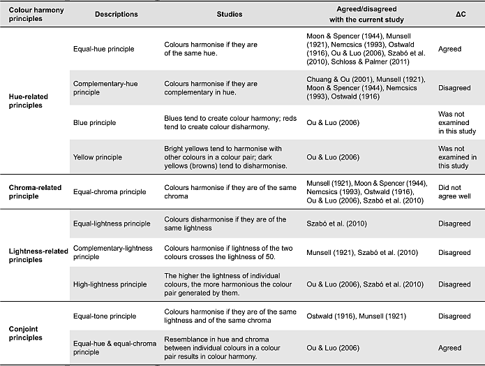
Colour harmony, as Judd and Wyszecki (1975) suggested, can be defined as “two or more colours seen in neighbouring areas which produce a pleasing effect”. Granville (1987) also defined colour harmony as “colour usage that pleases people”. For many years, specialists have sought to understand which colour combinations produce pleasant feelings. Their studies can generally be categorised into two groups, including one group of studies based on the orderly arrangement of colours and the other group based on the interrelationship between colours (Ou & Luo, 2006). The former group of studies, such as those by Itten (1961), Munsell (1921), Nemcsics (1993, 2007) and Ostwald (1916), focused on the systematic selections of colours in a colour order system. The latter group of studies, such as those by Chevreul (1839), Chuang and Ou (2001), Goethe (1810) and Moon and Spencer (1944), claimed that complementary or analogous colours in terms of hue, lightness or chroma could produce harmonious combinations.
Previous studies of colour harmony have suggested some principles of colour combinations that create colour harmony. The effect of hue difference is perhaps the most consistent effect across the findings of the colour harmony studies (Moon & Spencer, 1944; Munsell, 1921; Nemcsics, 1993; Ostwald, 1916; Ou & Luo, 2006; Schloss & Palmer, 2011; Szabó, Bodrogi, & Schanda, 2010). These studies all agreed that colours tended to harmonise if the colours are of the same hue. Some theories and studies of colour harmony also suggested that colours harmonise if they are complementary in hue (Chuang & Ou, 2001; Moon & Spencer, 1944; Munsell, 1921; Nemcsics, 1993; Ostwald, 1916).
A number of previous studies proposed an equal-chroma principle, suggesting that when two colours are equal or similar in chroma, their colour combination would look harmonious (Moon & Spencer, 1944; Munsell, 1921; Nemcsics, 1993; Ostwald, 1916; Ou & Luo, 2006; Szabó et al., 2010). In addition, Ou and Luo (2006) also suggested a similar principle of colour harmony, i.e., equal-hue and equal-chroma principle. This principle states that resemblance in hue and chroma between individual colours in a colour pair results in colour harmony.
In addition to hue-related and chroma-related principles of colour harmony, a number of previous studies also suggested some lightness-related principles. They are equal-lightness principle (Szabó et al., 2010), complementary-lightness principle (Munsell, 1921; Szabó et al., 2010) and high-lightness principle (Ou & Luo, 2006; Szabó et al., 2010).
Since packaging itself represents the image of a product and a colour-harmonised package design would please people, it is hypothesised that a product itself will be liked if the package has a harmonious colour scheme. Hence, the current study aims to examine the associations between colour harmony of package design and the degree of liking of the product. It is important to note that colour harmony and liking refer to different aspects: the former evaluates the package design whereas the latter refers to the customer’s response to the product itself.
Consumer Expectation
Consumer expectations are pre-purchase beliefs or evaluative beliefs of a product (Oliver, 1980; Olson & Dover, 1979) which are influenced by customer perception of a product or service. They can be generated from previous experience, advertising, hearsay, awareness of competitors and brand image (Oliver & Winer, 1987), and can also affect purchase decision making (Hutchings, 2003). In the realm of food products, colour (including colours of food itself and colours on packages) can evoke and influence pre-experienced expectations, such as sweetness, pureness, refreshing, freshness, naturalness, flavour intensity, liking, etc (Clydesdale, Gover, Philipsen, & Fugardi, 1992; Deliza, Macfie, & Hedderley, 2003; Schutz, 1954; Wei, Ou, & Luo, 2007; Zellner & Durlach, 2002, 2003).
Deliza et al. (2003) investigated the influences of package design on expectations. They manipulated six features of package graphic design and then asked observers to rate their expectations of sweetness, pureness, sharpness, refreshing, freshness, naturalness and liking for each stimulus. The six features include background colour, price, information, brand, language and shape. The results showed that background colour and information have significant effects on expectations.
Wei et al. (2007) examined the effect of package colours on expectations. In their study, package colours referred to the background colours of a package design. Observers of their study assessed orange juice packages with 20 different background colours using six bipolar scales, i.e., quality (poor quality–high quality), the position in the market (economy–luxury), healthiness (unhealthy–healthy), refreshingness (not refreshing–refreshing), flavour strength (weak–strong) and freshness (stale–fresh). They found that quality, the position in the market and healthiness showed similar patterns of results and can be further categorised into a broader category of “product quality”. A product would be expected to be of high quality if light or dark colours were used to design the package. Poor quality would be expected if the colours with lightness of mid levels were used. In addition, the scales of refreshingness and freshness showed similar patterns of results and were categorised into a broader category of “freshness”. Freshness was relative to chroma of package colours, such that an orange juice would be expected to be fresh if vibrant colours were used to design the package.
Deliza et al. (2003) showed that background colours of a package affect consumer expectations. Wei et al. (2007) further manifested that, for orange juice, product quality and freshness were the two expectations being affected by package colours. Given Wei et al.’s (2007) findings of the relationship between colours and expectations of orange juice however, their results may not be applicable to different fruit juices. We believe that different contexts within which colours are used would lead to different relationships between colours and expectations. Hence, in order to gain a more comprehensive understanding with regard to the influences of colour on expectations, the current study used seven different fruit juices to empirically investigate the relationships between colour scheme of packaging and expectations of quality (poor quality–high quality) and freshness (stale–fresh).
Methods
The framework of the method employed in this study was, firstly, asking observers to view digital images of packages projected onto the screen of a colour calibrated monitor. The observers then scored the images for colour harmony and expectations. Finally, colour appearance of the images was compared with the observers’ responses. To achieve this, a series of tasks were carried out, as shown in Figure 1. The first step was to conduct a market survey in order to obtain a typical layout of juice packages. This typical layout was then used as a guideline to design experimental stimuli. In step 2, colour specification and on-screen colour rendering of juice packages were carried out. To achieve this, colour measurement technology and uniform colour space (CIE, 2004; Hunt, 1998; Wyszecki & Stiles, 1982) were used for colorimetric characterisation of the experimental display, colour specification and colour rendering of experimental stimuli. The third step was to perform psychophysical experiments using the semantic differential (SD) method. In this step, we asked observers to visually assess the stimuli using semantic scales. The final step was to analyse data and then examine the relationships between colours of juice packages and observers’ responses.
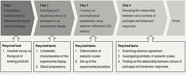
Figure 1. The four steps of tasks accomplished in this study.
CIELAB Uniform Colour Space
CIELAB colour space is a perceptually uniform colour space which comprises of three orthogonal scales: L*, a* and b*. L* stands for the axis of lightness, a* and b* represent two scales of opponent colour pairs (i.e., redness–greenness and yellowness–blueness, respectively). Chroma and hue, two of the perceptual attributes of colours, are specified by converting the rectangular a* and b* axes into polar coordinates C* and h (CIE, 2004).
The distance between any two colours in CIELAB space represents the (visually) perceived colour difference between them. CIELAB colour difference (ΔE*ab) is defined by either the three orthogonal coordinates L*, a* and b* or by the cylindrical coordinates L*, C* and h. A ΔE*ab value of 1 approximately corresponds to a just visible difference in colour.
The CIELAB colour space and the corresponding colour difference (ΔE*ab) were used in this study to render colour stimuli, as given in Table 2. Details of rendering colour stimuli are given in the section of Stimuli Preparation.
Colorimetric Characterisation of the Display
A 21-inch SONY Trinitron Multiscan 20SE CRT display was used to present the stimuli. Before manipulating the colours of the experimental stimuli, a colorimetric characterisation for the display was carried out. The resulting characterisation model was used to convert the digital input (i.e., RGB) of the display to colour appearance attributes (e.g., CIE L*a*b* values). In this study, a Gain-Offset-Gamma (GOG) model developed by Berns (1996; also see CIE, 1996) was used to characterise the display.
A set of 20 colours, which cover a wide range of the CIELAB colour space, was used to test the performance of the characterisation model. As a result, the average colour difference (i.e., ΔE*ab) between the measured colours and their predictive counterparts was 0.95, with a maximum colour difference value of 2.04.
Market Survey of Juice Packages
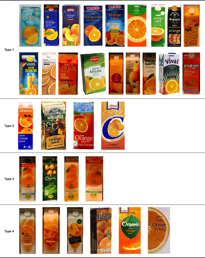
The purpose of surveying the package design of fruit juice was to explore the existing graphic designs in the market. The findings of this market survey provided a guideline for designing the experimental stimuli. Thirty-two carton packages of orange juice, produced by 24 leading brands, were collected from various UK supermarkets. The 24 brands were ASDA, Britvic, Calypso, Cawston Vale, Del Monte, Don Simon, Grove Fresh, Just Juice, Kulana, Libby’s, Londis, M&S, Morrisons, Princes, Rubicon, Safari Vival, Safeway, Sainsburys, Somerfield, Stute, Sunpride, Tesco, Tropicana and Waitrose. The 32 carton packages were presented in Appendix 1.
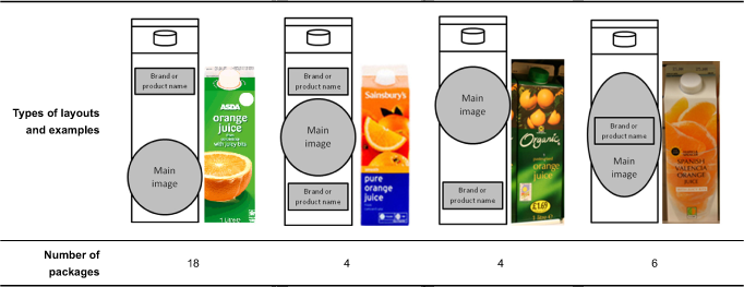
According to Ampuero and Vila (2006) and Deliza et al. (1999), the salient features of the 32 packages included package colours, main images, brand name and product name. On the basis of the arrangement of these features, the 32 packages were classified into four groups: those with the brand/product names located above the main image, those with the brand/product names separated by the main image, those with the brand/product name located below the main image, and those with the brand/product name overlapped with the main image. Table 1 shows the four types of layouts and their corresponding representative packages. Among the 32 packages, 18 were found to have the first type of layout. This type of layout was, hence, used to design the experimental stimuli in this study.
Table 1. Classification of juice packages according to the layout of graphic design.
Stimuli Preparation
Experimental stimuli were generated using an image of an existing juice product. For each image stimulus, an image was captured in a controlled surrounding. A VeriVide viewing cabinet was used to control surround lighting. Inside the viewing cabinet was the juice product on a uniform grey background and illuminated by a D65 simulator. The colour-calibrated Canon EOS 350D camera used to capture photos of the package was set 50cm in front of the package.
After capturing the image of the product, Photoshop CS2 was used to modify it. As shown in Figure 2, the original graphic design of the label and the picture of fruits were first replaced with newly designed ones, and five such designed packages were then aligned side by side in order to simulate the products presented on a supermarket shelf. The modified image of the existing juice product was used as the “base” image. The experimental stimuli were generated by changing package colour and picture of fruit of this “base” image.
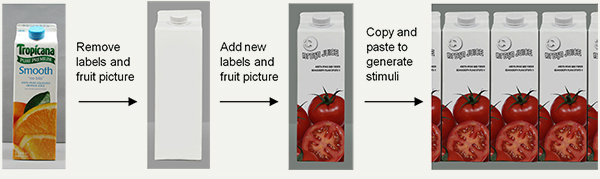
Figure 2. Procedure for modifying the layout of the package.
A total of 140 experimental stimuli were generated using pictures of seven fruits and 20 package colours. Colours and designs of the rest of the package appearance, such as covers, labels and logos, remained unchanged. The seven pictures of fruits, shown in Figure 3, included orange, apple, cranberry, pineapple, grapefruit, strawberry and tomato. They are popular flavours of juices sold in the UK. According to the 2011 UK Soft Drink Report released by BSDA, they shared over 74% of the fruit juice market in 2010. In addition, these seven fruits covered a considerable range of natural fruit colours from red through orange and yellow to green. These pictures were captured following the same procedures as described in the first paragraph of this section.
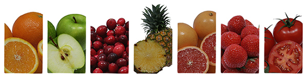
Figure 3. Seven pictures of fruits used in this study.
The images from left to right are orange, apple, cranberry, pineapple, grapefruit, strawberry and tomato.
Twenty colours, selected from Ou, Luo, Woodcock and Wright (2004), provided a guideline here to render package colours. Specification of the package colours were calculated by averaging L*, a* and b* of all pixels within the background areas of packages, see Table 2. The 20 colours gave an adequate coverage in the CIELAB colour space, as shown in Figure 4. Note that the package colours used in this study are different from the 20 colours used in Ou et al.’s study (Ou et al., 2004). This is because some pale colours used in their study failed to render package colours. Texture details disappeared when these pale colours used. To avoid this, package colours were further adjusted using Photoshop CS2 software. Figure 5 demonstrates three examples of the stimuli: Figures 5a and 5b show the packages of orange juice with blue and white package colours and Figure 5c shows the packages of apple juice with white package colour.
Table 2. The 20 package colours used in the experiment.
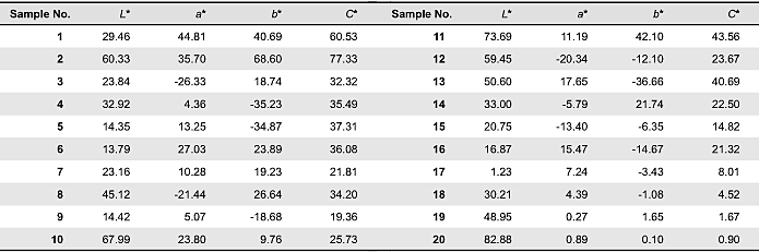
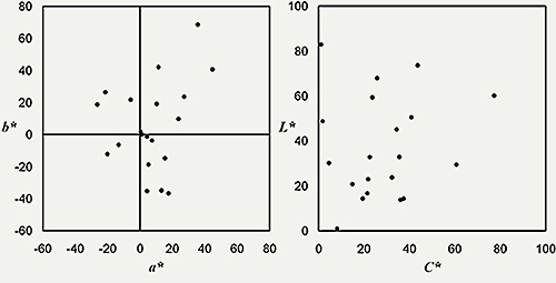
Figure 4. The 20 package colour in CIELAB (a) a*–b* plane and (b) L*–C* plane.
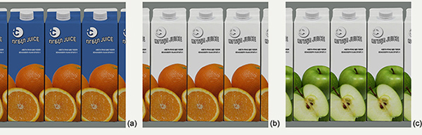
Figure 5. Examples of the experimental stimuli: (a) and (b) are packages of orange juice with blue and white package colours; (c) shows packages of apple juice with white package colour.
Observers
A total of 20 observers, 10 males and 10 females, participated in this study. The ages of these observers ranged from 23 to 34 years (average = 26 years; SD. = 3.64). They were postgraduate students or academic staff members of the University of Leeds, UK. All of the twenty observers passed the Ishihara test (Ishihara, 2003) and were thus regarded as having normal colour vision.
Semantic Scales
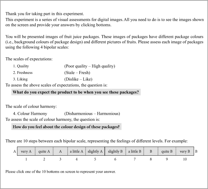
Four semantic scales, colour harmony (disharmonious–harmonious), liking (dislike–like), quality (poor quality–high quality) and freshness (stale–fresh), were used in this study to indicate observers’ responses of juice packages with different colour schemes. The scale of colour harmony quantified observers’ responses for the colour scheme of the package design. The scale of liking was used to indicate observers’ expected liking for the juice product contained in the pack. With regard to quality and freshness, they are two underlying factors among the six expectation scales: product quality, position in the market, freshness, refreshingness, healthiness and flavour strength (Wei et al., 2007). Hence, the scales of quality and freshness were then used in this study to quantify observers’ expectations.
In the experiment, each of these four scales was presented in terms of ten categories. These categories were represented by the integers from 1 to 10. The numbers from “1” to “5” represent the degree of agreement with the left end of the scale, with “1” being the strongest and “5” the weakest. Numbers from “6” to “10” represents the degree of agreement with the right end of the scale. “6” represents the weakest and “10” is the strongest. Taking the scale of freshness for example, the ten categories represented by the integers from 1 to 10 correspond to “very stale”, “quite stale”, “stale”, “a little stale”, “slightly stale”, “slightly fresh”, “a little fresh”, “fresh”, quite fresh” and “very fresh”, respectively.
Experimental Procedure
The whole experiment was conducted in a laboratory where the only light source came from the experimental display. Before the experiment, the observers were asked to read instructions of the experimental procedure (see Appendix 2 for the instructions). A 3-minute adaptation time was given before beginning the experiment. Due to the high display luminance level, the 3-minute duration is sufficient for the observers to adapt to the luminance levels of the screen and the laboratory.
During the experiment, the observers were asked to assess colour harmony, liking, quality and freshness of the 140 stimuli using numbers from 1 to 10 to represent their responses. For each semantic scale, the assessments of 28 stimuli were repeated. These 28 stimuli were packages of the 7 fruit juices using 4 package colours. The 4 package colours we selected for repeated measure were red (L* = 29.46, a* = 44.81, b* = 40.69), golden yellow (L* = 60.33, a* = 35.70, b* = 68.60), green (L* = 23.84, a* = -26.33, b* = 18.74) and blue (L* = 32.92, a* = 4.36, b* = -35.23). These colours together cover a wide range in CIELAB space.
The stimuli were presented in random order on the 21-inch CRT display. The viewing distance was approximately 50cm. Figure 6 shows the style of image used in the experiment, including the angular sizes (in degrees) of the stimuli and of the viewing field. An object’s angular size is the angle between the lines of sight to its two opposite sides.
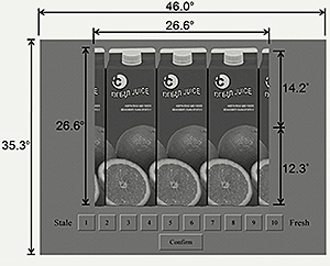
Figure 6. The user interfaces employed in the experiment.
Results
Intra-observer and Inter-observer Agreement
Intra- and inter-observer agreements were first examined to investigate response consistency. Intra-observer agreement examines whether or not the responses of assessments agree with the repeated counterparts from the same observers, whereas inter-observer agreement investigates whether or not an observer’s responses agree with the majority, i.e., the mean scores of all observers’ responses.
In this study, the measure of root mean square (RMS) was used to determine the level of both intra- and inter-observer agreements, as given in equation 1. RMS determines how well two data sets agree with each other and is a commonly used index in the field of colour science to evaluate scoring reliability (Ou et al, 2004, 2006). The RMS has a minimal value of 0, indicating that the two data sets agree perfectly with each other. The maximal value of RMS varies, depending upon the scale range of the data sets. The maximal value occurs when observes give extreme responses (e.g., 1: “very stale” and 10: “very fresh”) to the same stimulus. In other words, higher RMS values indicate poorer intra- or inter-observer agreements.
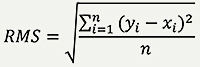 |
(Eq. 1) |
For intra-observer agreements, yi and xi represent the scoring of individual observers’ second and first assessments for ith stimulus, respectively. n represents the number of repeated stimuli, which equals to twenty-eight in the current study. For inter-observer agreements, yi is the mean score of all observers’ raw data for the ith stimulus; xi is the individual observers’ raw data for the ith stimulus. n is the total number of stimuli, which is 140 in the current study.
Table 3 summarises the results of intra- and inter-observer agreements in terms of RMS. In the case of intra-observer agreement, most of the RMSs between repeated assessments were smaller than 2 units with the mean RMS of 1.38 units for male observers and 1.45 units for female observers. This indicates high intra-observer agreement, as the differences between repeated assessments for both genders were below 1.5 categories of the 10-category measurement scale.
Table 3. Observers’ agreements in terms of RMS.
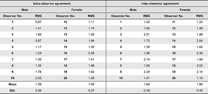
In the case of inter-observer agreement, the values of RMS were around 2 units with the mean values of 1.84 for male observers and 1.80 for female observers. That is, the differences between individual observers’ responses and the responses of the majority were less than 2 categories of the 10-category measurement scale, suggesting reliable inter-observer agreement.
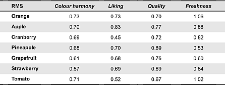
Gender Differences
Gender differences were investigated using the measure of root mean square (RMS, see equation 1). Table 4 summarises the results. In the cases of orange juice and tomato juice, the differences of expected freshness between male and female observers were slightly larger than 1 unit of the 10-category measurement scale. For the other cases, the gender difference was less than 1 unit.
Table 4. The results of gender difference.
Relationships between Scales
Examinations of the relationships between scales help clarify which semantic scales were similar and which were different according to the colour design of the juice packages. These relationships were described using the Pearson product-moment correlation coefficient (R) and demonstrated using scatter plots shown in Figure 7. The probability value p = 0.05 was used to determine the significance of R.
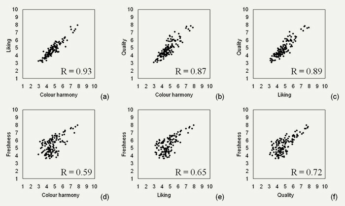
Figure 7. Scatter plots of the relationships between each pair of the four scales.
The scale of colour harmony was highly correlated with the scales of liking and quality (R ≥ 0.87, p < 0.05), as shown in Figures 7a and 7b. In addition, liking and quality were also highly correlated (R = 0.89, p < 0.05), as shown in Figure 7c. Given the findings, we further consider the possibility that quality is a mediator variable that carries the influence of colour harmony to liking. When quality was included as a mediator variable, the regression coefficient for colour harmony and liking reduced from 0.952 to 0.649. Results from the Sobel test indicated that quality significantly mediated the relationship between colour harmony and liking (Z = 5.75, p < 0.001). These findings suggest that colour harmony of juice packages has significant influences on observers’ expectations of the quality of juice products, which would in turn affect observers’ liking of the juice products.
Figures 7d to 7f show the relationships between the scale of freshness and three other scales: colour harmony, liking and quality, respectively. The correlation coefficients of freshness and the other three scales were all significantly (0.72 ≥ R ≥ 0.59, p < 0.05), although there is a tendency that these three scales agree better in the higher than the lower scale range (i.e., a wilder spread was seen when scores were lower than 6). Given that all three scales are highly correlated, we examined the possibility that the relationship between colour harmony and liking is mediated by freshness. The regression coefficient for colour harmony and liking reduced from 0.952 to 0.857 when freshness was included as a mediator. The results of Sobel test confirmed that freshness was a significant mediator between colour harmony and liking (Z = 3.78, p < 0.001). These findings suggest that juice products with a colour-harmonised package design are considered fresh products, which would in turn lead to better liking of the product.
The Effect of Colour on Observers’ Responses
This section describes the influences of package colours and fruit pictures on colour harmony, liking, quality and freshness. The following indicators were used to examine the interactions between package colours and the colours of fruit pictures: sums and/or differences of lightness (L*sum and ΔL*), chroma (C*sum and ΔC*) and hue angle (Δh) as well as chromatic difference (ΔC) between package colours and colours of fruit pictures. Note that chromatic difference (ΔC) integrates chroma difference (ΔC*) and hue difference (ΔH*). These attributes were chosen according to Ou and Luo (2006).
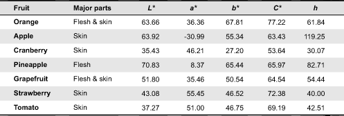
The twenty package colours are given in Table 2. Table 5 lists colour attributes of the seven fruit colours. These colours were determined according to the results of Wei, Ou and Luo’s study (2008) to find out perceived colours of fruit pictures. In the study observers were asked to define major parts of fruit pictures, e.g., the skin areas of the images of apple, and then to visually match colour appearance of uniform colour patches according to the colours of the major parts. The matched uniform colours, i.e., the perceived colours, were lighter and more colourful than average colours of the major parts of the fruit pictures.
Table 5. Representative colours of the seven fruit pictures.
The effect of lightness
Previous studies found that small lightness difference (ΔL*) led to colour disharmony. Ou and Luo (2006) and Szabó et al. (2010) also claimed that high lightness values (L*sum) of constituent colours tend to enhance colour harmony. However, such relationships were not found in the current study. The effects of lightness on colour harmony, liking and quality were limited. As shown in Table 6, the correlation coefficients (R) of these three semantic scales across the three lightness-related attributes, i.e., lightness of package colours (L*bg), L*sum and ΔL*, were only weakly correlated (i.e., between -0.14 and 0.08). This result is inconsistent with previous finding of a significant effect of lightness on colour harmony (Chuang & Ou, 2001; Moon & Spencer, 1944; Ou & Luo, 2006).
Table 6. Correlation coefficients of the four semantic scales across the attributes of L*bg, L*sum and ΔL*.
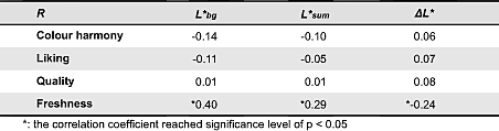
The scale of freshness, on the other hand, was moderately correlated with L*bg (R = 0.40). This suggests that light package colours of fruit juice are associated with freshness.
The effect of chroma
Table 7 summarises the correlation coefficients (R) of the four scales across the four chroma-related attributes, i.e., chroma of package colours (C*bg), C*sum, ΔC* and ΔC. As shown in Table 7, the effects of C*bg, C*sum, and ΔC* on the scales of colour harmony, liking and quality were rather weak (0.32 ≥ R ≥ -0.28). The results are inconsistent with Szabó et al.’s (2010) findings that two colours having small ΔC* or having large C*sum tended to harmonise.
Table 7. Correlation coefficients of the four semantic scales across the attributes of C*bg, C*sum, ΔC* and ΔC.
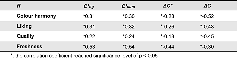
Chromatic difference (ΔC), which involves both the attributes of chroma difference and hue difference, was moderately correlated with the scales of harmony, liking and quality (R ≤ -0.43). Figure 8 shows the scatter plot of the harmony–ΔC relationship. This diagram reveals that colour harmony tends to decrease as the chromatic difference between the package colours and the colours of fruit pictures increases. This pattern is similar to those of the liking–ΔC and quality–ΔC relationships, and is consistent with the pattern of the harmony–ΔC relationship found in Ou and Luo (2006).
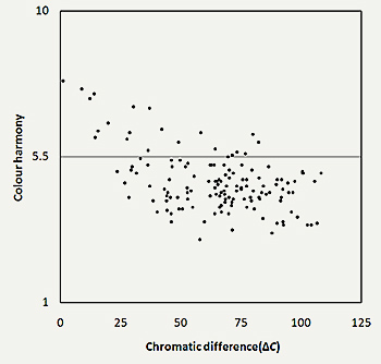
Figure 8. Scatter plot of the relationship between colour harmony and chromatic difference (ΔC).
The results of freshness differed from those of colour harmony, liking and quality. As shown in Table 7, freshness was moderately correlated with C*bg and C*sum (R ≥ 0.53), but weakly correlated with ΔC (R = -0.30). Figures 9(a) and 9(b) are scatter plots of freshness against C*bg and C*sum. As can be seen in Figure 9a and 9b, colourful colours would give rise to an impression of freshness, except for some cases (see the grey ellipses in Figures 9a and 9b). These cases are the packages of the 7 fruit juices using white package colour. They were also rated as fresh products.
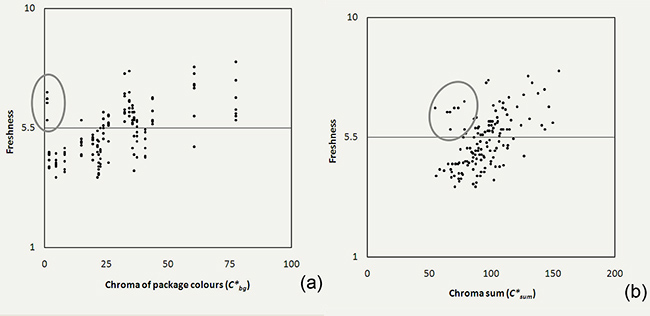
Figure 9. Scatter plots of the relationships between freshness and (a) chroma of package colours (C*bg) and (b) chroma sum (C*sum).
The Effect of Hue
Unlike the colour attributes of lightness and chroma, hue angle is an angular measurement rather than a linear measurement. Hence, correlation coefficient (R) is not an appropriate method for evaluating the relationships between hue angle and the four semantic scales. Instead, the scatter plots of hue angle against the ratings of the semantic scales were used to investigate the relationships.
Figure 10a illustrates the scatter plot of colour harmony against hue angle of package colours. As shown in this figure, hue angles ranging from 45° to 135° were more likely to be rated harmonious. This indicates that orange, yellow and yellowish green package colours were more likely to produce harmonious feelings to the observers. This trend, as visualised by the curve in Figure 10a, also reveals a tendency that the hue angles of these harmonious packages colours were similar to that of fruit colours which were red, orange, yellow or green. Figure 10b plots colour harmony against hue angle difference (Δh). As shown in this figure, colour harmony scores around the two ends of this diagram were larger than those around the middle parts. This indicates that a package would look harmonious if the hues of the package colour and the fruit colour are similar or identical. Complementary colour combinations, on the other hand, would look disharmonious. These results are in accordance with the findings reported by Ou and Luo (2006) and Szabó et al. (2010), but contrast with the studies by Moon and Spencer (1944), Munsell (1921) and Ostwald (1916), who claimed that colours harmonise if they are complementary in hue.
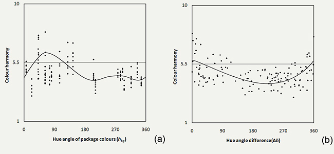
Figure 10. Scatter plots of colour harmony against (a) hue angle of the package colours (hbg) and (b) hue angle difference (Δh).
The effects of hue on liking and quality were similar to the effects of hue on colour harmony, indicating that the observers liked a juice product and considered it a high quality product if the hues of the package colour and the fruit colour are similar or identical.
The effect of hue on freshness was not as strong as the effects of hue on colour harmony. Figure 11 shows the scatter plot of the freshness against hue angle difference (Δh). As can be seen in this figure, the data spread widely and do not show a clear trend, suggesting no clear connection between hue angle difference and freshness.
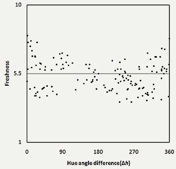
Figure 11. Scatter plot of freshness against hue angle difference (Δh).
Discussions
Colour Harmony and Liking
In the current study, we hypothesised that a fruit juice product will be liked and expected to be of high quality when the package colour scheme looks harmonious. Our findings support this hypothesis. We found that colour harmony of fruit juice packages is highly correlated with observers’ expectation of quality and liking of juice products. In addition, results from the mediation analyses revealed that colour harmony of package colour scheme influences the observers’ perception of the quality and freshness of the products, which in turn influences their liking of the products.
Although the goal of the current study was to obtain descriptive data to describe the relationships between colour harmony and psychological responses within the context of fruit juice, it is also of interest to further consider possible accounts underpinning the associations between package colour and expectation of juice products. One possible account for the link between colour harmony of package design and expected liking of the juice products lies in the effect of hue. In the current study, we found that similar hues of the colours of the packages and fruit pictures increased both colour harmony and liking. It is possible that when the package of a fruit juice product was designed using a colour that was similar in hue to the colour of the target fruit, the package colour would activate concepts or thoughts associated with the target fruit. For instance, for an orange juice product with an orange package colour, the package colour might activate the concept of “orangeness”, which is consistent with the typical colour of the target fruit. From this ecological perspective, our findings of a preference over similar hues can be viewed as a reflection of the goodness of fit between conceptual representations of the background colour and the target object (Palmer & Schloss, 2010), which is orange in this case.
Colour Harmony in the Context of Fruit Juice Package
Most of the conventional principles of colour harmony were based on research focused on combinations of uniform colours. In the current study, we examined colour harmony within a specific context. We stated that the context within which colours are used affects how colours are perceived and colour harmony. We found that colour harmony in the context of juice packaging was different from that of uniform colours. Table 8 summarises the comparisons between existing colour harmony principles and the findings of the current study. As shown in the table, there are four types of colour harmony principles, i.e., hue-related, chroma-related, lightness-related and conjoint principles. In comparison to previous findings, only two principles are applicable to the current data: the equal-hue principle and the equal-hue and -chroma principle. The equal-hue principle specifies that colours harmonise if they are of the same hue. The equal-hue and -chroma principle states that resemblance in hue and chroma between individual colours in a colour pair results in colour harmony.
Table 8. Comparisons between existing colour harmony principles and the findings of the current study.
Schloss and Palmer’s study (2011) distinguished colour preference into 2 conditions: seeing a colour combination as a whole (similar hues are preferred) and seeing a colour combination as a figural colour on its background colour (complementary hues are preferred). Our findings on colour harmony agreed with the former condition. The observers of the current study tended to interpret the term colour harmony as a subjective judgment of preference. In addition, they tended to see the package colour scheme as a whole, rather than seeing fruit pictures as figures and package colours as backgrounds.
Expectation of Freshness and Chroma
Unlike colour harmony, which is mainly affected by the hue of the package colour scheme, freshness is mainly influenced by chroma. A product with colourful package and fruit colours was expected to be a fresh juice product. A possible explanation that saturated colours produces fresh expectation is that saturated colours might be associated with the concepts of pure and new, as opposed to less saturated or dull colours. Hence, a juice product with a colourful package would give rise to the impression of “recently-made” and therefore freshness. To our best knowledge, few previous studies examining the influence of package colours on freshness have inspected the connection between freshness and chroma. Future studies should further examine the relationship between package colours and the expectation of freshness in order to gain a better understanding of this issue.
Practical and Educational Implications
In the current study, we found that colour harmony of juice packaging influences consumers’ expectations of the products (quality and freshness), which in turn affects consumers’ liking of the products. For designers who attempt to create positive psychological or emotional connections between their package design and a fruit juice product, the current findings suggested that white package colour or package colours with hue identical to the representative colours of fruit pictures would give rise to a harmonic impression. In addition, colourful package colours could enhance expectation of freshness for juice products.
Colour harmony, as a concept, is often represented in the form of rules or principles in art or design textbooks. These rules or principles are mainly based on uniform colours. While putting colours in context, we found that the conventional colour harmony principles cannot fully account for the current data. In training students to develop skills and knowledge needed to work with colours, it is important to emphasize the fact that colour harmony does not constitute a fixed set of principles. Instead, it changes according to the context in which colours appear. While it is important to acknowledge the fact that colour harmony is not a fixed concept but can vary with the context, a better understanding of colour harmony is still to be achieved by extending investigations of colour harmony to different contexts.
Conclusions
In the current study, we found that colour harmony of fruit juice packages is associated with observers’ liking of the products, and the association was mediated by the observers’ expectation of the quality and freshness of the products. Colour harmony, liking and quality are mainly influenced by chromatic difference (ΔC) and hue angle difference (Δh) between package colours and fruit colours. The effect of lightness on the three semantic scales was weak. We suggest that a package design with its colour scheme having low ΔC and similar hues between package colour and fruit colour will look harmonious. Customers are more likely to expect this product to be a quality product and would tend to like it.
The relationship between colours and freshness do not agree well with the other three semantic scales, especially in the cases of mid or low scale scores (see Figures 6d to 6f). Freshness is mainly affected by chroma of package colours (C*bg) and chroma sum (C*sum). Lightness of package colours (L*bg) also contribute to the perception of freshness. Hue effects on freshness are weak. This suggests that a juice product will be expected to be fresh if the colour scheme of its package has bright colours.
We also found that the principles of colour harmony may differ according to the context in which the colours are used. The results of comparisons suggest that only two existing colour harmony principles, i.e., the equal-hue principle and equal-hue and equal-chroma principle, apply to colour combinations in the context of juice packaging.
Fruit juices proved to be a convenient model material for this project. The experimental design and methodology employed and developed can be applied to other foods as well as to other packaged products.
References
- Ampuero, O., & Vila, N. (2006). Consumer perceptions of product packaging. Journal of Consumer Marketing, 23(2), 102-114.
- Berns, R. S. (1996). Methods for characterizing CRT displays. Displays, 16(4), 173-182.
- Burchett, K. E. (2002). Color harmony. Color Research and Applications, 27(1), 28-31.
- Chevreul, M. E. (1839). The principles of harmony and contrast of Colors. Translation by C. Martel (1854) from the French edition of 1839. Reprinted in 1981, NY: Van Nostrand Reinhold.
- Cho, H. S., & Lee, J. (2005). Development of a macroscopic model on recent fashion trends on the basis of consumer emotion. International Journal of Consumer Studies, 29(1), 17-33.
- Chuang, M., & Ou, L. C. (2001). Influence of a holistic color interval on color harmony. Color Research and Application, 26(1), 29-39.
- Clydesdale, F. M., Gover, R., Philipsen, D. H., & Fugardi, C. (1992). The effect of color on thirst quenching, sweetness, acceptability and flavor intensity in fruit punch flavored beverages. Journal of Food Quality, 15(1), 19-38.
- Commission Internationale de l’Éclairage (CIE) (1996). Technical report 122: The relationship between digital and colorimetric data for computer-controlled CRT display. Vienna, Austria: CIE Central Bureau.
- Commission Internationale de l’Éclairage (CIE) (2004). Technical report 15: Colorimetry. (3rd Ed.). Vienna, Austria: CIE Central Bureau.
- Crossley, L. (2003). Building emotions in design. The Design Journal, 6(3), 35-45.
- Deliza, R. et al. (1999). An investigation using the repertory grid and focus group methods of the package features affecting consumer perception of fruit juice. Brazilian Journal of Food Technology, 2, 63-71.
- Deliza, R., Macfie, H., & Hedderley, D. (2003). Use of computer-generated images and conjoint analysis to investigate sensory expectations. Journal of Sensory Studies, 18, 465-486.
- Desmet, P. M. A., Overbeeke, C. J., & Tax, S. J. E. T. (2001). Designing products with added emotional value: Development and application of an approach for research through design. The Design Journal, 4, 32-47
- Eckman, M., Damhorst, M. L., & Kadolph, S. J. (1990). Towards a model of the in-store purchase decision process: Consumer use of criteria for evaluating women’s apparel. Clothing and Textiles Research Journal, 8(2), 13-22.
- Goethe, J. W. (1810). Theory of colours (C. L. Eastlake Trans.). London, UK: John Murray. (Reprinted in 1970, Cambridge, MA: The MIT Press).
- Granville, W. C. (1987). Color harmony: What is it? Color Research and Application, 12(4), 196-201.
- Hunt, R. W. G. (1998). Measuring colour (3rd Ed.). West Sussex: Fountain Press.
- Hutchings, J. B. (2003). Expectations and the food industry: The impact of color and appearance. New York, NY: Kluwer Academic / Plenum Publishers Press.
- Ishihara, S. (2003). Ishihara’s tests for colour deficiency: Complete 38 plates edition. Tokyo, Japan: Kanehara Trading.
- Itten, J. (1961). The art of color. Translation by Ernst van Haagen from German “Kunst der Farbe”. New York, NY: Van Nostrand Reinhold.
- Jordan, P. W. (1998). Human factors for pleasure in product use. Applied Ergonomics, 29(1), 25-33.
- Judd, D. B., & Wyszecki, G. (1975). Color in business, science and Industry (3rd Ed.). New York, NY: John Wiley & Sons Press.
- Lee, W. Y., Luo, M. R., & Ou, L. C. (2009). Assessing the affective feelings of two- and three-dimensional objects. Color Research and Application, 34(1), 75-83.
- Moon, P., & Spencer, D. E. (1944). Geometric formulation of classical color harmony. Journal of Optical Society of America, 34(1), 46-59.
- Morganosky, M. (1984). Aesthetic and utilitarian qualities of clothing: Use of a multidimensional clothing value model. Home Economics Research Journal, 13(1), 12-20.
- Munsell, A. H. (1921). A Grammar of color, In F. Birren (Ed.). (Reprinted in 1969) New York, NY: Van Nostrand Reinhold.
- Nemcsics, A. (1993). Colour dynamics: Environmental colour design. New York, NY: Ellis Horwood.
- Nemcsics, A. (2007). Experimental determination of laws of color harmony, Part 1: Harmony content of different scales with similar hue. Color Research and Application, 32(6), 477-488.
- Oliver, R. L. (1980). A cognitive model of the antecedents and consequences of satisfaction decisions. Journal of Marketing Research, 17(4), 460-469.
- Oliver, R. L., & Winer, R. S. (1987). A framework for the formation and structure of consumer expectations: Review and popositions. Journal of Economic Psychology, 8(4), 469-499.
- Olson, J. C., & Dover, P. A. (1979). Disconfirmation of consumer expectations through product trial. Journal of Applied Psychology, 64(2), 179-189.
- Ostwald, W. (1916). The color primer, In F. Birren, (Ed). (Reprinted in 1969) New York, NY: Van Nostrand Reinhold.
- Ou, L. C., Luo, M. R., Woodcock, A., & Wright, A. (2004). A study of colour emotion and colour preference Part I: Colour emotions for single colours. Color Research and Application, 29(3), 232-240.
- Ou, L. C., & Luo, M. R. (2006). A colour harmony model for two-colour combinations. Color Research and Application, 31(3), 191-204.
- Palmer, S., & Schloss, K (2010). An ecological valence theory of human color preference. Proceedings of the National Academy of Sciences of the United States of America, 107(45), 8877-8882.
- Schloss, K., & Palmer S. (2011). Aesthetic response to color combinations: Preference, harmony, and similarity. Attention, Perception, & Psychophysics, 73(2),551-571.
- Schutz, H. G. (1954). Color in relation to food preference. In Farrel, K. T., Wagner, J. R., Peterson, M. S., & MacKinney, G. M. (Eds.), Color in food, a symposium (16-21). Washington, DC: Natl. Acad. Sci., Natl. Research Council.
- Szabó, F., Bodrogi, P., & Schanda, J. (2010). Experimental modelling of colour harmony. Color Research and Application, 35(1), 34-49.
- Wei, S. T., Ou, L. C., & Luo, M. R. (2007). Package colour and consumer expectations: Taking orange juice packaging design as an example. In Proceedings of the International Conference on Kansei Engineering and Emotion Research. Tokyo, Japan: Japan Society of Kansei Engineering.
- Wei, S. T., Ou, L. C., & Luo, M. R. (2008). Colour design for carton-packed fruit juice packages. Proceedings of the 4th International Conference of Design Research Society. Sheffield, UK: Design Research Society .
- Wyszecki, G., & Stiles, W. S. (1982). Color science: Concepts and methods, quantitative data and formulae (2nd Ed.). New York, NY: John Wiley & Sons Press.
- Zellner, D. A., & Durlach, P. (2002). What is Refreshing? An investigation of the color and other sensory attributes of refreshing foods and beverages. Appetite, 39(2), 185-186.
- Zellner, D. A., & Durlach, P. (2003). Effect of color on expected and experienced refreshment, intensity, and liking of beverages. The American Journal of Psychology, 116(4), 633-647.
Appendix
Appendix 1. The 36 carton-packed orange juices surveyed in this study.
Type 1: The brand/product names located above the main image. Type 2: The brand/product names separated by the main image.
Type 3: The brand/product name located below the main image. Type 4: The brand/product name overlapped with the main image..
Appendix 2. The Instruction of the Experiment.
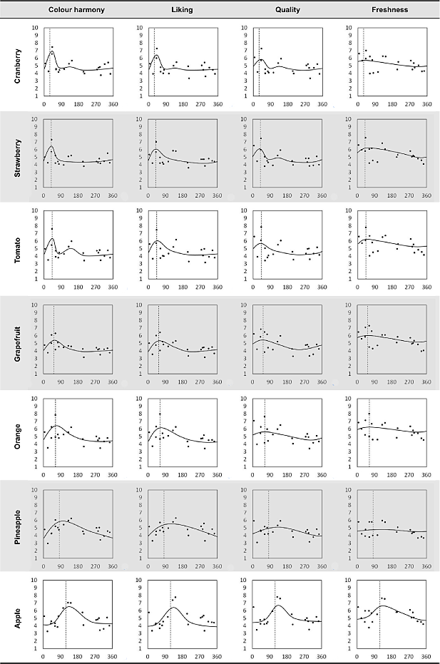
Appendix 3. Scatter plots of the 4 semantic scales (y-axis) against hue of the package colours hbg (x-axis) for the 7 fruit juices. The dashed line in each figure represents the hue of the corresponding fruit images (see Table 5).
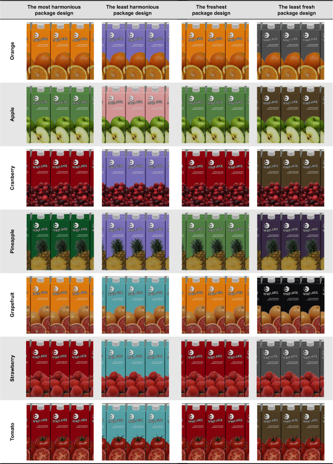
Appendix 4. The most and the least harmonious and fresh colour design of juice packages.